Best of Commercial Space
Designer / Agency
- Raul Sanchez
Category
- Commercial Space
Award
- 2022 GOLD
Share this project
PROJECT
DESCRIPTION
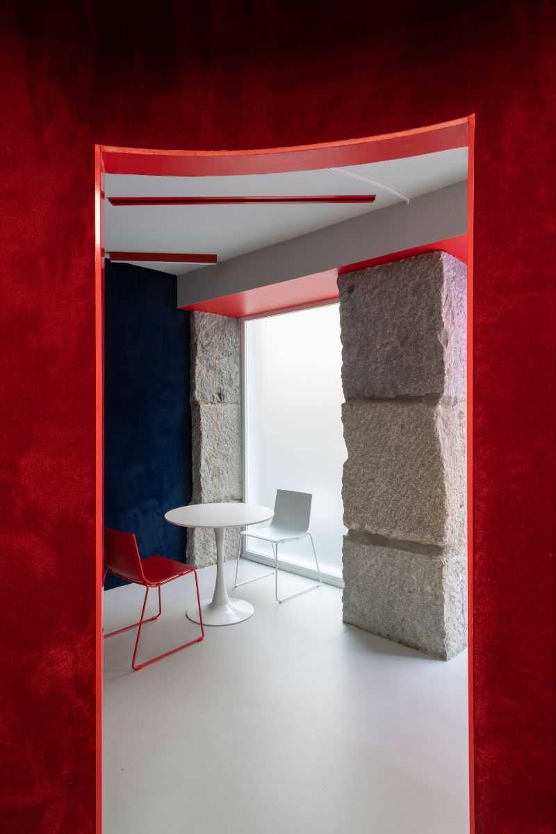
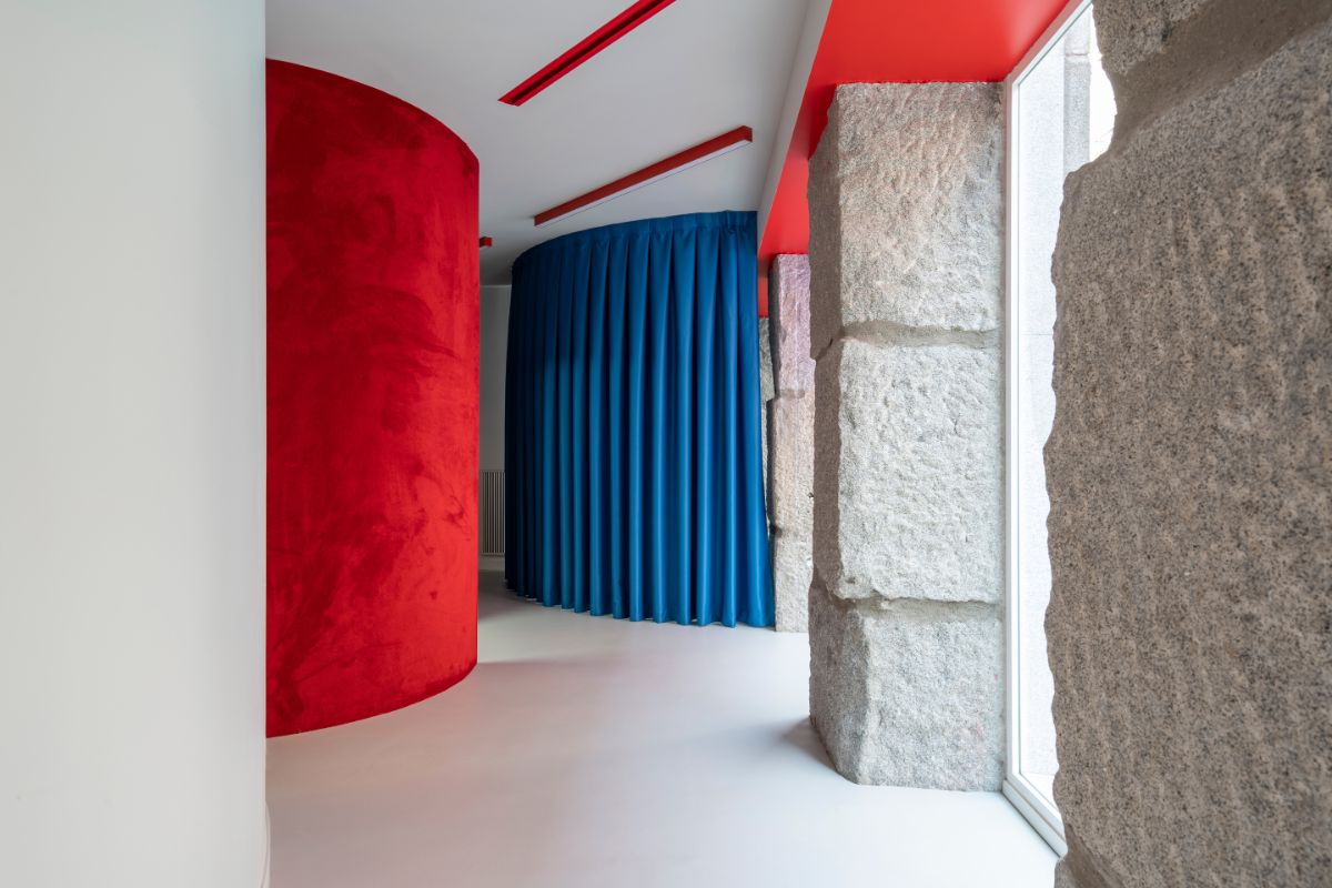
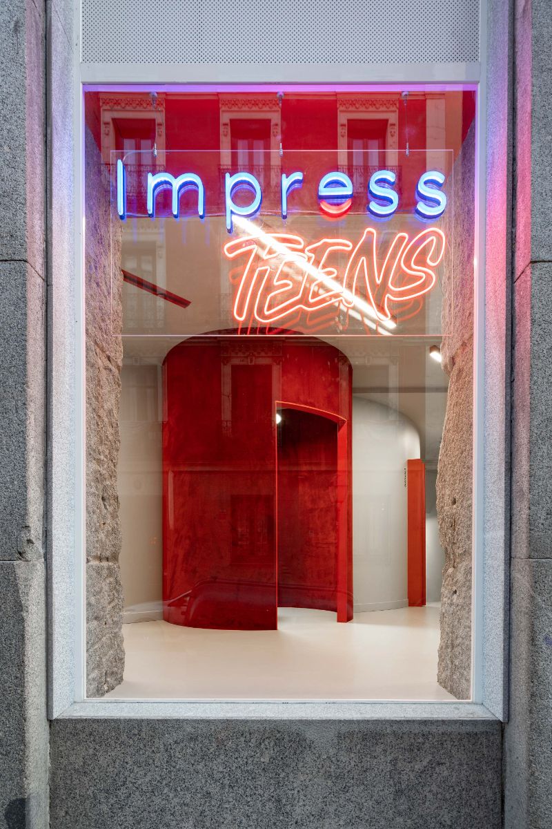
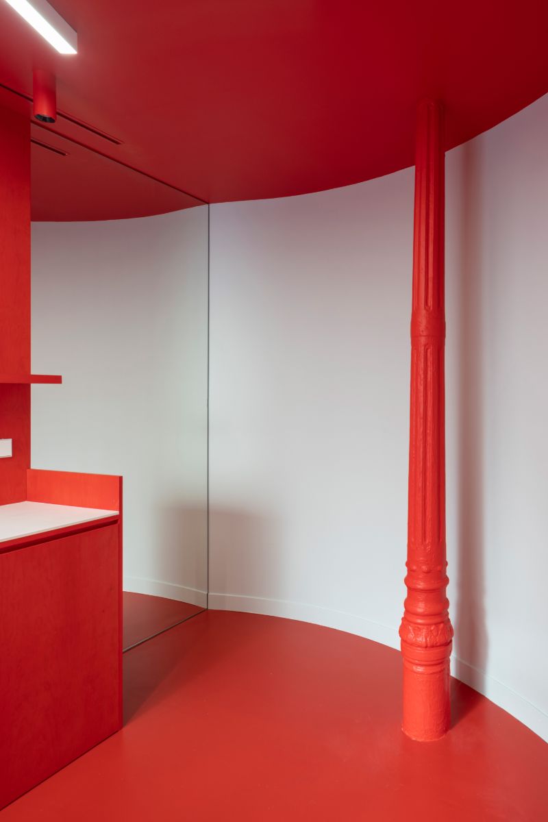
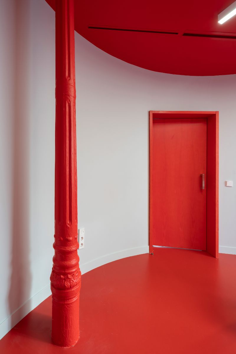
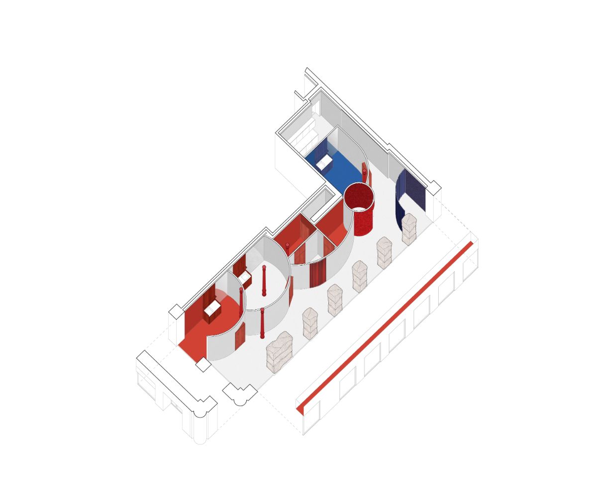
This new clinic for Impress in Madrid is located on a busy corner of Carranza street, where a line of huge granite ashlars delimits the perimeter towards the street, while inside, slender and refined wrought iron columns make the counterpoint to the ashlars. This striking contrast between these two porticoes guided the design process: a series of curves in the form of cylinders crowd the interior party wall and play with the wrought iron columns, leaving them inside or outside them, while leaving an empty space towards the stone ashlars, where the lobby and the waiting area are resolved, always in close contact with the street. In this way, a dialectic game is created between the enormous stone pillars, which are given space to be seen, and the curves and iron pillars, which appear, in contrast, as fragile planes and lines that approach and move away from the ashlars. Even the iron columns themselves have been painted red, giving them a more playful character compared to the stony seriousness of the granite.
The use of curves is a recurring design element in the projects we carry out for Impress, based on its own logo, and functionally, it has been revealed as an optimizer of spaces on small footprints. Thus, all public rooms are resolved by concatenated cylinders, varying their size according to need; in turn, the space in negative, towards the lobby, achieves a very rich and complex spatial quality, with an ever-changing perimeter, flooded with natural light. For the rest, all the private functions of the clinic are solved in the basement.
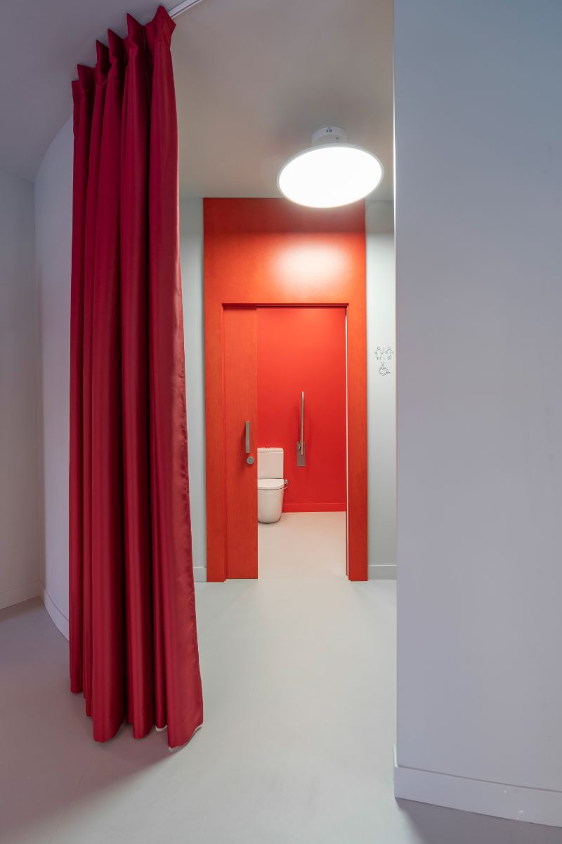
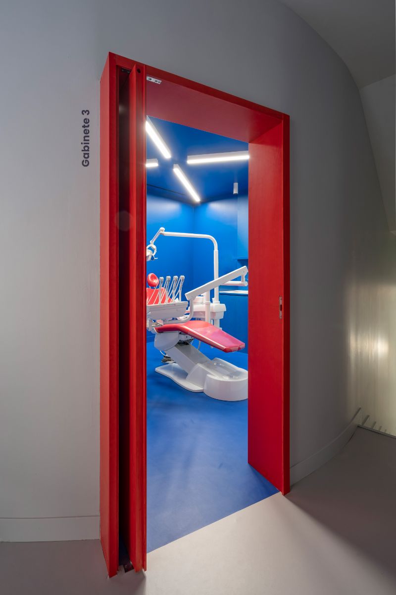
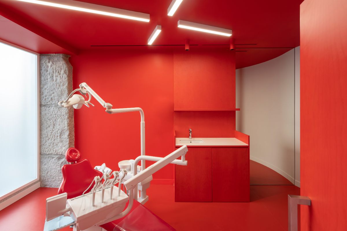
The hall/waiting area, developed longitudinally in close contact with the outside, is stained gray, both on the linoleum floor and on the lacquered walls, where the ashlars, clearly outlined by a red soffit, stand out for their massiveness. The doors, blocks of wood tinted red, announce the passage to other rooms (dental boxes, X-ray and toilets), where the color codes change in each one of them. Thus, the three corporate colors of Impress, red, gray and blue, star in each of the three boxes, applied indistinctly.
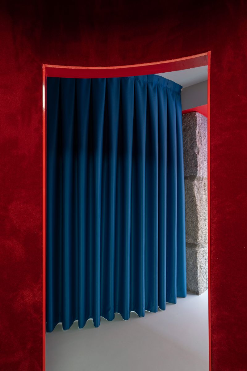
All ceiling elements are rotated 45º, again echoing the corner position; the points of sale are covered with carpet on their vertical surfaces (a resource with an acoustic and comfort objective); curtains close spaces for temporary use; the dye of the wood allows to preserve its texture, turning a traditional material into something fresher; the use of mirrors inside the boxes creates illusions of depth… All these spatial, material and figurative resources are due to the communication of the Impress brand, aimed at a young audience, and allegedly far from the traditional concept of a dental clinic (white colors, aseptic environment), while pursuing a design that encompasses not only visual conditions, but also tactile and sensory ones, where the reference to David Lynch's 'Twin Peaks' universe inevitably reappears.

Designer: Raúl Sánchez
Raúl Sánchez graduated architect from the architecture school in Granada, Spain. Since 2005 resides and works in Barcelona developing a professional activity which escapes specialization in order to cover all types of work and projects related to architecture, interiorism and design.
He is professor in ‘private perimeters’, a postgraduate diploma in interior design in Elisava School of Design, Barcelona.
The work of the office has numerous awards and is published worlwide in printed and online media.
Our approach to architecture and design is based on the encounter of humanism+technique: the former relies on the world of ideas, on the conceptual and cultural focus, while the latter brings the constructive coherence, the grammar, into the equation.
We don’t work with methods, we use no preconceived formulas, we just work with the space, and the space is the conjunction of material, construction, structure, light, color, texture… and thus, each new project is a new challenge


