Best of Commercial Space
Designer / Agency
- Liang Ningjian
Category
- Commercial Space
Award
- 2021 Innovation
Share this project
PROJECT
DESCRIPTION
Fengling'er, is a venue that focuses on Chinese ancient style parent-child photography. With the current Chinese culture from revival to self-confidence to reinvention, we hope that through this project, we can make a new exploration of the future Chinese scene, and at the same time can guide children to build their knowledge and love of traditional culture.
The building was formerly an old state-run shopping mall, an old building group, three buildings built in three different time periods from the 1980s, 1990s, and 2000 onwards are lapped together according to the site situation. The structural forms and combinations of the different eras bring a highly irregular space: the columns are of different sizes, the column network is intricately distributed, the floor heights are also different, and there are certain problems with both plan and vertical traffic. The structure was remodeled by the business that moved in behind, resulting in a situation where some of the structure had to be preserved while at the same time matching the flow of Fengling'er and the space needed for the experience.
PROJECT
DESCRIPTION
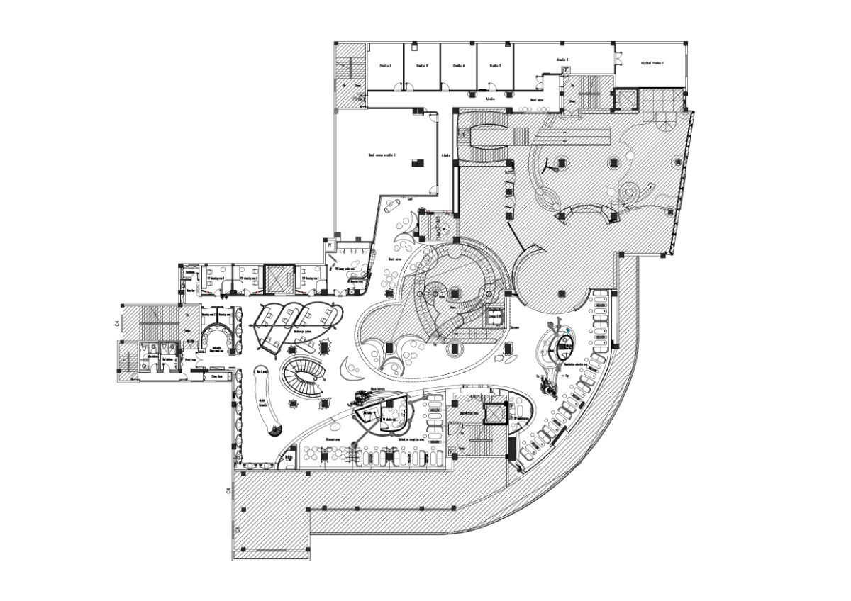
The renovated building has three floors, with a floor area of 12,000 square meters, distributed with a play area, a dining area, and a partially open atrium. Fengling'er is located on the second floor of the old building group. Due to the need to buy tickets and change shoes before entering the indoor space, the experience flow of Fengling'er and the play area should not interfere with each other. The cultural atmosphere of Fengling'er is different from the play area and has a certain degree of coordination, which are the key points to consider in the design.
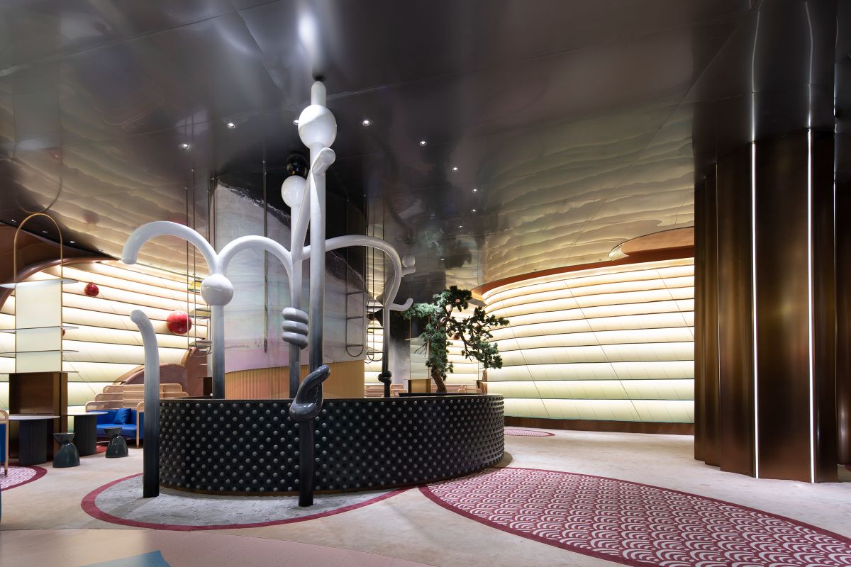
There are two flow lines to reach the store when entering Fengling'er. One is the courtyard elevator, and the other is the courtyard rotating staircase. After reaching the second floor, the Fengling'er service desk is the core to guide the left and right diversion so that the amusement section and Fengling'er customers do not interfere with each other.
The design is based on the irregularity of the existing building form, the wide space and the short depth of the openings, and the different heights of the floors. With the parallel perspective of traditional Chinese landscape painting, the space is unfolded horizontally to form a long axis scroll.
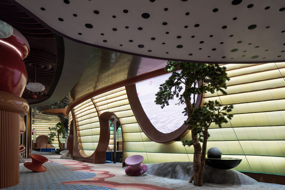
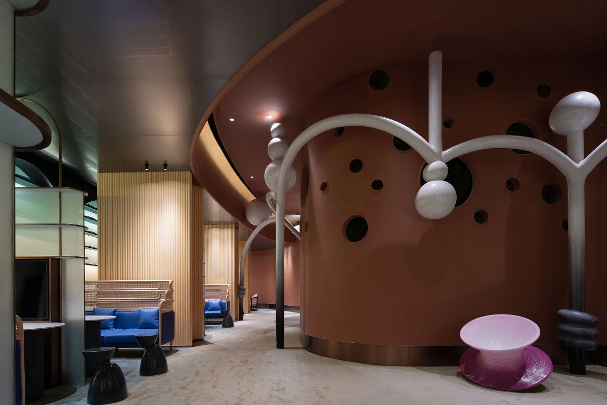
The Fengling'er service desk is used as the starting point for the close-up scene, and the micro-terrain and interior landscape are recreated to form a three-stage composition in the landscape painting - abstracted elements of riverside, river, island, and distant water shape and stretch the spatial level. The classic symbols of landscape painting, such as ink pine trees and waterfront pavilions, are alienated. The scenes are either echoed with the interior landscape by a continuous water pattern or spread by a water carpet to guide people forward into different functional areas.
PROJECT
DESCRIPTION
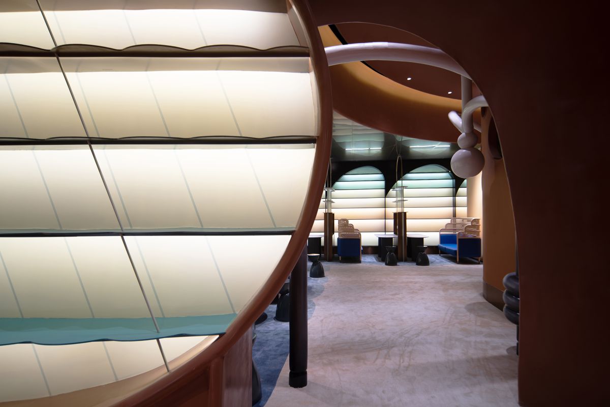
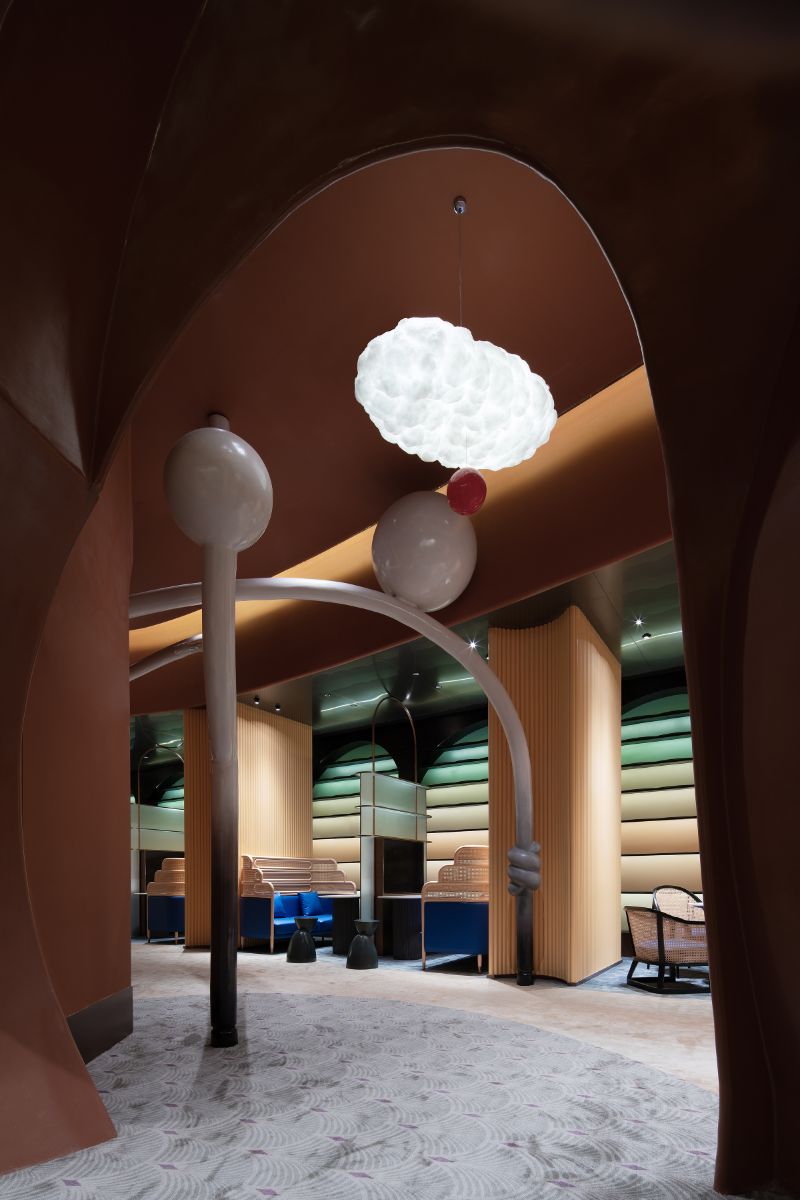
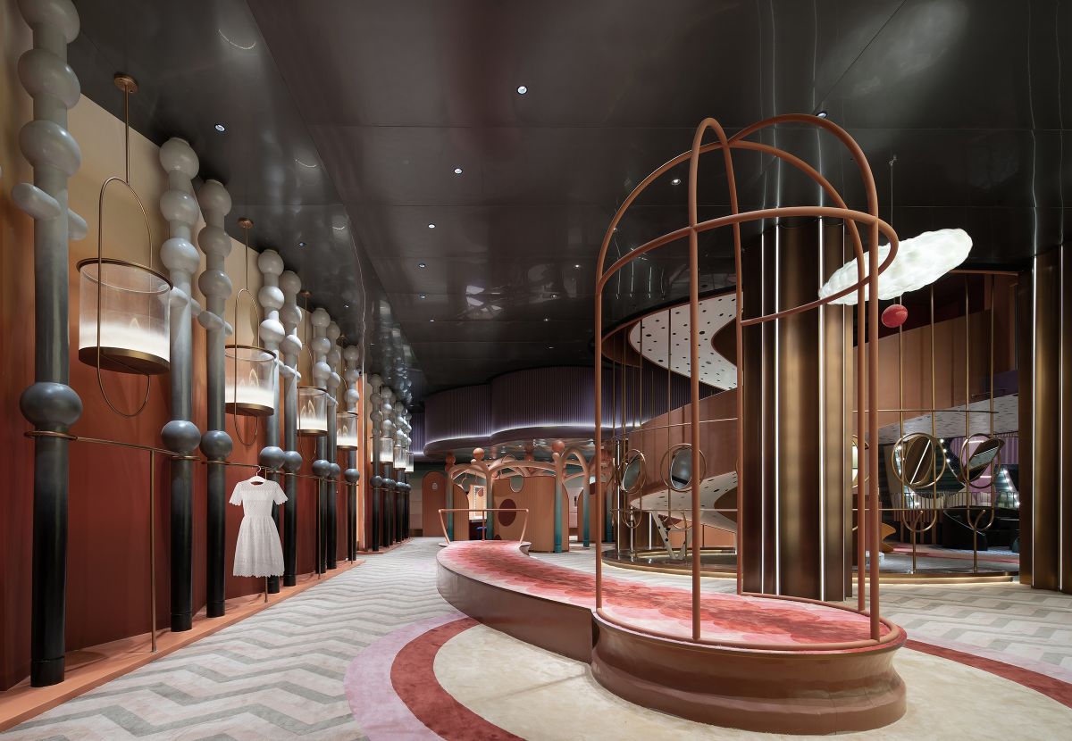
People travel through the realistic jungle structure and can realize narrative scene switching. The space façade is painted with steel plates to create layers of waves, distant peaks, and a remote landscape mood. Through the realistic mountain island doorway and the curved surface shape with a large area of white space, to achieve the space of transparency and ethereal, near and far rich layers.
In Wen Zhengming's landscape paintings, there are a series of classic elements, such as strange rocks, strange pines, and thin bamboo stands, a few study pavilions under the trees, some friends cooking tea and listening to the guqin, which convey an elegant interest in life, and a kind of unrestrained thoughts about life.
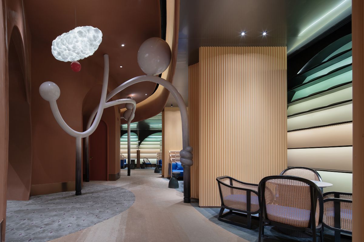
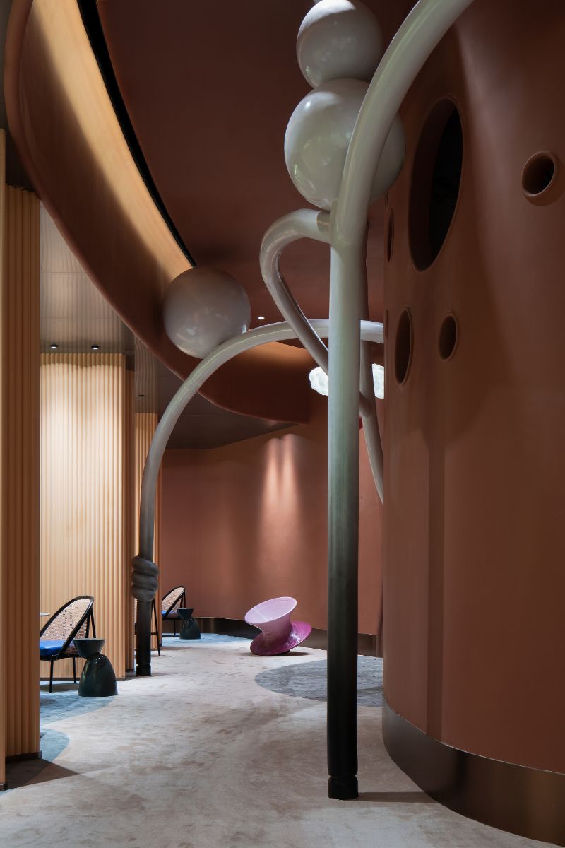
The design is an abstract childlike perspective that interprets the reproduction of the ancient living mood. We interspersed interesting curved tree shapes freely in different spaces with asymmetrical linear strokes, and the shapes are simple and refined, pure and clean. We hope to evoke children's different understanding and imagination of Chinese style through these lively and playful techniques.
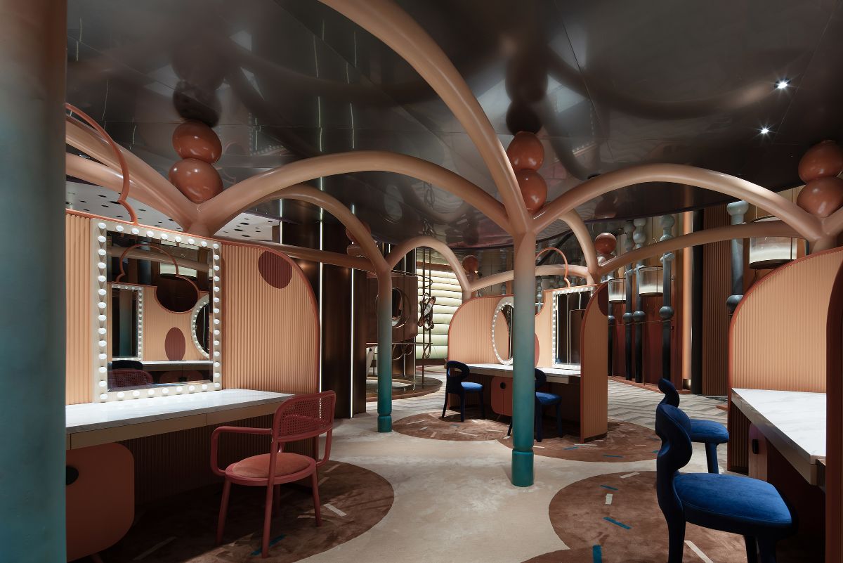
In order to break through the space limitation of floor height, the design blends the border of reality and illusion through the reflection of dark matte stainless steel panels. The curved beams of the ceiling articulation, the large circular white area, the spherical installation with a sense of levitation, and the vertical extension of the landscape based on reflection create a dynamic and distinctive future scene. Whenever the children look around the space, they will feel like standing on a high place to see a thousand miles of rivers and mountains.
The space is divided by function. Combined with the rhythm of the landscape layout, different courtyard-style partitions are naturally formed, allowing children to produce the feeling of "swimming" in the space.
PROJECT
DESCRIPTION
The child's eyes are a camera, curious, moving, and enthusiastic. After stepping into the space, gradually play, each place has a different view, the level of progression, in order to feel the humanistic mood of the indoor landscape.
The child thus dynamically explores and discovers one part after another - climbing on the slightly arched slope, jumping up and touching the branches of the pine trees, running and chasing between the colonnades, hiding behind the rocks. This kind of enlightening scenography gives the space a natural flow of innocence.
The non-linear and heterogeneous expressions, which portray the majestic realm and magnificent rhythm of the landscape, are the natural empowerment of children's vivacity and exploration of nature. The pine rocks and surging waves, which are highly generalized to the natural landscape forms, inspire children to think freely beyond the material forms, and they are thus more willing to create and express their inner world. In this way, the combination of humanity and nature and the balance of commerce and art are achieved.
The ancient Chinese saw the world as having three realms: seeing mountains as mountains, seeing mountains as not mountains, and then seeing mountains as still mountains.
The shape of the space is objective and real. Chinese landscape painting is flat and far, high and deep, while it is inspired and full of motion.
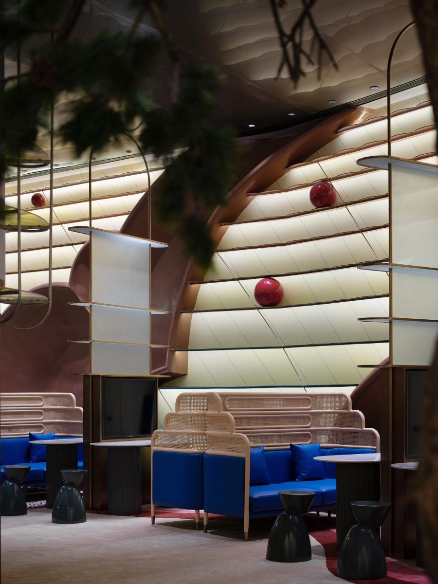
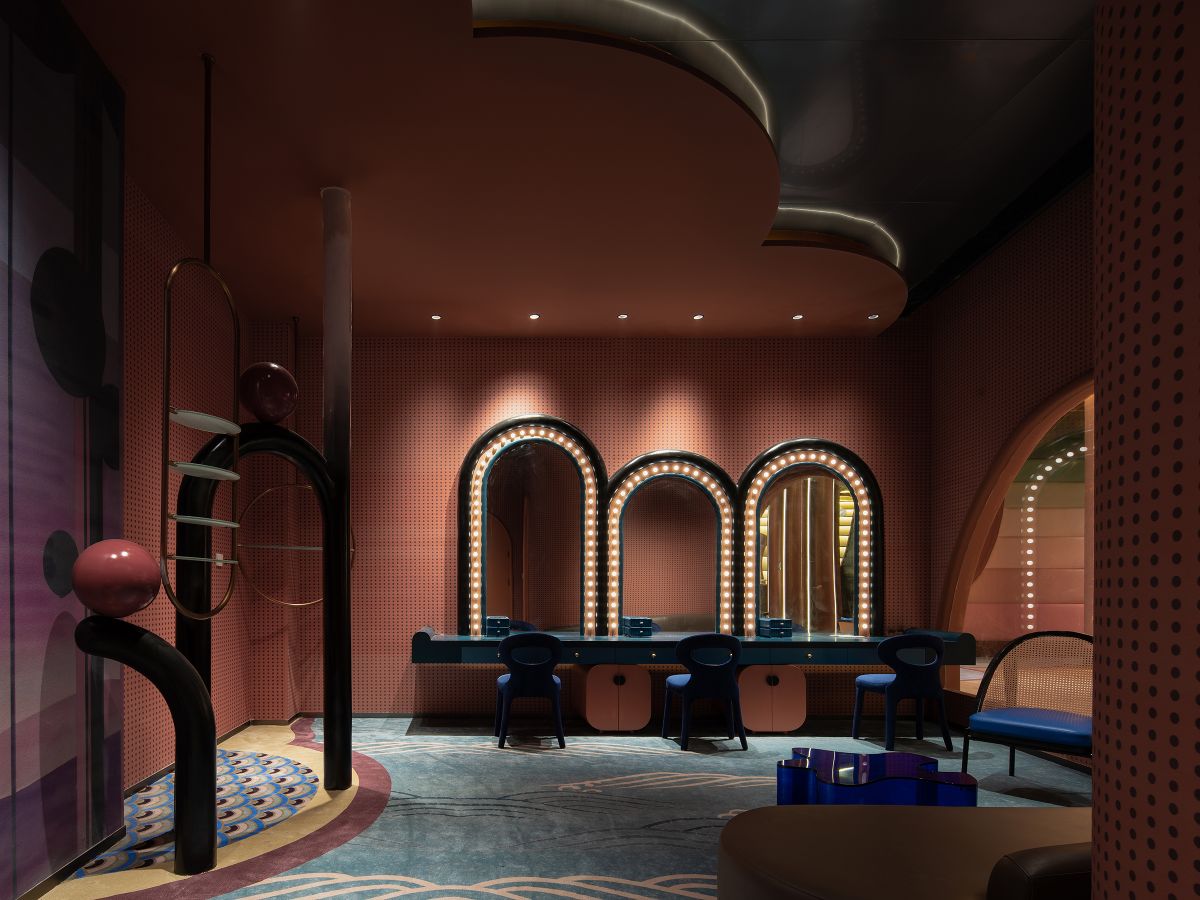
In terms of space color, the design adopts the classic Chinese "Golden Landscape Painting" to establish children's color perception so that children can enrich their beautiful vision in playfulness and gradually form their own logic and organization.
The natural gradient colors such as mud gold, stone green, and stone green are used to recreate, restore and convey the colors of the Golden landscape in the space passages, the fiberglass corridors in the dressing area, and the display façade. The deep garment area corridor columns and ceiling stainless steel treatment, through the gradient of black and white gray and the reflection of the vast landscape, presenting a landscape painting like the appropriate intensity, mellow and gentle far-reaching rhythm.
In the worldview of children, the development of understanding follows the heart, and the design takes the expansiveness and nature of Chinese landscape painting to gradually deepen the children's love for traditional Chinese culture between the real and the mood.
Fengling'er is a revolutionary reinvention of the new offline scene with the rise of the Chinese national trend at the moment.
The design takes the depiction of a thousand miles of rivers and mountains as the background to break through the shackles of the limited interior and recreate the interior landscape in Chinese style, giving children the freedom to explore and discover the various possibilities of creativity.
The traditional shape of the landscape is not bound to the carved shape, but the non-linear extension of the space conveys the momentum and strength of the real mountains and water. The spatial scene is then geometrically enlarged, thus unveiling an alienated, three-dimensional future landscape volume of Chinese style.

Designer: Liang Ningjian
Liang Ningjian
Founder; Design Director of shuimuyan Design Institute
Deputy director of Environmental Art Committee of Hunan design Artists Association
Master's practical tutor, School of fine arts, Hunan Normal University
Vice president of Hunan Architectural Interior Design Society
Director of CIID (Changsha)
2021 American Muse Design Grand Prix platinum gold award (highest award)
2021 American Muse Design Grand Prix gold award
The highest honor award of "best of best" in 2017 Singapore Sida Design Award
Two silver awards of 2017 Singapore Sida Design Award
2017 40 under 40 China design Outstanding Youth Award
2017 20th CIID China interior design cultural space Gold Award
2017 red cotton China interior design supreme Award
The 20th CIID China interior design and catering Gold Award in 2016


