Best of Dining Space
Designer / Agency
- Wuhan Jingyun Construction Company
Category
- Dining Space
Award
- 2023 Innovation
Share this project
PROJECT
DESCRIPTION
This project has one and two floors,There are 100 seats on the first floor;The second floor seats 144 people,The total number is 244.Project positioning middle and high-end business banquet.The project requires an atmospheric taste in harmony with the building,And has a certain temperature of elegance and style,Meet regional demand.
How to give full play to the advantages of geographical location,Build on your strengths and avoid your weaknesses,Create a landmark business banquet?
How to meet the business banquet target customer group,Meet their needs for catering, socializing and entertainment,Create "fine and beautiful" with temperature, service catering brand?
How to introduce cultural content and build a diversified catering brand?
Excavate the Oriental connotation under modern life, construct the space and the place Poetic connection,Refresh the Chinese dining experience with the Chinese humble and tenacious philosophy of self-cultivation.Export Chinese culture creatively, express the essence of traditional culture with fashion elements, and achieve cultural symbiosis.
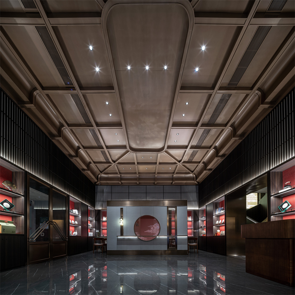
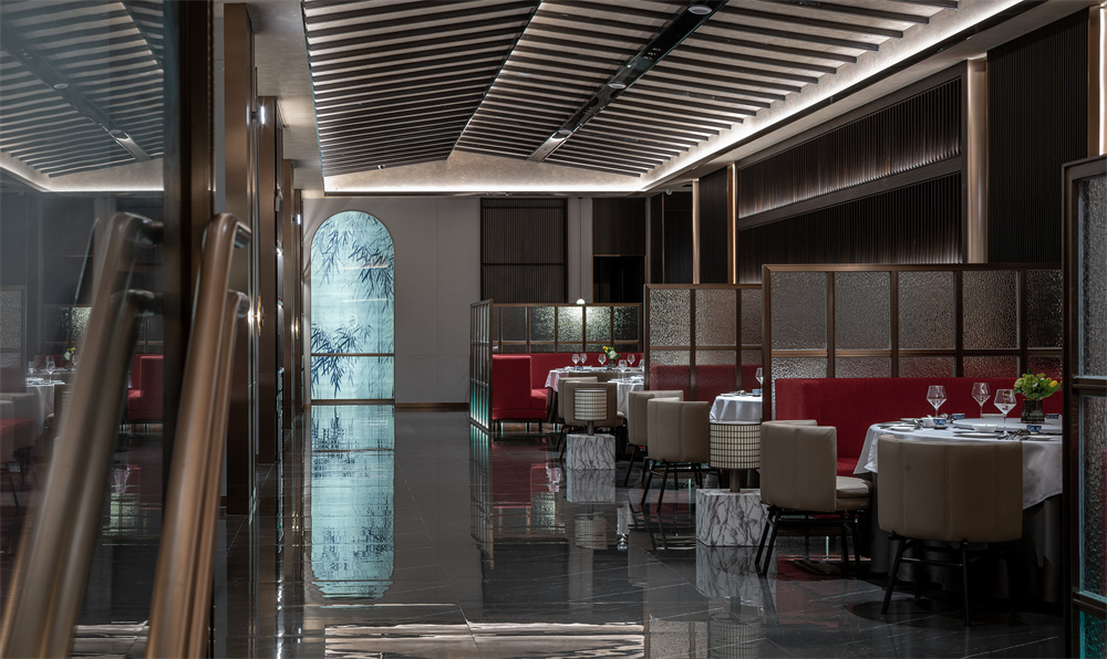
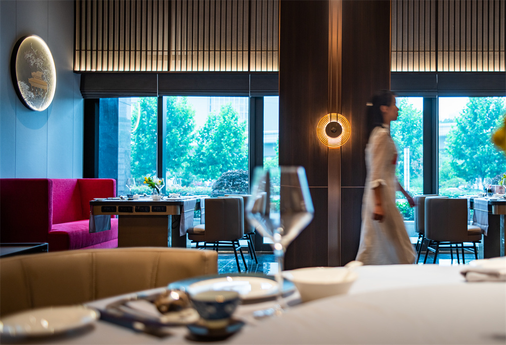
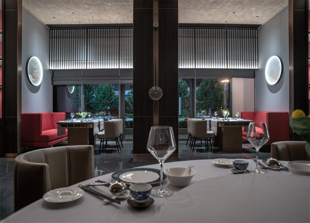
Red symbolizes the continuous bloom of vitality, giving the main mood and tone of the space.
The arch shape structure connects the square and regular indoor space into connected areas, which is not only in line with the preference of Chinese people for the circulation of qi and rhyme, but also improves the space energy efficiency in practical applications.
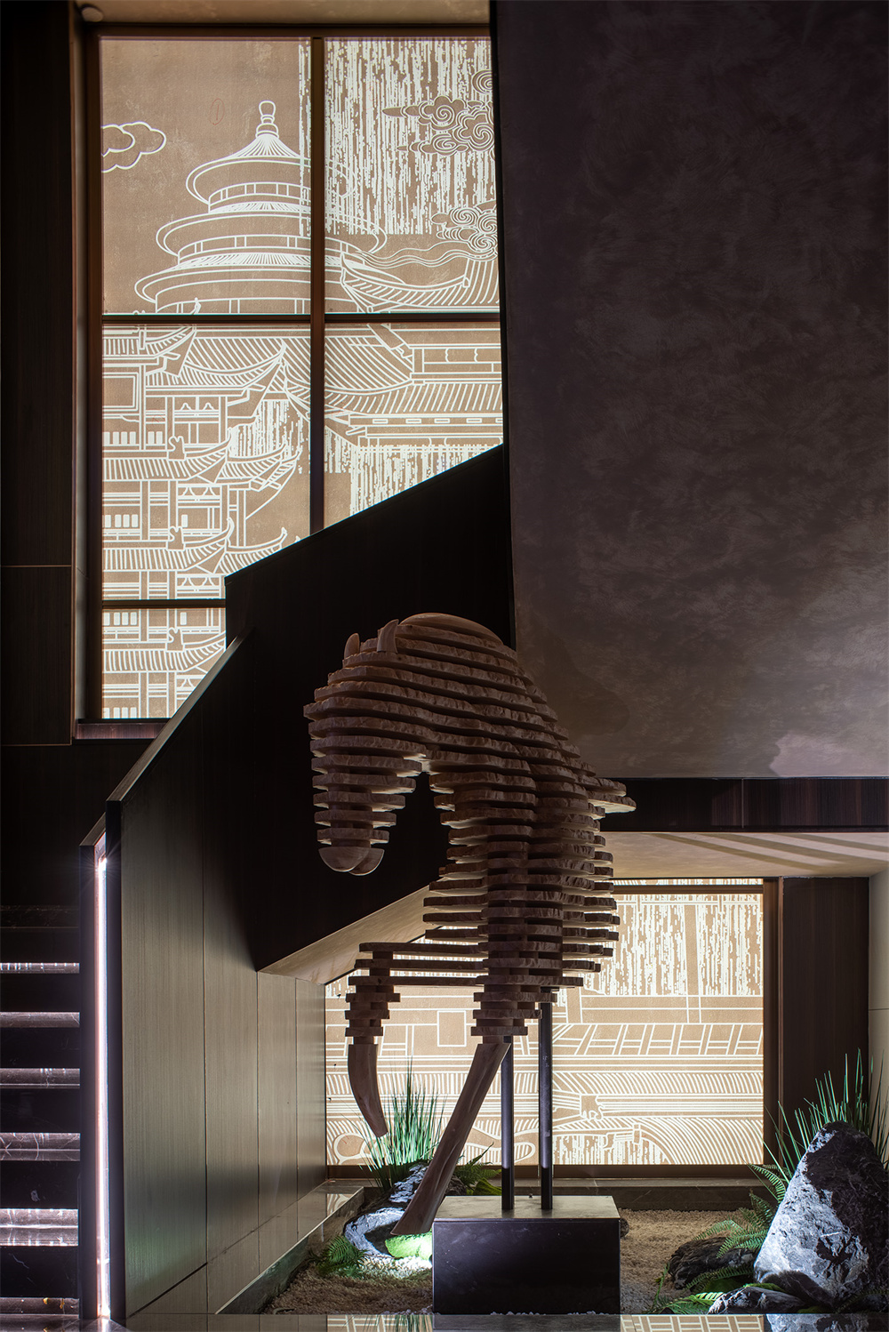
The introduction of the inner courtyard landscape, garden tea, space, there are mountains, stones, water, trees to achieve the function of borrowing scenery and creating scenery.
Finally, all techniques point to the contemporary Orient, with a deep cultural awareness understanding, in the form of relative art to construct internationalization and contemporary space, contemporary aesthetics, the trend of The Times collision.
This is the location of the original oil main riser, the original pipe diameter is 150mm, the water riser of this layer only needs to be connected to the ground and then to the oil separator.
Exterior facade: "Don" theme.
Combining traditional Chinese arch elements with modern materials, the series design technique is used to show the impression of red Ding.
The whole foyer is expanded to increase the use area of the vestibule, and the momentum is stronger。The arch on the form is combined with the array technique to create a soft aesthetic feeling in the matrix。Material selection of stainless steel, enhance the sense of quality and durability。Luminous characters in the form of positive light, the night is more pronounced.
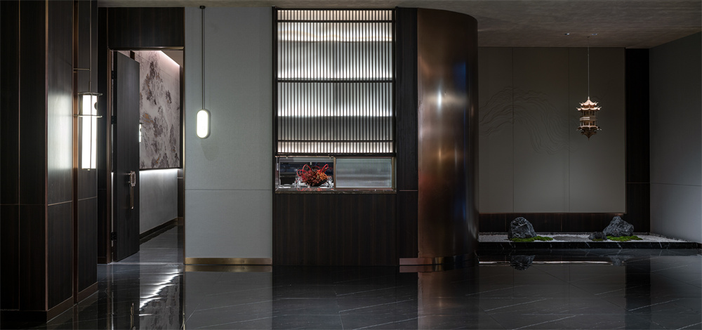
First floor hall, scattered area: "Entering the scene" as the theme.
Using sequence, borrowed scene, mortise and tenon structure and other design techniques to create a borderless poetic space in a limited space.
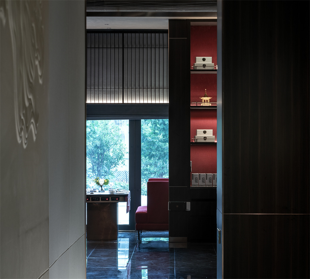
This case has no hall in the traditional sense, introducing tea room culture.In the tea room and the hall to open and close the conversion room, make the space interesting.The first floor of the hall is high in height, with "tea" as the main space to create, through the screen to ensure the privacy of the tea space, the screen opens a hole to extend the visual space.The top surface adopts mortise and tenon structure to increase the sense of matrix and ceremony.
As far as the whole space can see, there is no stiff shelter, and the semi-enclosed space gives customers the inner free feeling.The left side of the scattered area creates a private dining environment through the clever treatment of the column, and the right side is placed a screen device to form an enclosed space, taking into account the privacy while not affecting the openness of the space.Through the rust grid instead of the wall, to build a clean pattern, so that the space is beautiful but not serious, positive but not serious.The top surface is treated in the form of a sloping roof, paying tribute to the architectural form of the Song Dynasty, and the use of chandeliers in the tuyere area to meet the needs of table lighting.
Taking into account the safety of the building, the width of the stairs is limited to the beams and columns, and the beams are avoided.The first step of the staircase is raised as a whole, and the side of the staircase is covered with wooden handrails.The wall painting with cloth wrapped density board runs through the second floor space. Then through the placement of art decoration, lighting atmosphere to create Zen space.
The teahouse is embedded into the tea cabinet with the existing structure of the space. The front is
divided by the cloth wrapped density board, and the light is used to illuminate the wall to create a
harmonious and quiet tea space.
Second floor hall, second floor aisle: "wear the court" theme.
Through the placement of the structural form, the effect of light transmission, light borrowing and light induction can be achieved, making the space more flexible.
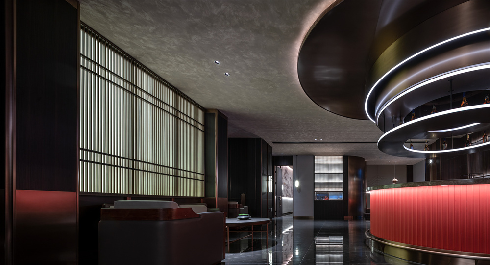
The entrance of the staircase uses an arch array element to create a sense of Chinese protocol and ceremony, while the wine display area uses a transparent treatment to increase the display surface.The bar counter of the middle island is the focal point of the hall, which strengthens the memory point through the integrated design of wall and cabinet.The wall of the waiting area uses the change of material to highlight the volume sense of the bar in the middle island, and the processing of the light transmission film once again strengthens the visual center.Chinese artistic conception and the introduction of bar, leather furniture and other western mood, Chinese noble elegant and Western rigorous leisurely collision fusion, revealing the city's inclusive and open spirit of bearing.
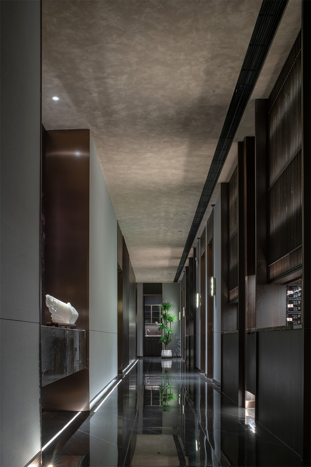
Aisles are partially made of long rainbow glass to enhance light transmission, wind Wells and fire stairs are all made of wood finish, and local silk glass is embellished to increase the amount of light and enhance the interest. The wall at the end of the aisle forms a relationship with the tuyere on the top surface, weakening the sense of tuyere volume.
The wall of the ten-person package uses columns and screen elements to increase the sense of spatial sequence, and the end of the package uses the plum blossom as the visual focus to create a spatial artistic conception of "a skew outside the bamboo".
Eight people private room wall cloth wrapped density board bisector seam treatment, in the middle of the hard bag painting to enhance the interest, the column embedded mirror to make the space more flexible.
The wall of the 12-person private room is divided by the cloth wrapped density board. The vertical wall lamp and the vertical and horizontal divided density board painting jointly create the plane structure aesthetics.
The wall of the tea cabinet weakens the spatial column by means of symmetry, and then weakens the sense of volume of the column by longitudinal division. The tea cabinet is placed with artistic ornaments to enhance the atmosphere of the space.
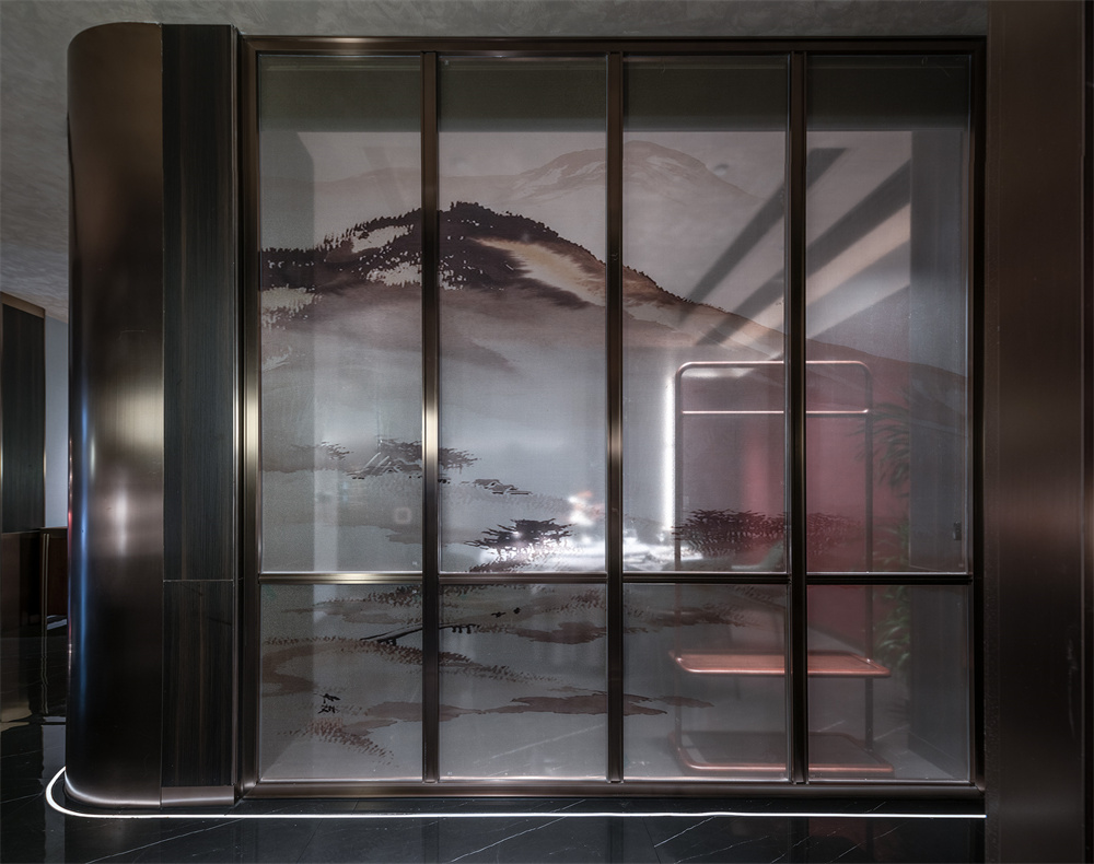
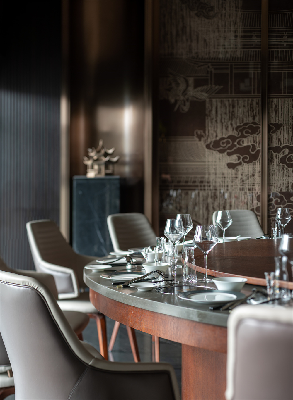
The wall of the 14-person private room adopts a symmetrical method to weaken the column body, and the top surface adopts a wood grid, blue cloth wrapped density board wall painting and Chinese landscape pattern wired glass partition to make the space more ceremonial.
The wall of 10 people is divided with wall cloth, and the wall is decorated with red fan art pendant. Tea room and private room partition to enhance the sense of hierarchy.
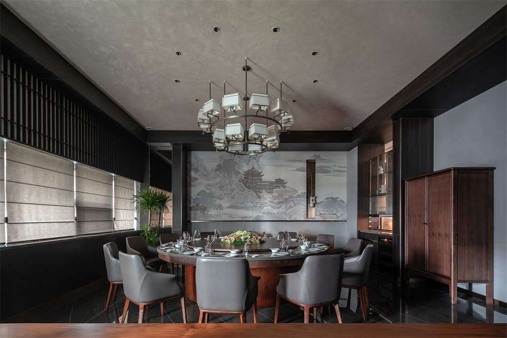
The background wall of the 16-person private room uses large cloth wrapped density board wall painting to echo the theme, and the chandelier with a sense of volume enhances the sense of hierarchy of the space.

Agency:Wuhan Jingyun Construction Company


