Best of Residential Space
Designer / Agency
- c-x design
Category
- Residential Space
Award
- 2021 Innovation
Share this project
PROJECT
DESCRIPTION
In addition to cold and cold, winter also has a simple, plain and simple beauty. When the snow is fast, the sky is clear or the frost is thick, and the fog can make the origin of the world clear. Without a lot of disturbance, the five senses and six senses will be closer to the original origin and cultivate a more sharp, rich and delicate perception.
Therefore, if the "home" looks like this, I will probably die in the end. What's more, the apartment to be presented in front of you is full of "plain on the surface" and "grand in the heart". Like Kawabata Yasunari's snow country, like yuanyan's boiled leaves.
The owner and Jin lifestyle are people who have very high requirements for the living environment and project quality, so high that there are specific facts and arguments to support this argument ~
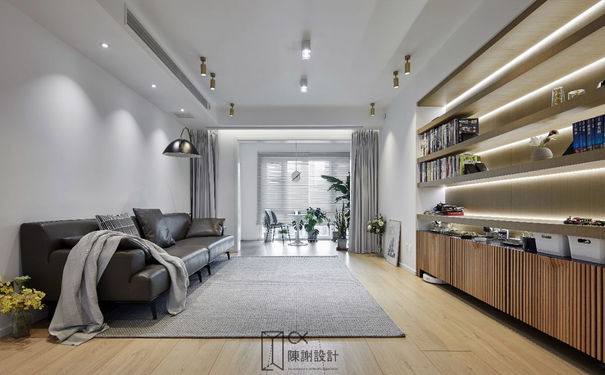
As you know, the typical Japanese style, of course, requires a lot of [white]. The benefits of this color are too many. The first is to improve the "Brightness" of the room, which is particularly important for the building density of the reinforced concrete jungle.
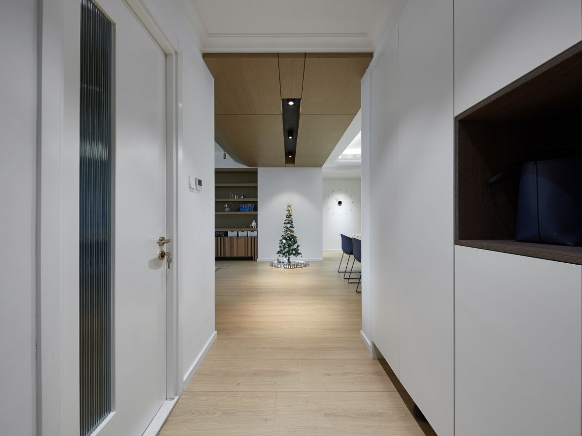
The second is to reduce the existence of goods and make the space appear larger. Think about the occupancy rate of high-rise apartments. You will thank me for helping you earn back a few square meters.
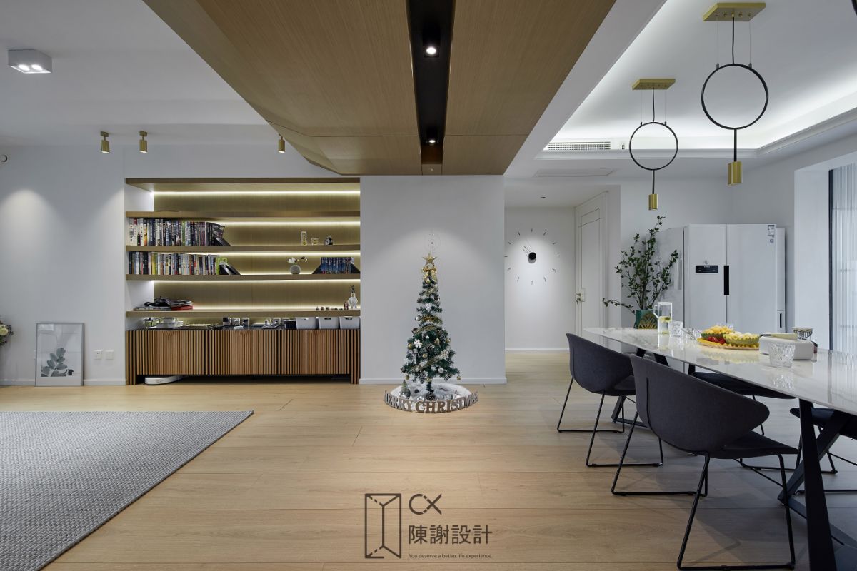
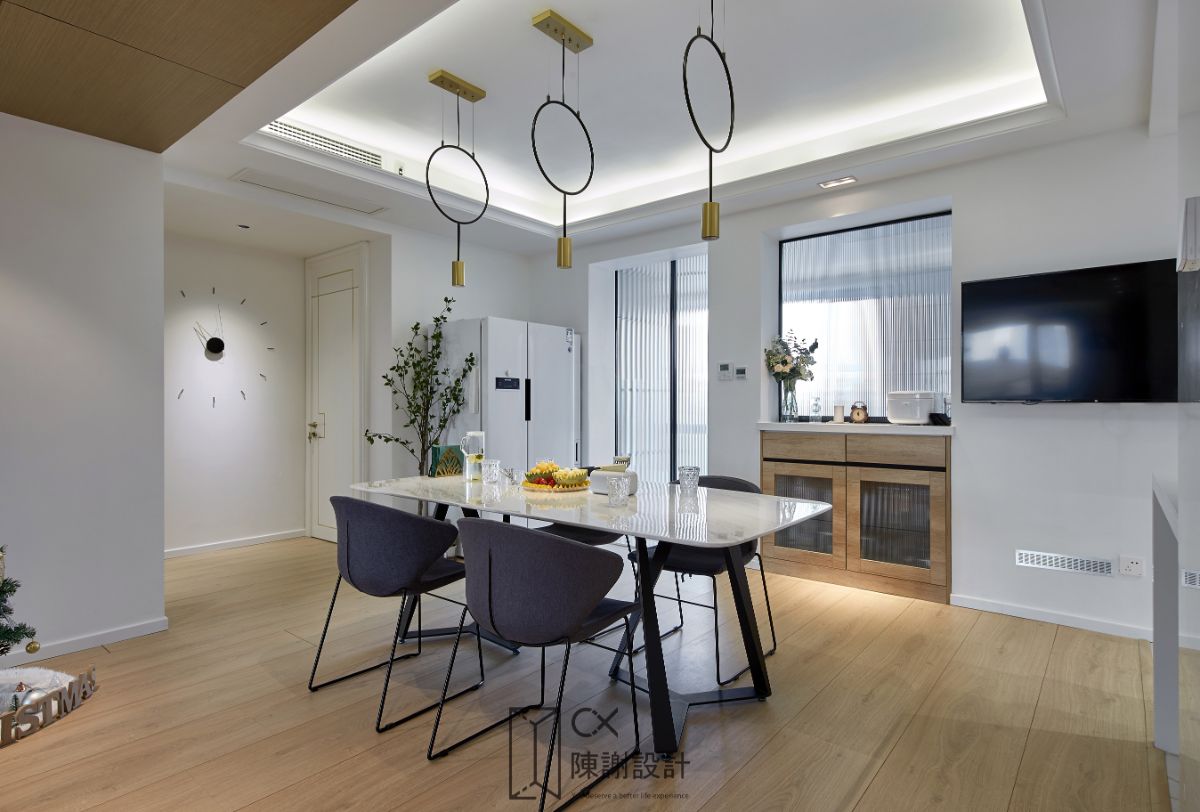
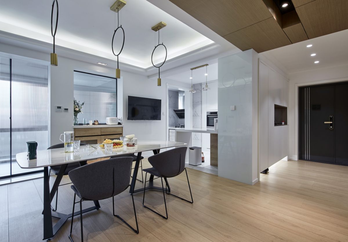
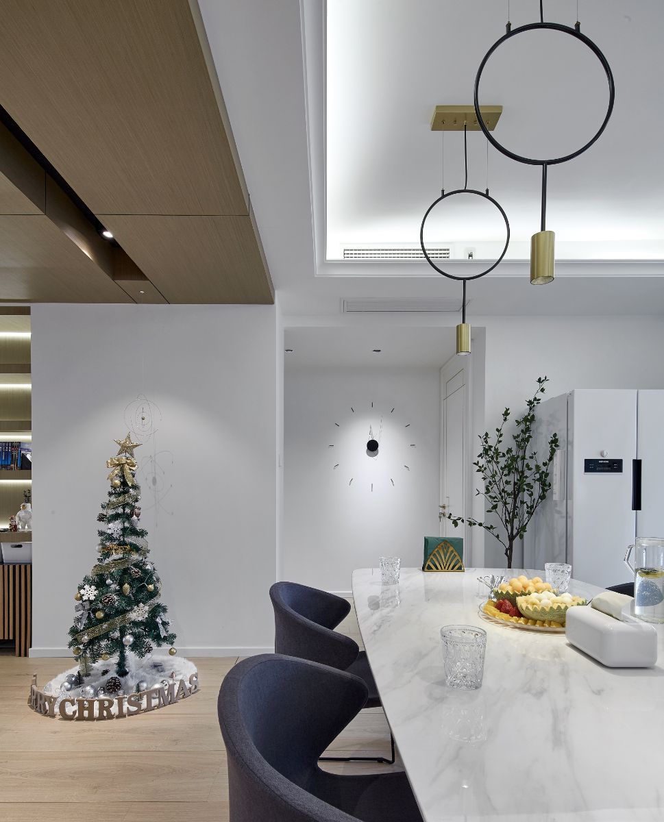
So, look at this square living room, which has the charm of the decompression drama "nothing in my home"? White is upgraded to a large number of white space, which is bright and open, clean and unobstructed!
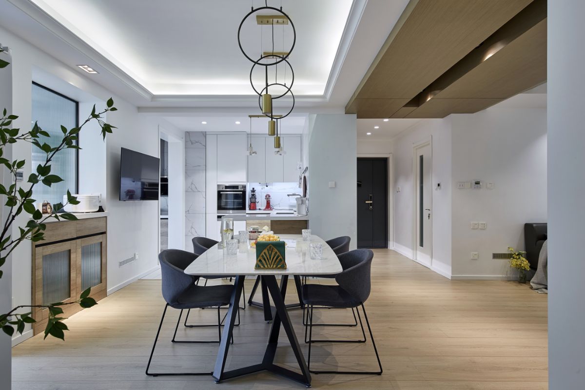
The open design cleverly straightens out the shortcomings of the kitchen. Large size ceramic tiles with white and smooth stone texture are paved, Let the [white] magic continue to extend. A group of bars with the function of operation desk are used to slightly divide the kitchen and dining area, which not only expands the area in terms of senses and reality, but also gives people a refreshing experience. They are naturally calm and care about food and vegetables. My kitchen faces the sun even if it does not face the sea.
The glass door and glass window on one side of the dining table are a little unexpected "wonderful". At first, there was a pass leading to the north balcony. The original plan was to knock down the middle column to increase daylighting. The original blueprint tells me that it is not a load-bearing column. But as soon as the hammer goes down, the steel bar stands out! This is embarrassing... But the remedial plan B, which came up with an idea, has achieved such good results that it wants to add chicken legs to itself!

Agency: c-x design
You deserve a better life experience.

