Best of Exhibition Space
Designer / Agency
- Phoenix Shi
Category
- Exhibition Space
Award
- 2021 SILVER
Share this project
PROJECT
DESCRIPTION
As the first home furnishing display store in Ningbo, BANMEI is located in the Youbang Home Furnishing Mall on Metro Road, Ningbo. In order to homogenize the aesthetics of popular culture and harvest many young customers, this project hopes to give business enlightenment: use spatial color and texture to awaken silent young people, dare to chase dreams, and value their inner world. With the completion of the store space, the entry point of our design has changed from shaping the urban petty bourgeoisie trend culture space to how to perfectly fit the brand characteristics and space aesthetics, and how to construct a composite space for shopping and social display. Taking into account the aesthetic orientation and lifestyle of the consumers in the project location, the space is set up with "boxes" to echo the contradictions and the ever-changing modern aesthetics. With [Box] as the design language, the space technique is simply returned to form the senses.
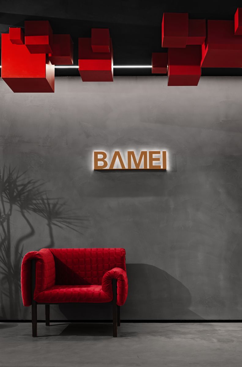
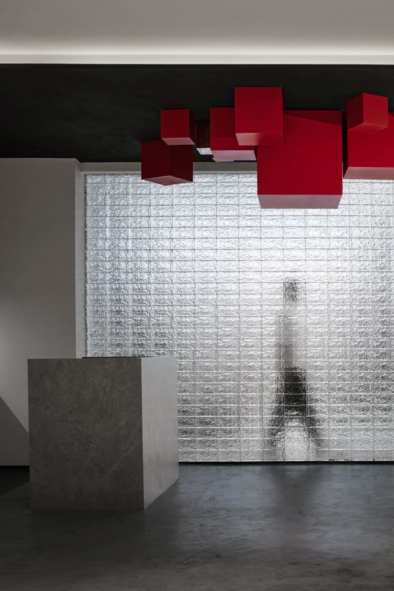
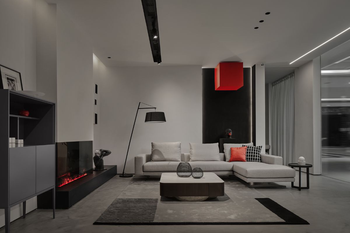
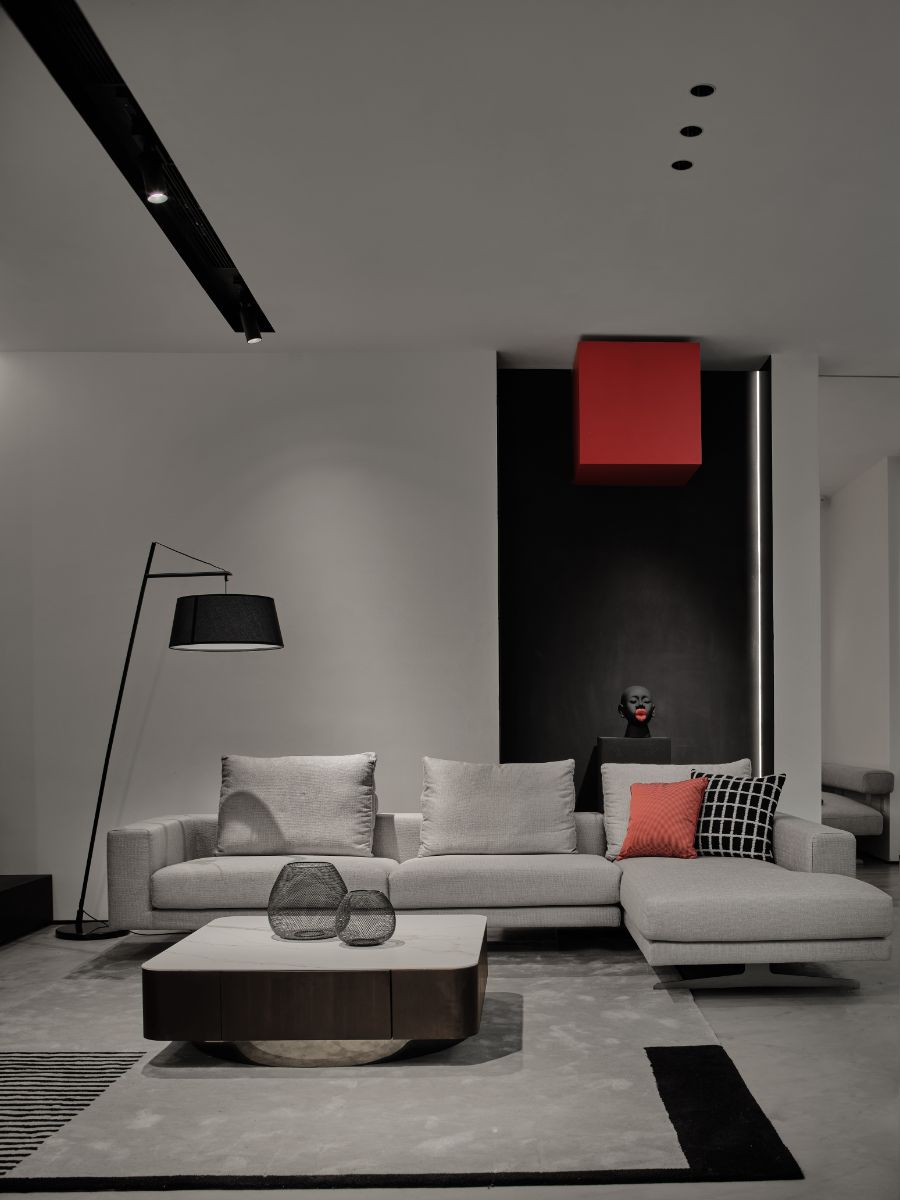
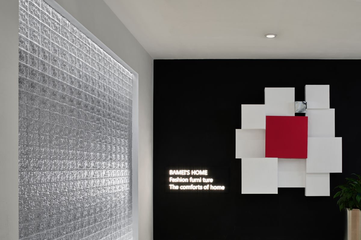
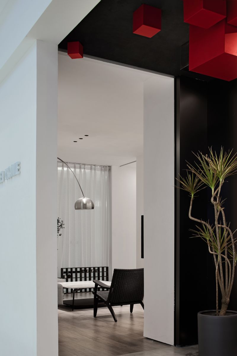
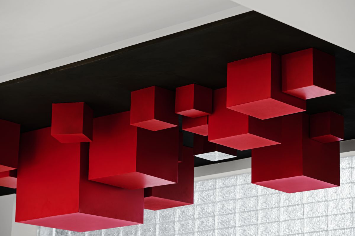
In the geometric space of the entrance, the red box on the ceiling creates a unique and tense mood in the space. The colors are filled with the contrast tone of red and black. Red is passion and explosion, and black is calm and restrained. Sensual blood grows in a rational enclosure, and the two colors are also balanced in the confrontation. Become the existence of vision and art. In this design concept, the device box is symbolized and enlarged to form a strong spatial memory point. By describing the potential relationship between the different sizes and different colors of the objective existence and the spiritual level, it tries to show the imagination of the whole and the individual, the macro and the small taste.
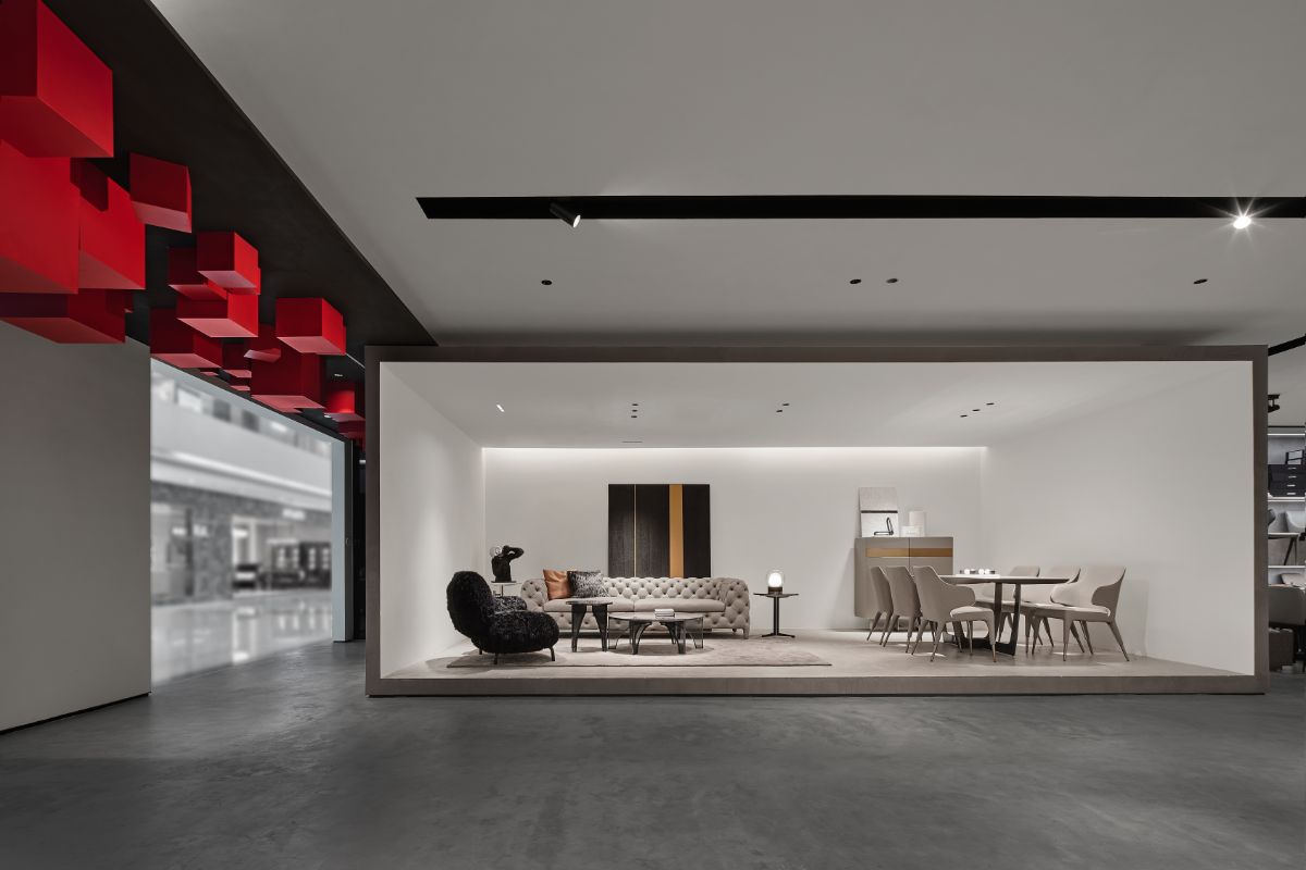
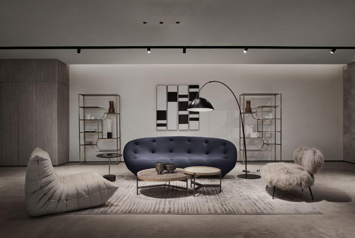
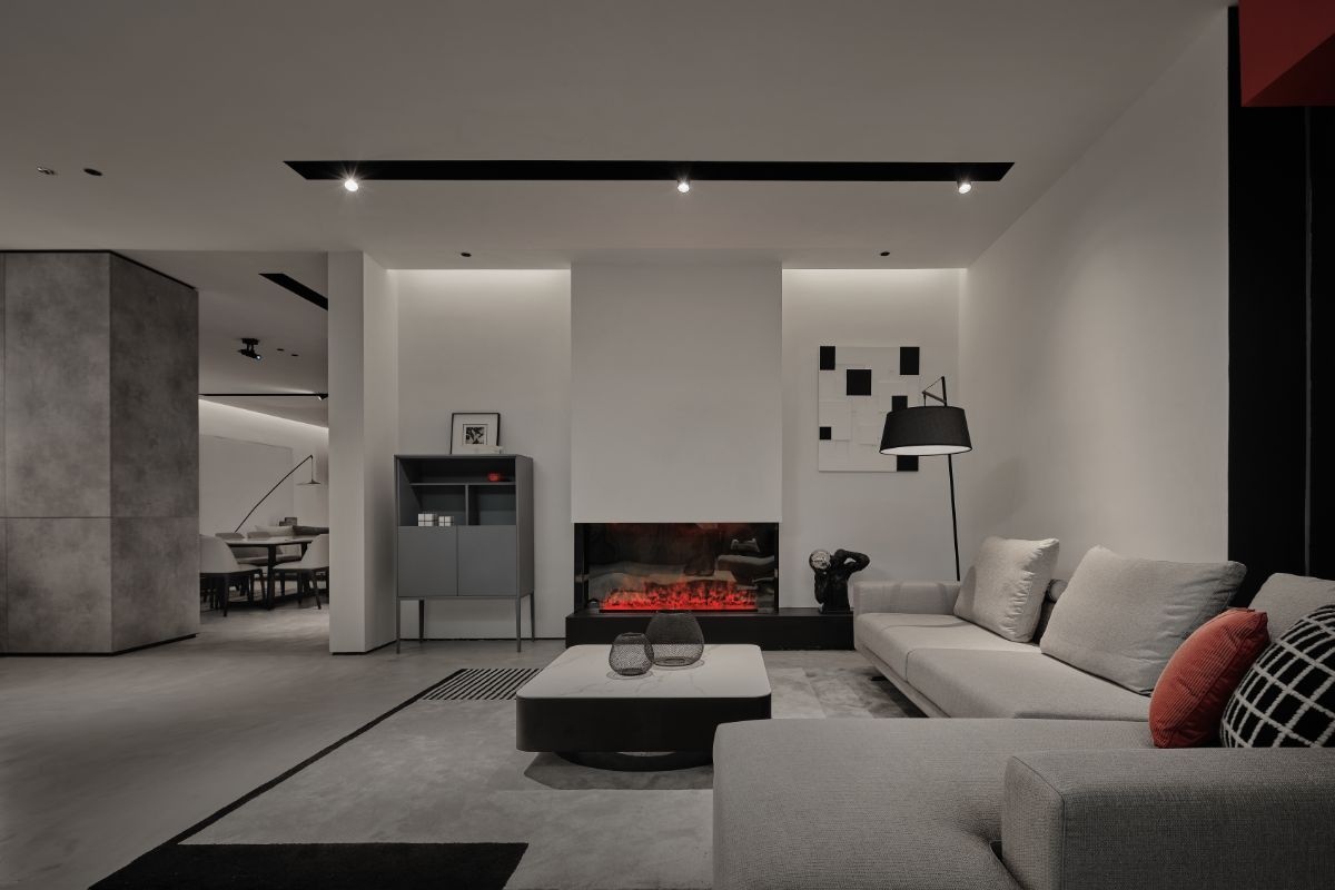
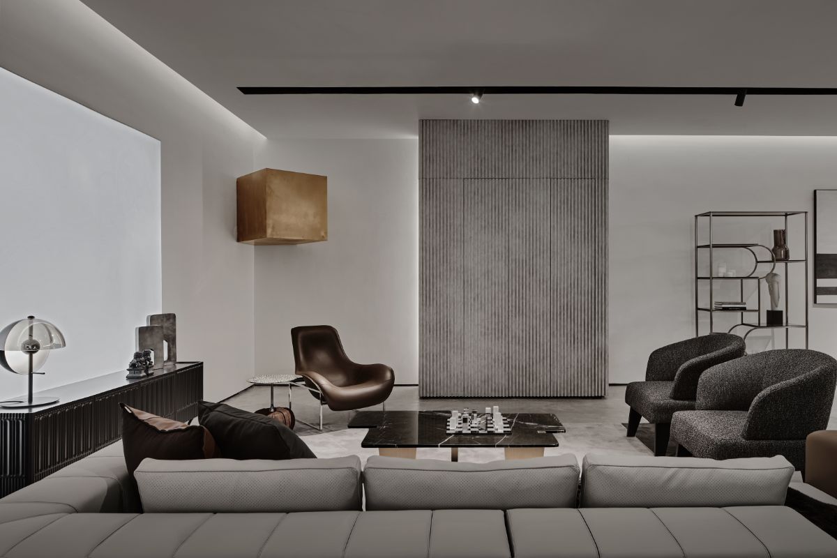
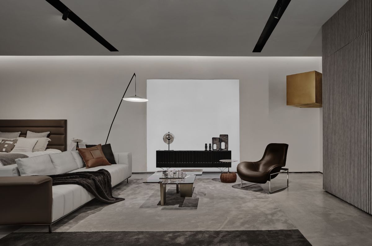
The installation box is made of red steel plate as the main material. Through the change of space and color, golden glossy box, mirror stainless steel box, and white paint box are used in other spaces, which run through the entire space to express different emotions. It can also be understood as a kind of Conflict and confrontation. The indoor wall ceilings use the most traditional paint and building materials system. The artistic texture paint constitutes a complete space surface. The floor material is cured cement, the color is uniform, black and white, and it looks thick and heavy, and is used for the homogenization of the space. For the furniture display space, it is enough to cope with the needs of adjusting and changing furniture color at any time, so as to adapt to the changes of various colors, textures and styles. It can be understood as an echo to the overall environment.
Spatial Form 1-Collection
Design is more about "how to provide customers with a sense of design and fashion attributes under the premise of cost-saving, and at the same time integrate a space with a sense of functional experience." The overall space integrates the different interfaces of the box, and gives the space a completely new visual sensory experience with simple geometric transformation techniques.
Spatial form 2-decomposition
The designer hopes that it can be extended as a metaphor, alluding to the variability of fashion trends and the effect of internet celebrity, rather than just a single point of view. The avant-garde box shape is the carrier, and creative thinking is carried out from the color. On the one hand, the red box installation with bright tones, like a red hard core wrapped around the outside, is firm and passionate, to interpret the passion for the trend. On the other hand, it focuses on the core significance of vitality as a carrier for its creation, and extends the exploration of the way commercial space is perceived by people-more spiritual core and avant-garde concepts.
Spatial Form 3-Disorder
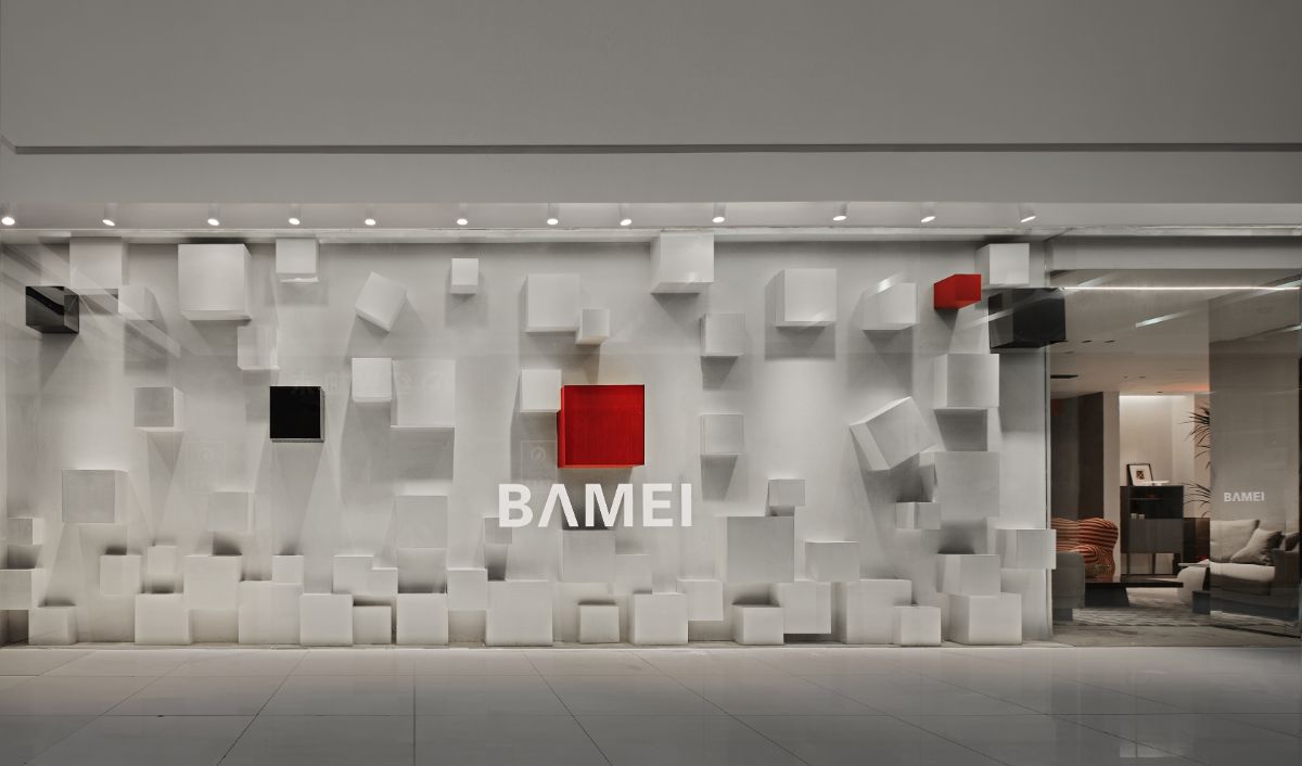
The randomly established form is organized by precise logic and a complete sequence appears. Parallel juxtaposition and vertical staggering, different levels connect inside and outside. As a connecting body between spaces, it acts as an intermediary of spatial elements in the disorderly shape. The formation of space creation penetration corresponds to the randomness and order in the exhibition hall. Between disorder and order is a game of creative instinct and technique.
Space Form 4-Freedom
From the consumer's point of view, the most interesting point of the space is that the geometric box is not only a complete display of the space as a whole, but also divided into several independent parts. The project makes the whole space more dynamic and creative through the change of furniture. More dynamic and changing ways of moving lines. The space function also has strong variability. The design is considered from the functional level. The LED light film is embedded in the wall and combined with the slide operation. In a sufficiently wide activity area, it can satisfy sharing events and trend parties, making the space not limited to shopping and display space, but also a diverse social space.
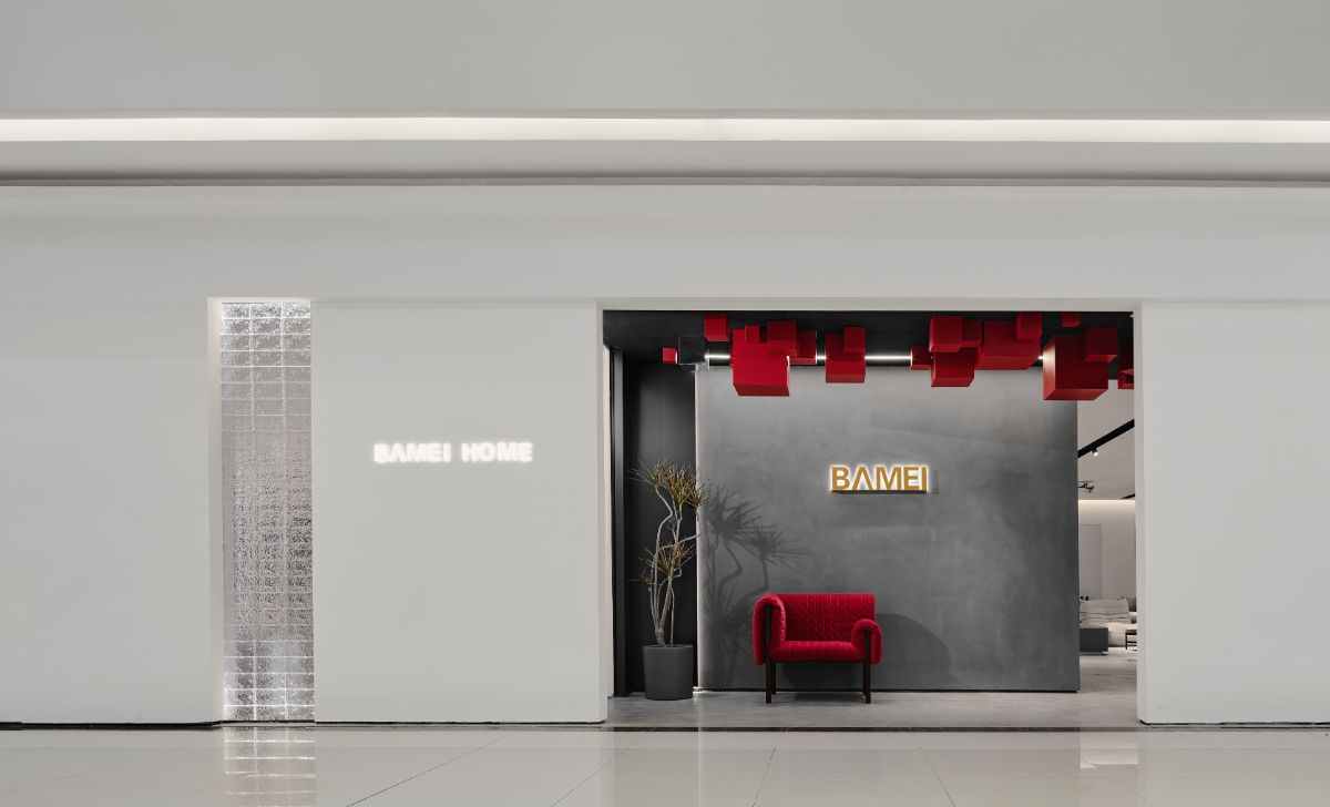
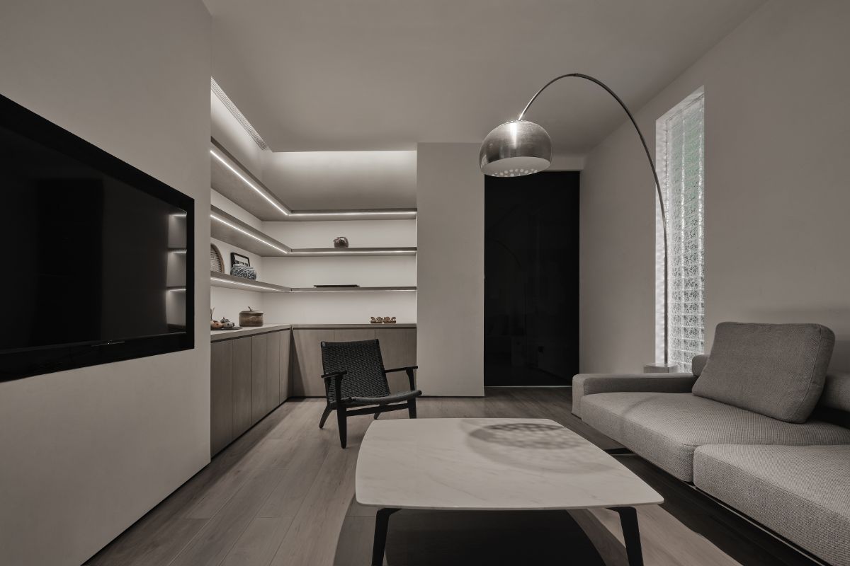
The change of emotions in different spaces is a very moving thing, it is related to the way of thinking, behavior pattern and sensory experience. We all hope to use space to convey rich, diversified and infinite possibilities. Due to the internal location environment of the project, it is the passage leading to the public toilet. The exterior facade combines white artistic paint material to construct the main body into a white minimalist volume, with transparent glass bricks to form a relatively independent unit. At the same time, the interest between the blocks is increased, and a certain echoing relationship and clear rhythm are formed between each other, and a relationship with embedded links is set up with the site to construct a holistic dialogue.
The external facade of the space continues the ingenuity that the aisle designer has added to the two box walls of the works, that is, it echoes the red box at the entrance in terms of art and element themes, and extends new changes, truly shaping the external brand display into one complete theme.


