Best of Cultural Buildings
Designer / Agency
- Wenqiang Li
Category
- Cultural Buildings
Award
- 2021 SILVER
Share this project
PROJECT
DESCRIPTION
A playful “art museum” that saves the boring city with anti-rational humor
Memphis: mix of music and design
Memphis is a word with multiple meanings. Geographically it reminds people of Memphis City, the home of Elvis Presleys, blues and rock’n’roll. In the design field, this term represents a unique anti-rational style and the Memphis Group — an Italian design and architecture group.
Memphis Group was founded by Ettore Sottsass in the 1980s. Its name apparently came from Bob Dylan's song, “Stuck Inside of Mobile with the Memphis Blues Again”, which played repeatedly throughout the meeting where Ettore Sottsass gathered a group of international young designers. With bizarre lyrics and design creativity colliding, this meeting gave birth to Memphis Group and aesthetic movement led by the design collective
Revival of Memphis Aesthetics
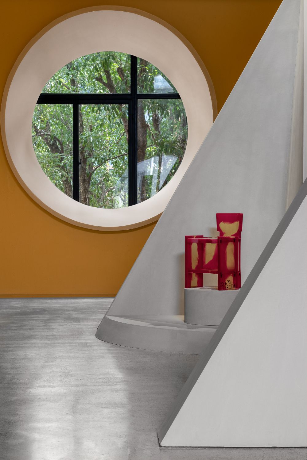
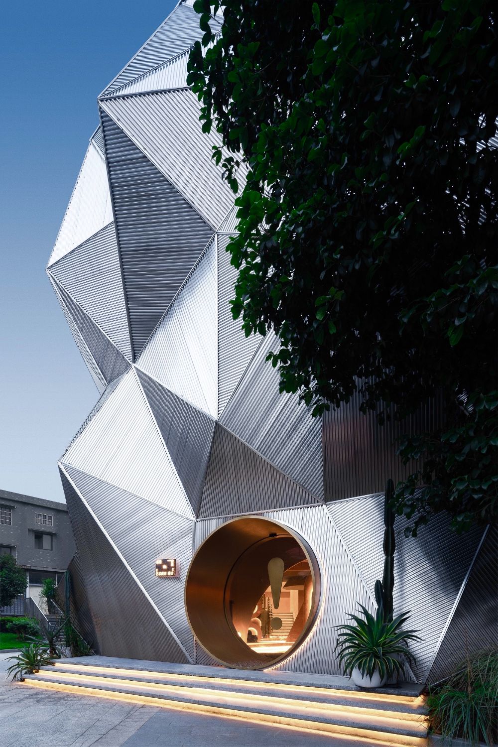
This project is a furniture exhibition space, with Memphis furniture as main exhibits. The designer titled it “Ya Space!”, which not only echoes the nickname of Memphis City in China — “Cliff City” (“Cliff” is pronounced as “Ya” in Chinese language), but also conveys a surprising feeling that indicate the unexpected sensory experiences Memphis furniture brings to people
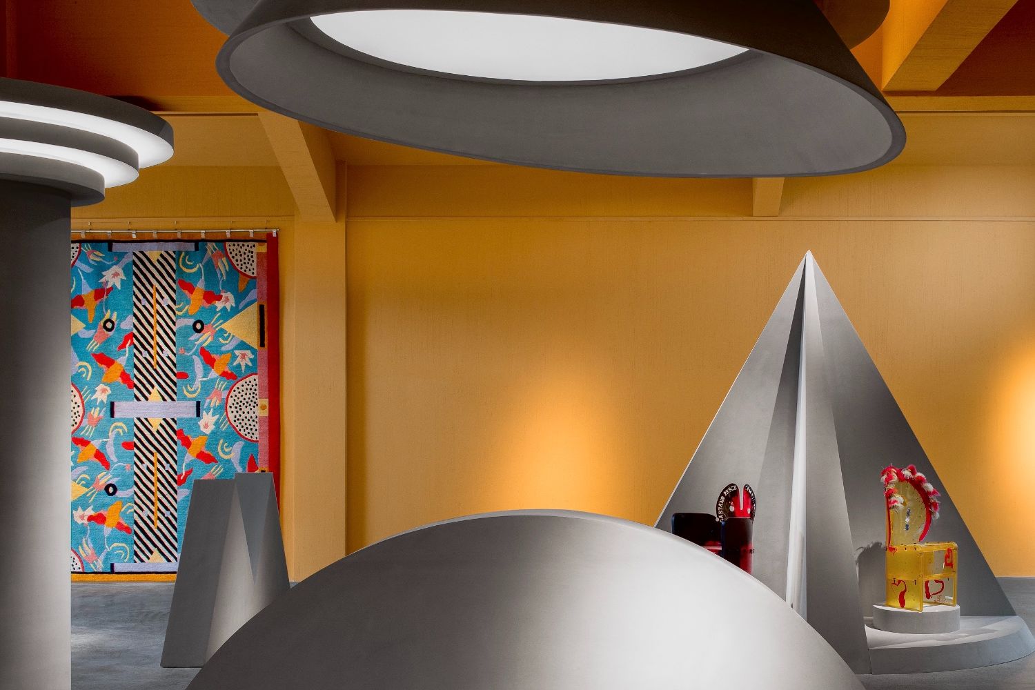
Memphis advocates unrestricted creative exploration, and has become the synonym of “alternative classical style” in modern design field. Its furniture features peculiar forms, bright colors and a design style liberated from minimalism and pragmatism. Classical style has always been prevailing, so the revival of Memphis style is at the right time.
Innovation in line with the times
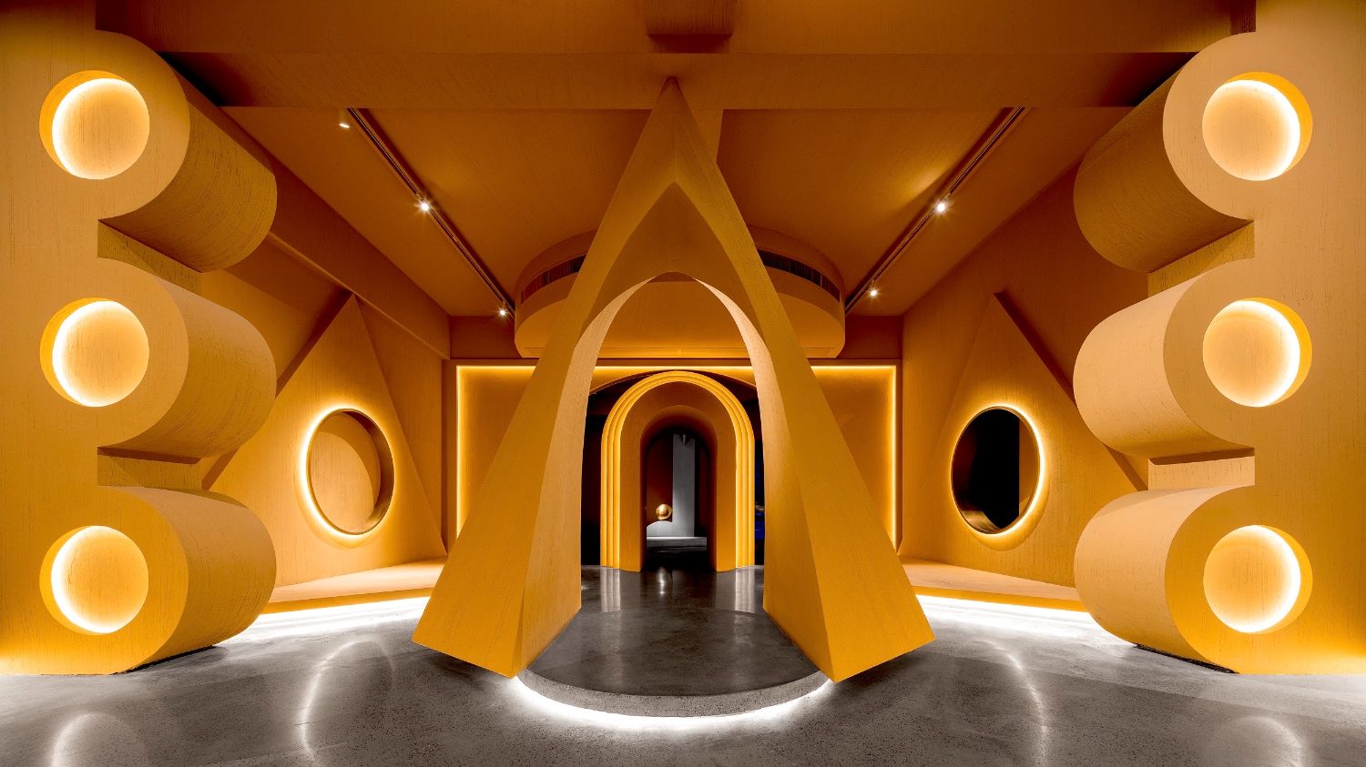
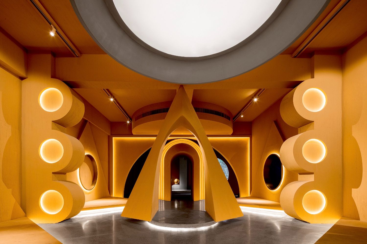
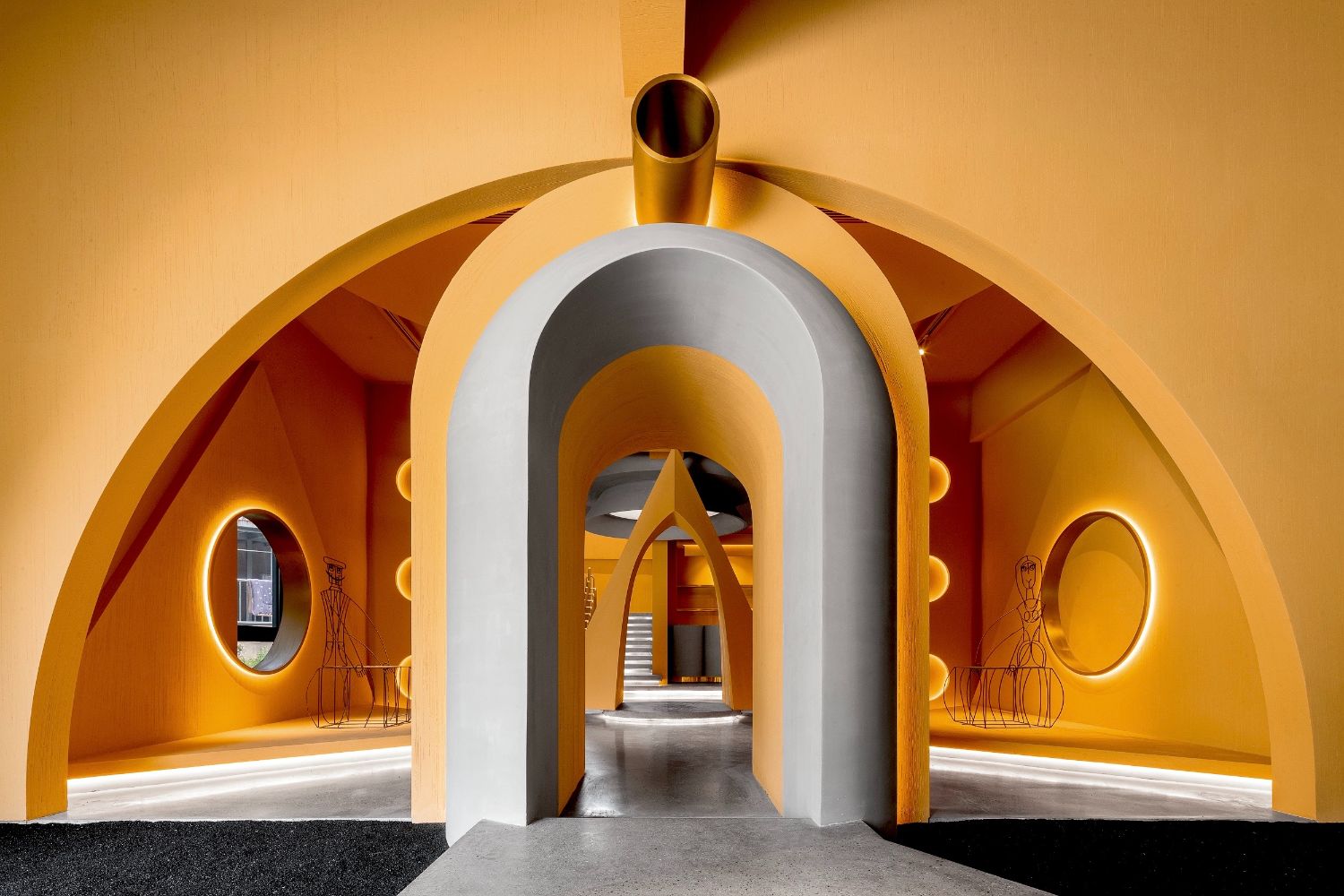
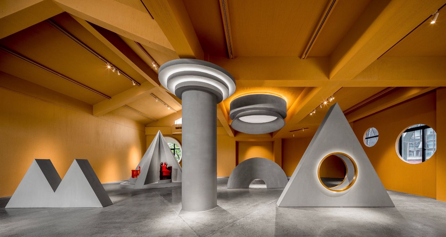
Representative elements of Memphis style, including geometric shapes and free composition, were frequently applied to the project. The designers identified priorities for the selection of spatial materials and hues, hoping to go beyond Memphis' extreme emphasis on visual effects with enhanced textures and more sustainable concepts
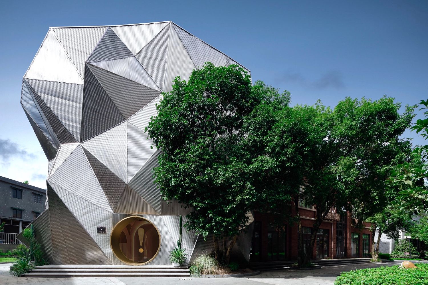
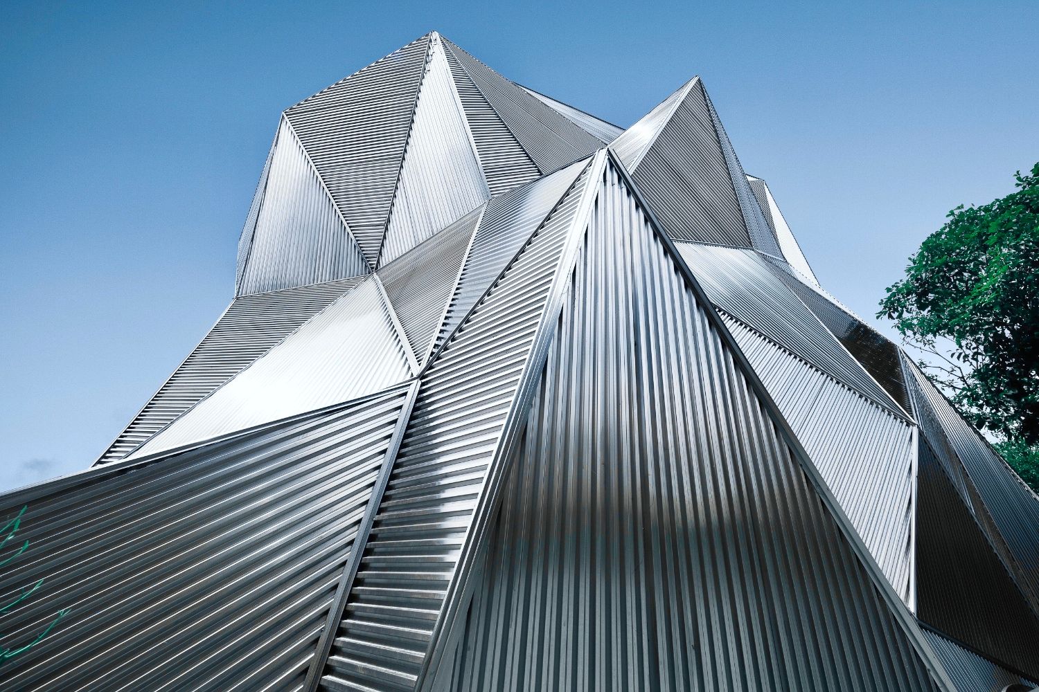
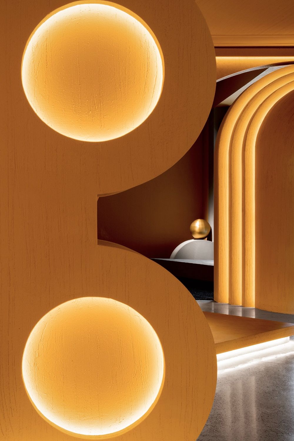
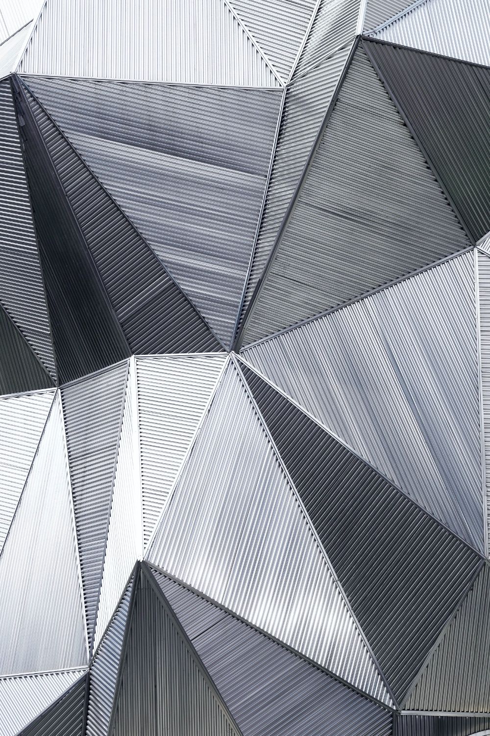
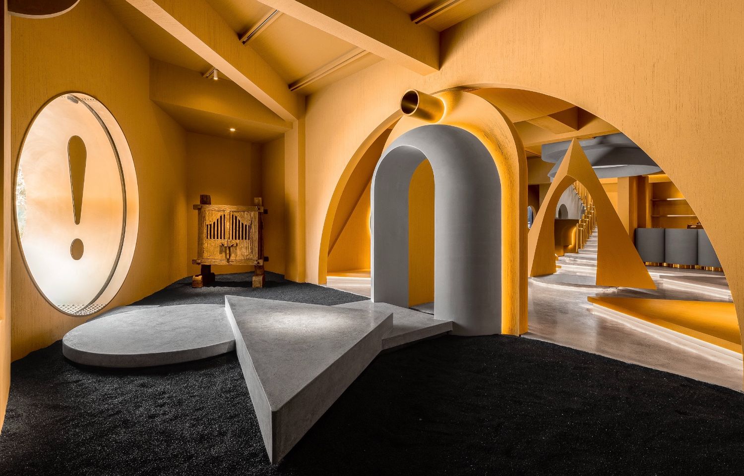
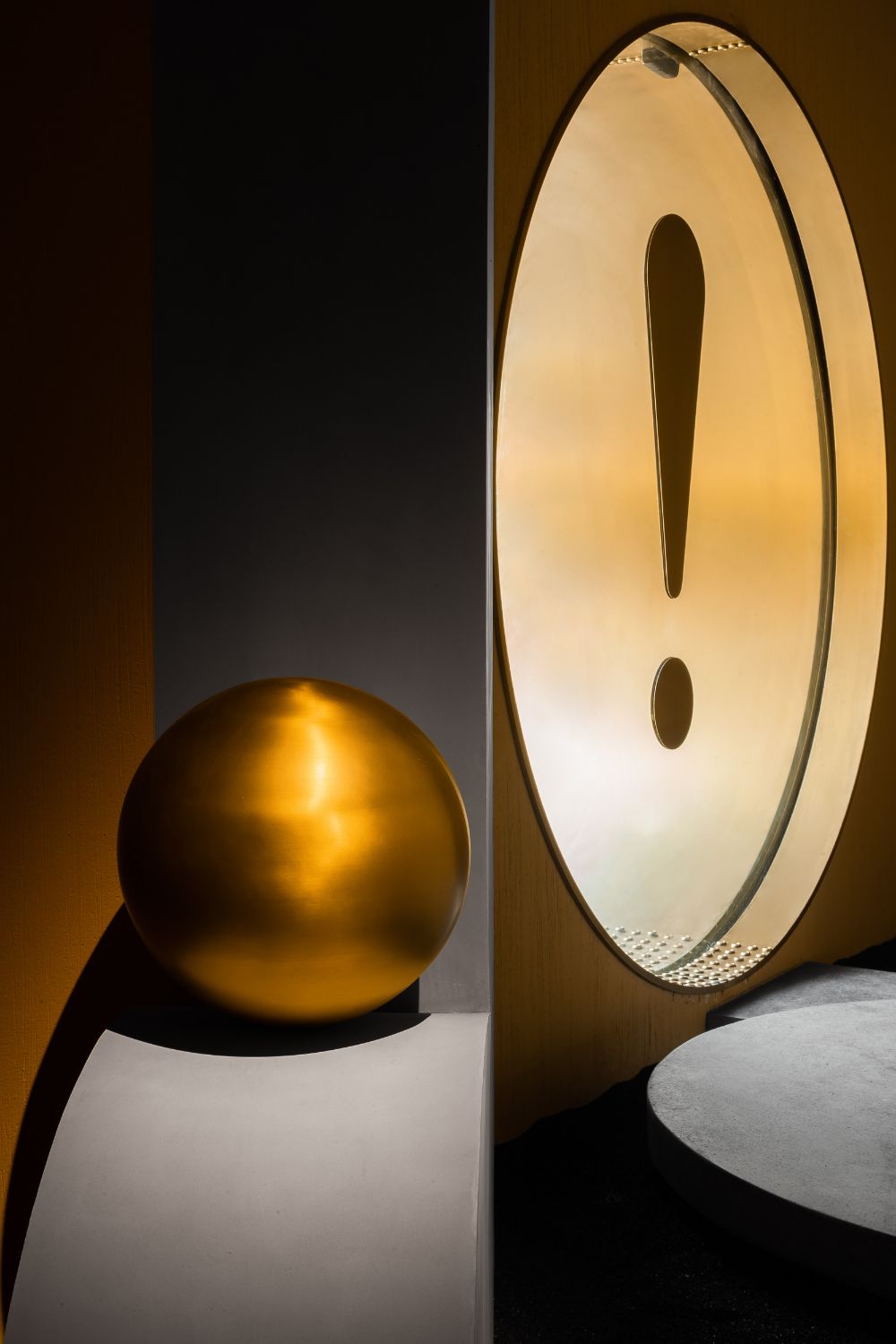
Constructed by corrugated stainless steel sheets based on the design concept of “cliff”, the facade is characterized by bizarre visual effects and complex structures and techniques. During construction, the design team constantly improved the edging and connection of corrugated sheets, as well as the treatment of nodes and materials, to ensure a holistic image. The entrance is highlighted by a large exclamation point, guiding visitors to explore the unknown interior world. All the visual elements perceived beforehand constitute an “index” of the peculiar and irregular space.
Continuation and variation
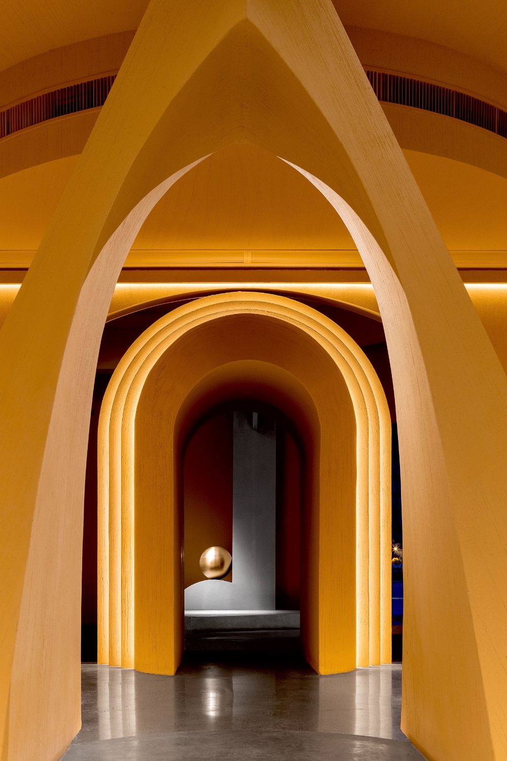
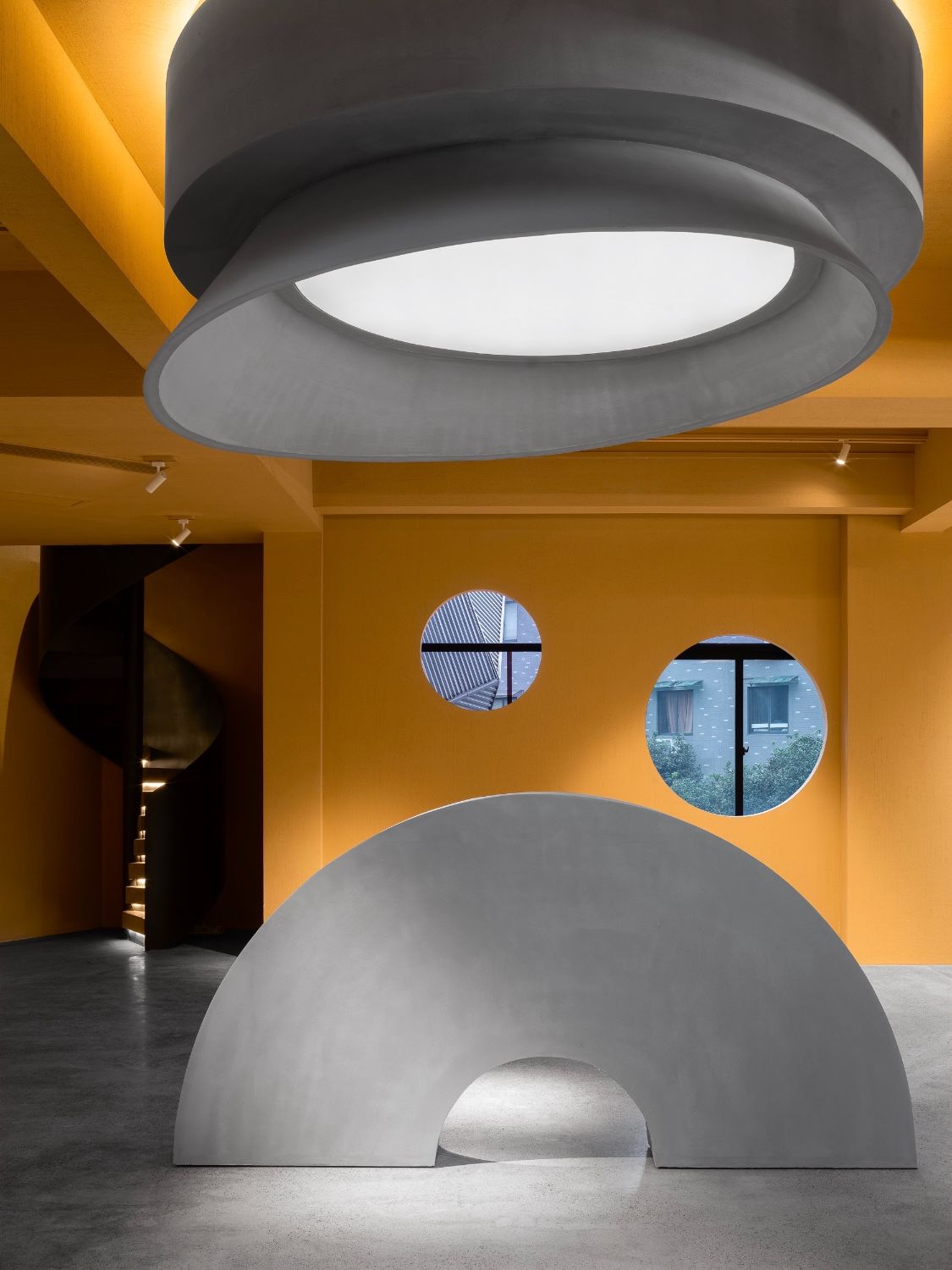
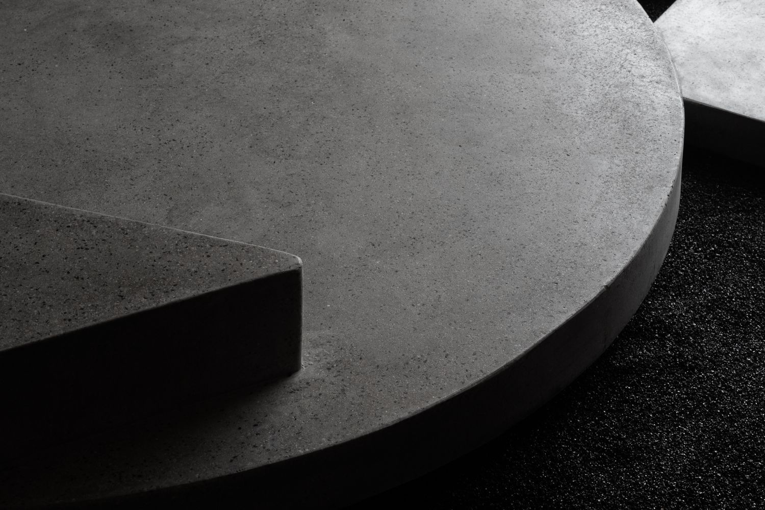
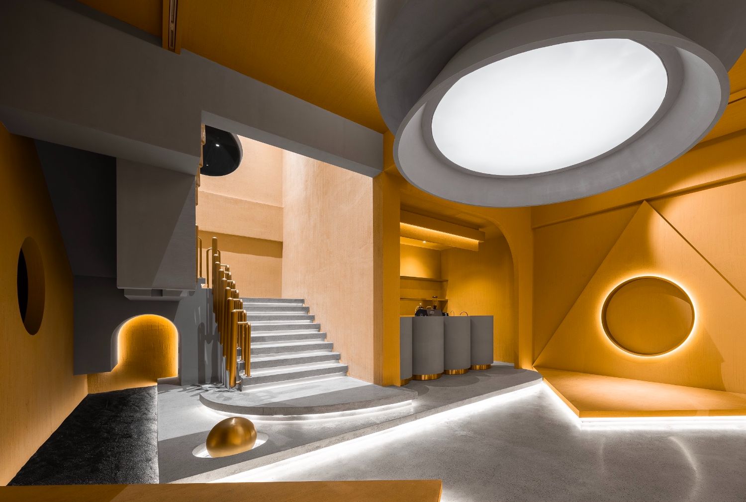
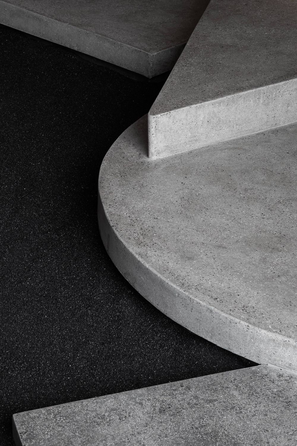
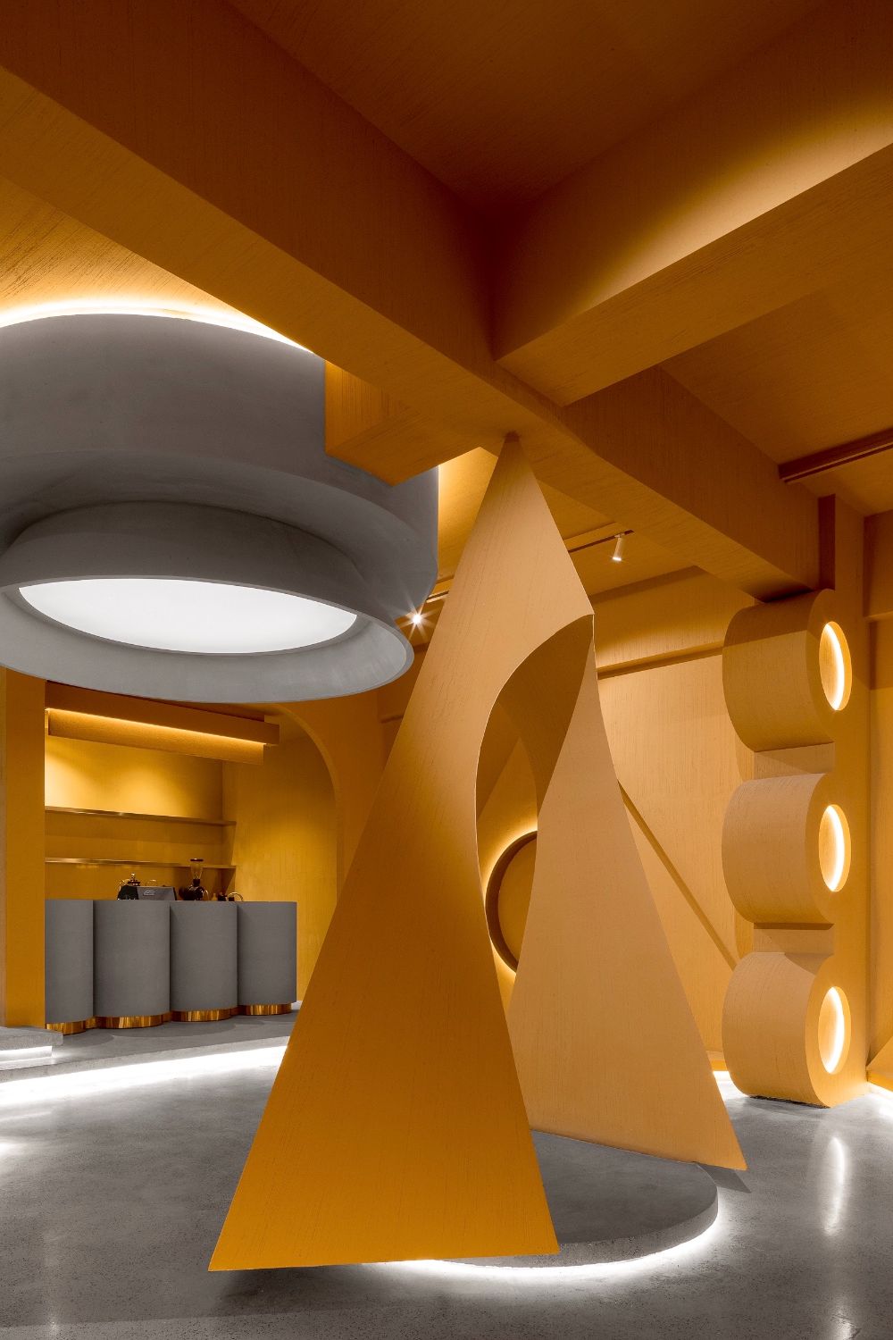
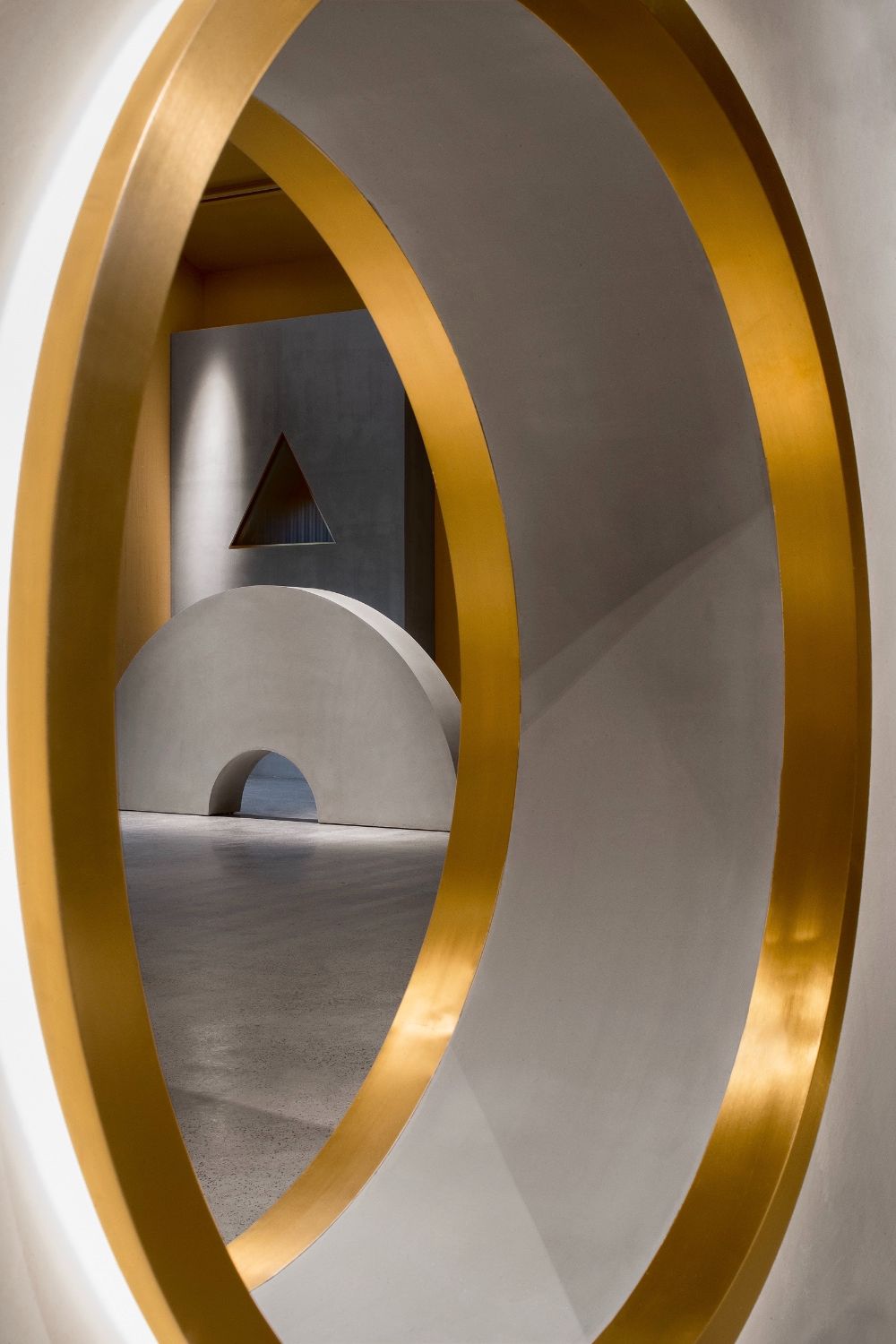
The interior space is composed of two floors. 1F centers on providing unconventional experiences, and produces spatial rhythm by unique combinations of geometric shapes. The foyer features irregular stairs paved with black stone pieces, a door opening that brings a sense of order and enriches visual experiences, and a building block game-like scene which tries to break the barrier of class.
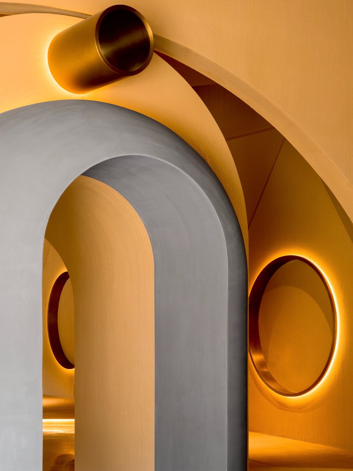
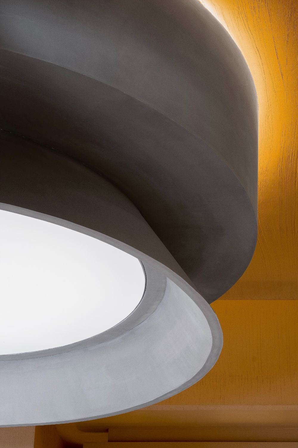
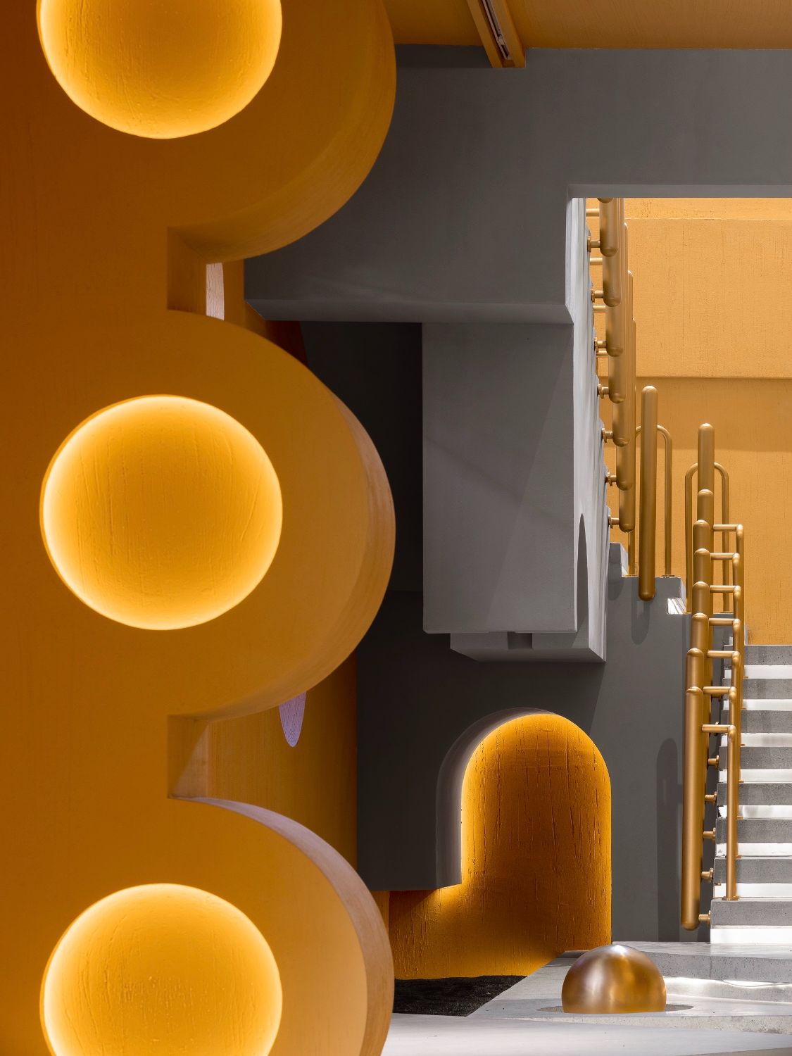
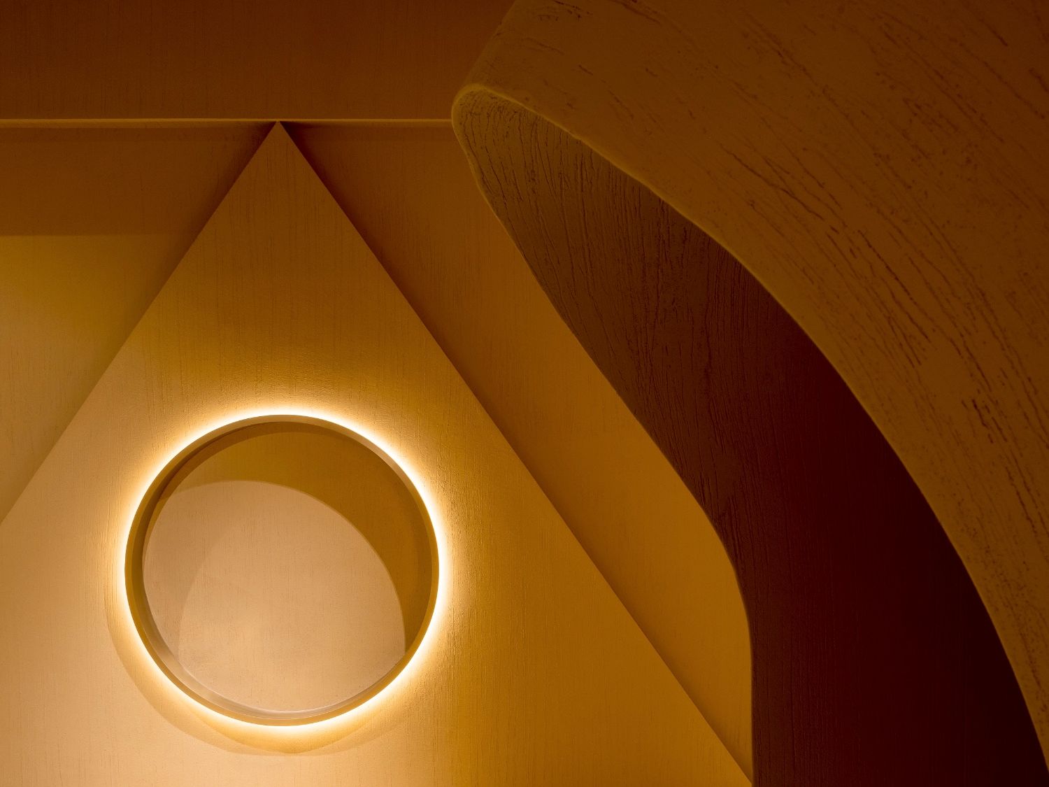
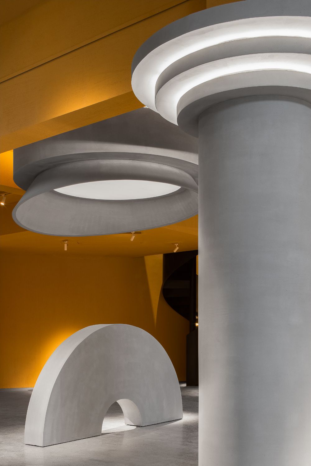
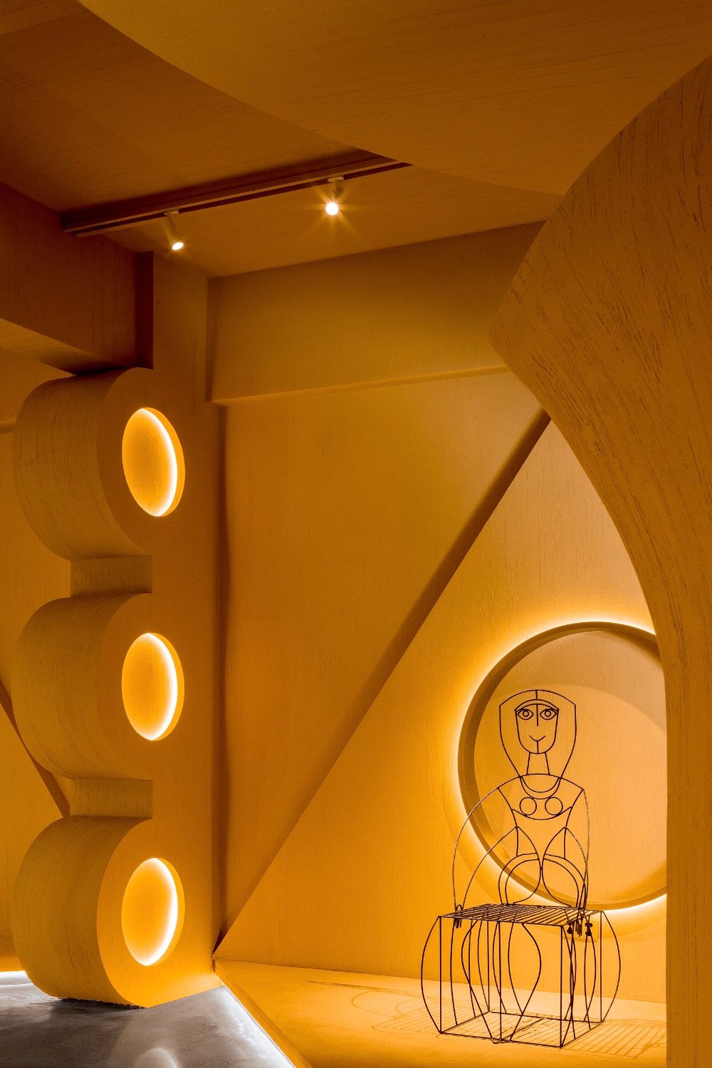
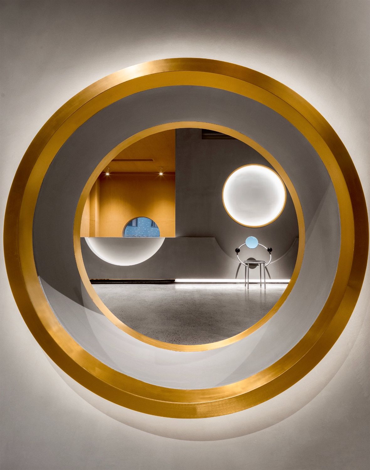
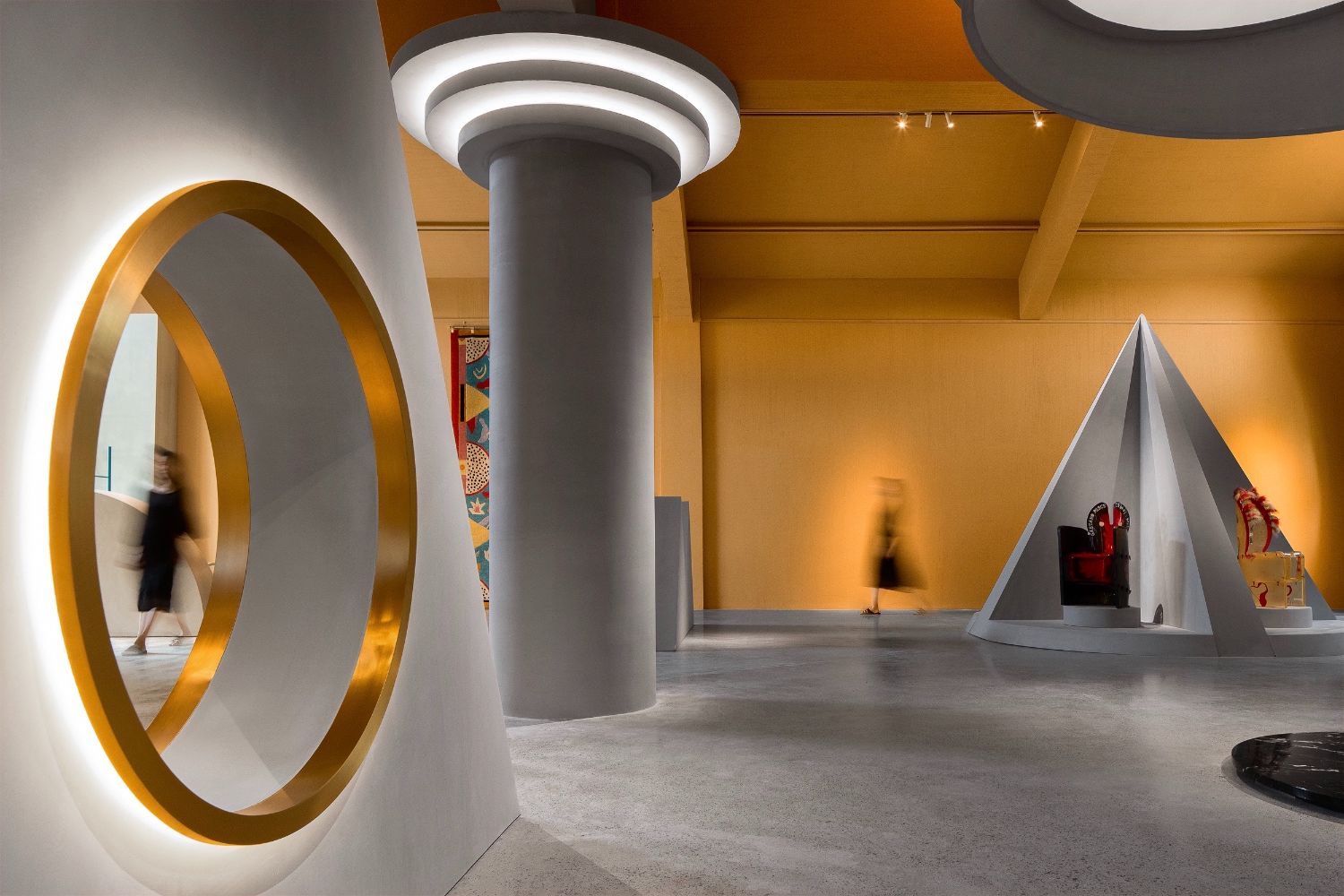
Countless visual points are formed by the combination of structures of different shapes. Every structure is a visual point, and a geometrically-cut view frame. Suspended from the ceiling, circular light boxes cast and diffuse lights, creating a surreal atmosphere of floating.
An array of cylinders form the bar counter, and several independent metal installations compose handrails of the staircase. In this space, ordinary items constitute a stage for display and experience. Lots of interior structures utilize the same materials as the walls, making them seem like objects that naturally “grow” from the space.
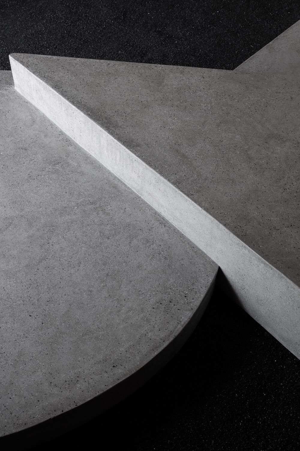
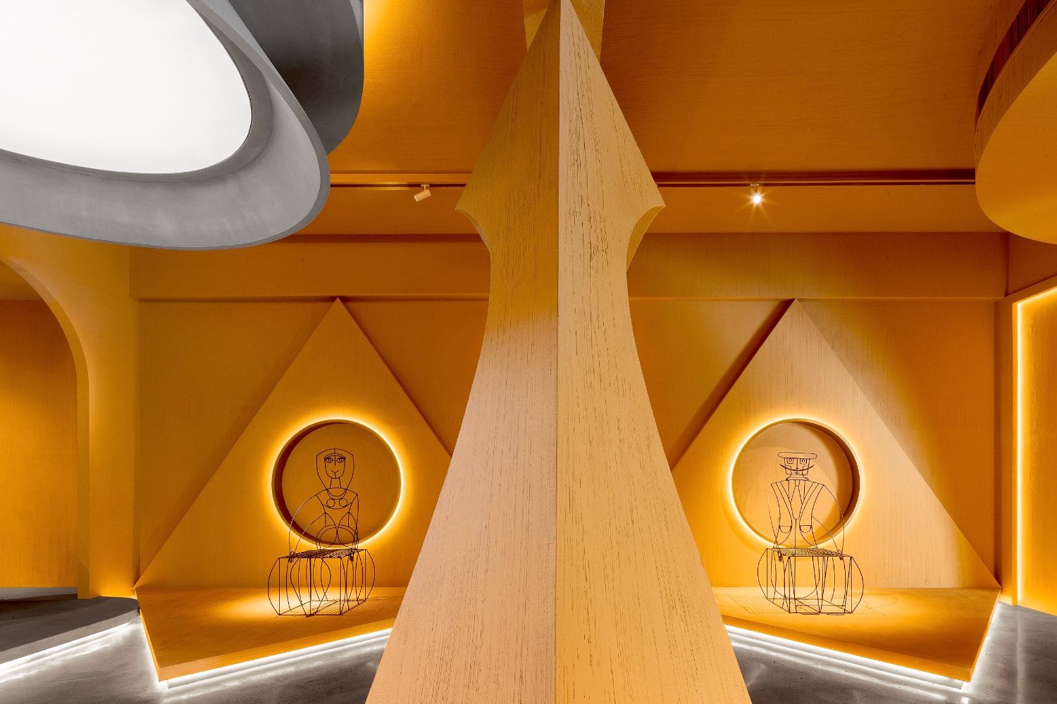
The entire space on 2F is used for exhibition. The interior surfaces are movable geometric screens. The design continues the concept of "view frame", with a view to bringing changes to the angles of observation. In this space, visitors can have a whole view or partial view of scenes, and can stand on tiptoe or bend down. Simple yet subtle arrangement of spatial structures produces playfulness within the space. Those structures adopt same finishes as the floor, as if they're growing from the floor.
The design of the display area is based on the concept of framed views. Through cutting and recombining the views, it brings infinite possibilities to visual experiences within the field of view and makes observation more interesting.

Designer: Li Wenqiang
Born in 1984
Graduated from the Oil Painting Department of China Academy of Art in 2008
Works: Apothecary, Alchemy, Bookstore, Way2 Bar, Monopoly, Cliff Space, Xinglanli Public Area

