Best of Real Estate Sales Space
Designer / Agency
- Yi Yong (Jerry)
Category
- Real Estate Sales Space
Award
- 2023 Innovation
Share this project
PROJECT
DESCRIPTION
In the light of the lake, this stylish and elegant dress shines brilliantly.
The display space at the sales center is limited in size, but it has full functionality. Through the use of borrowing scenery, we simplify the complex and introduce an artistic conception into the interior line structure, condensing the vision in an instant with poetry of eternity. After projection and reorganization, the oriental artistic conception flows within the square footage by combining the simple European style in the building. There is a sense that the sky and earth are shapeless, thin and dark, unified, quiet and clear.
Picture 04:
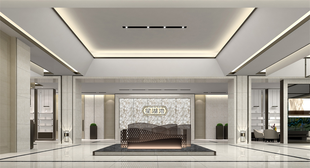
As you enter the exhibition hall through the thick, calm hairline bronze door, you will notice the central column design of the main space has a simple, clean aesthetic, and the texture highlights the beauty of the elegant temperament. Columns in the hall have been arranged in continuous door sets that make up the visual carrier of the hall, thereby greatly reducing the column's volume. It resembles an oriental courtyard floor lamp with an ancient atmosphere with the bronze-framed wall lamp embedded in the bottom of the column. This detail provides an exquisite oriental charm.
Perforated bronze metal plates compose a layered water wave display device at the central viewpoint. The background consists of an overlapping pattern of patterned glass. It is the subtlety of these objects that makes them a work of art. It's such a static combination of vision. Symbols associated with "Star Lake Bay" are condensed into this artwork. A natural shape also adds more imagination to the space.
Picture 05 and picture 06:
There are transparent display cabinets separating the left and right rest areas, the sand table area, the material exhibition hall, and the negotiation room corridor. In addition, transparent display cabinets integrate seamlessly into the same space. A wire frame shape on the ceiling of the sand table area represents tension and restraint, along with its simple shape structure and cabinet ornamentation, which only uses pure black or white for its design, diluting the impression of traditional cultural symbols. By incorporating lines, light and shadow, form, and surface texture, they convey the perceptual charm of silence, mystery, and balance. In addition to the simplicity and majesty of the blank space, it has an air of grandeur that encapsulates everything in the space.
Picture 08 and picture 09:
They include regular sofas, black flower seats embellished with chandeliers and ornaments, and artistic sketches decorated at every detail. It is possible to condense the mind and the eyes simultaneously during static moments. Throughout the corridor, the carefully arranged carpets, with modest and restrained patterns, and the entire wall of hanging paintings, exemplify how the textures and gradients of colors, movement and stillness, softness and rigidity, and silence are all blended together to create a delicate interlacing of shades of landscape paintings. A very elegant effect can be achieved with modern materials and construction techniques.
Picture 10:
It is different from the outer room in the sales center to have an independent studio. The style emphasizes high-tech sense and electronic information. The bronze metal plates and upper and lower gray mirrors have been embedded with large-screen electronic screens for viewing movies. There is a twinkling starlight effect created by the oval fiber optic dot ceiling. A laminate that serves as a sound absorber and diffuser gradually emerges from the surrounding walls as they become higher and higher.
Picture 11:
Chinese style is highlighted in the tea and coffee area, which matches the sales center. By using a log-colored grille screen and a partial gray mirror ceiling, we can create a unique combination of Chinese and Western styling in the sales office. There is a subtle and interesting collision between tea art and coffee, which enhances the intensity of the elements.
Picture 12:
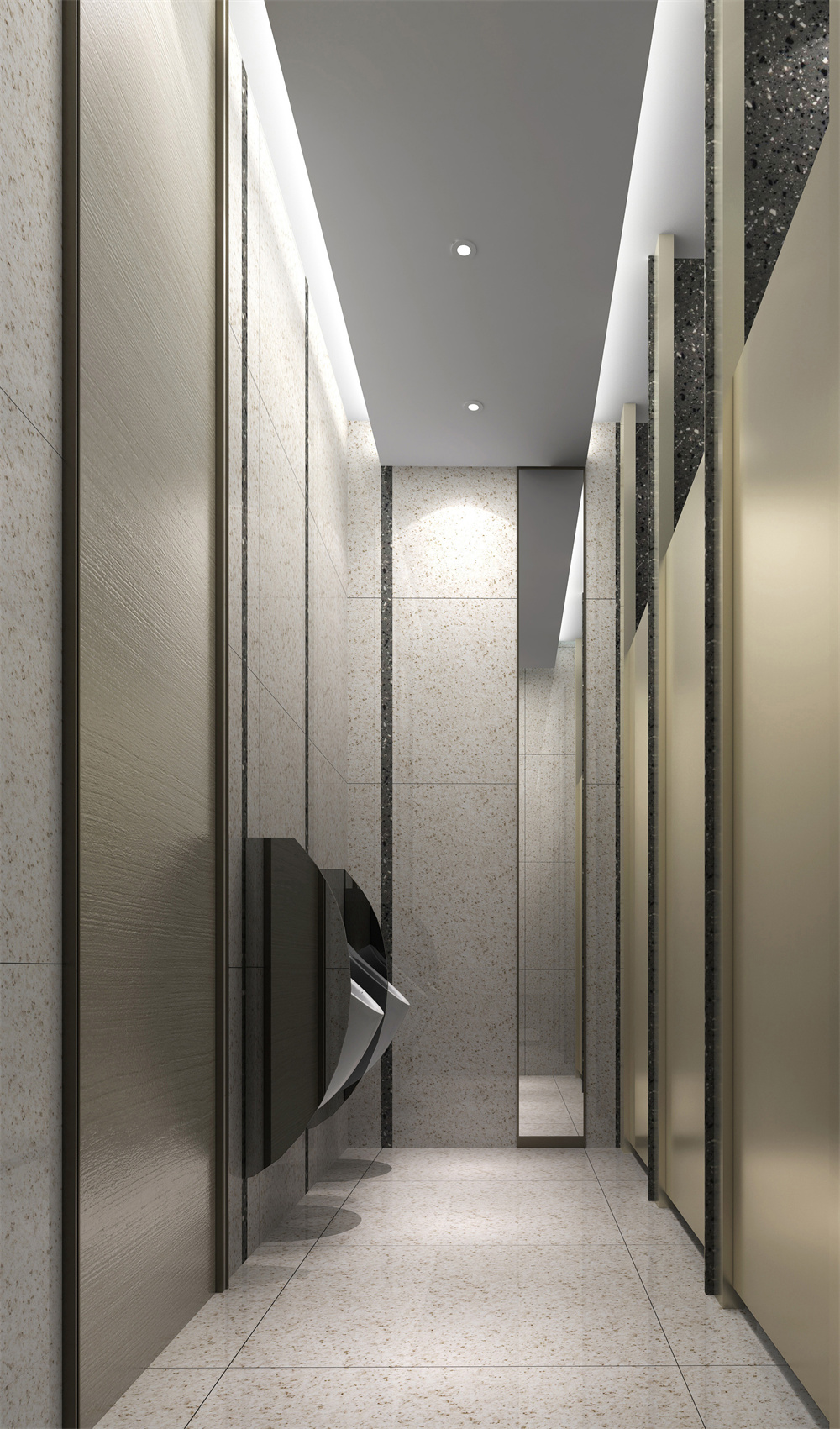
In the same way as the garage corridor and restroom, the negotiation room is structured in a small space. All of these materials and effects are abstract, despite the differences in materials and integration effects. There is a feeling of growing and breathable air in the space. From a shape perspective, it is quiet. Let the white space in the thick ink speak for itself, and embellish the white space with the artwork. Ruffles formed by refinement reveal a quaint rhythm, forming an oriental realm of meaning.

Designer:Yi Yong (Jerry)
Yi Yong, designer, graduated from Hubei Institute of Fine Arts with a bachelor's degree in 1996 and a master's degree from Wuhan University in 2011.
The design director of Shenzhen Bohan Interior Design Company, senior interior architect, national senior project manager, ICSID international registered senior interior designer, and director of Shenzhen Interior Designers Association.
Over the past few years, he has participated in and completed a series of large-scale comprehensive real estate projects and hotel design projects, including New World China Shenyang Real Estate, New World China Anshan Real Estate, and Hong Kong KNS Wuhan Service Industry Park. It is his goal and continuing to work hard for the creation of comprehensive decoration design-related industries and integration of Internet-based design functions, through active communication with the art, hotel-home furniture and soft decoration fields, as well as design and creation.


