PROJECT
INFORMATIONS
Everyone has an oriental conception in their hearts.
Here is a space with vitality and creativity.
We return to the most authentic state of life, with the original heart.
Listen to the sound of rain, see the scenery of flowers, realize the wisdom of the elegant charm of the east.
The return and continuation of the Chinese artistic conception.
The Poetic Remarks in The Human World by Mr.Wang Guowei wrotes three realm of life. This three realm inseparable and layer upon layer. The beauty of objects, space conception and artistic conception. Maybe these three kinds of beauty correspond to the three states of space.
PROJECT
INFORMATIONS
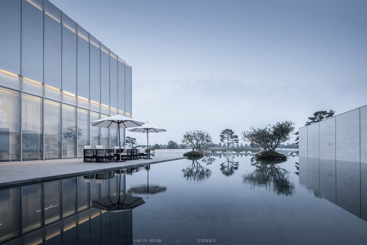
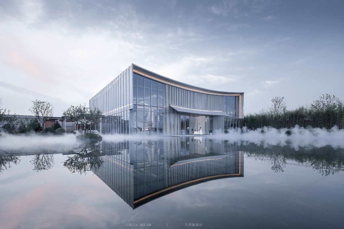
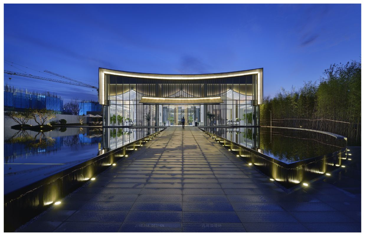
The design theme of the project is "water as the shape, mountain as the template", which divides the space in the form of functions. Find the balance of space in the axis of the square, so as to form the connection between the matrices and return to the "positive" point.
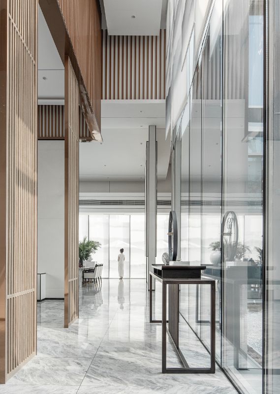
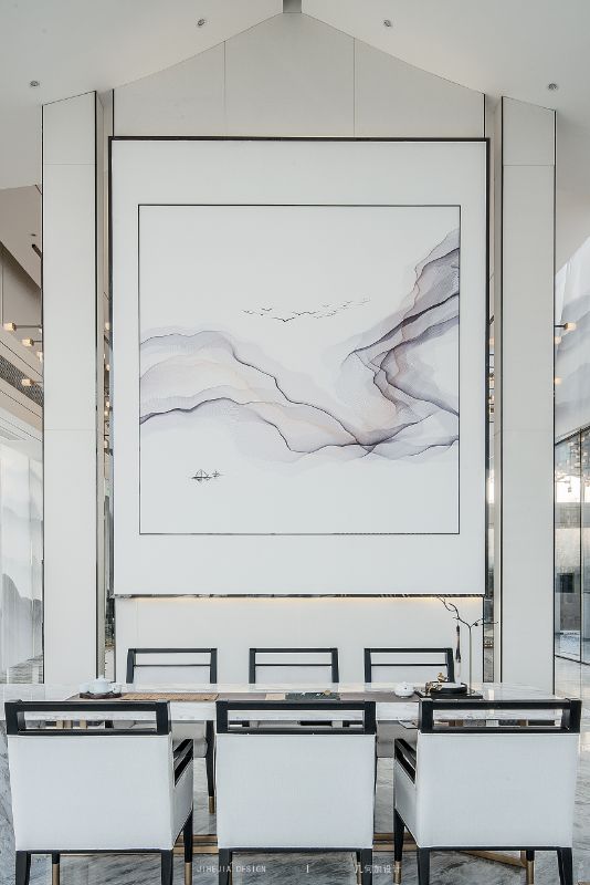
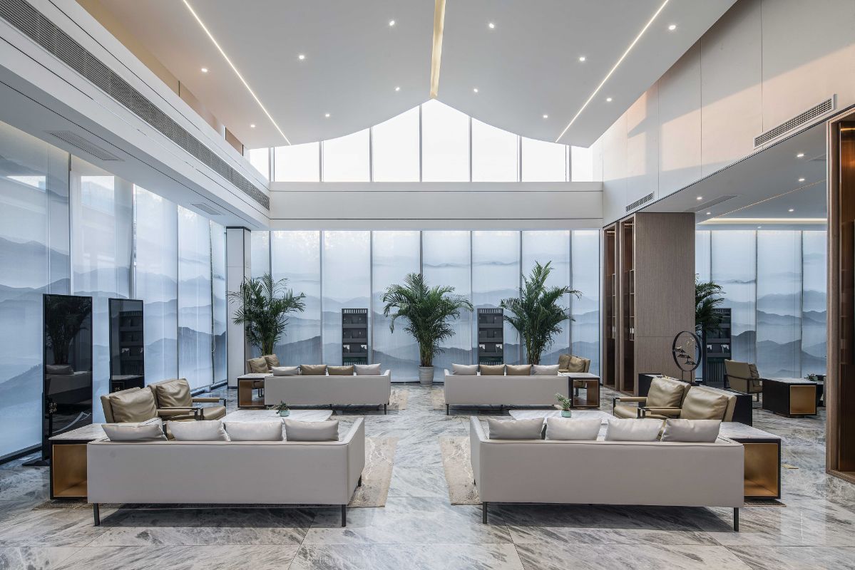
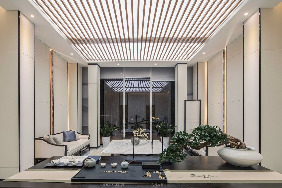
As the transition zone between outdoor and indoor, the entrance hall of the center is the main entrance of the whole marketing center. Between this hill and water hides stylist broad feelings and original heart. The designer placed the concept of "landscape" in the whole hall space, with a screen partition between two floors and two sides as the visual center, highlighting the atrium from a positive perspective. Combined with the variation of the shape of the different sides of the ceiling, different openings emphasize the relationship between the primary and secondary space and the axis. The line of sight under the impact of the structure is shining but uninterrupted, forming a virtual and real visual impact,which enables the whole space lifelike.
It is the attitude that shows after dimensional flow, softened effectively relatively hale space butt joint, show the hale and able breath in contemporary decorate a style again at the same time. The contrast between reality and reality formed by the three-dimensional groove and the scene light source makes the visual tension of the modern avant-garde, the plain materials cooperate and the simple lines, presenting the feeling of macro stability. This is the beauty of the balance that the project is trying to achieve.
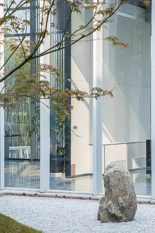
At the same time, it pays attention to the expression of light and shadow effect, and uses the transparent glass curtain wall to introduce the natural light of the courtyard into the interior. Outside the window is the scene that has poetic picture meaning Oriental garden, indoor the display shop that is appliance of Chinese style lasting appeal presents. The indoor and outdoor space can continue and echo each other, and the nature is mixed with a mysterious Oriental charm, so that the whole space atmosphere reveals the humanistic connotation.
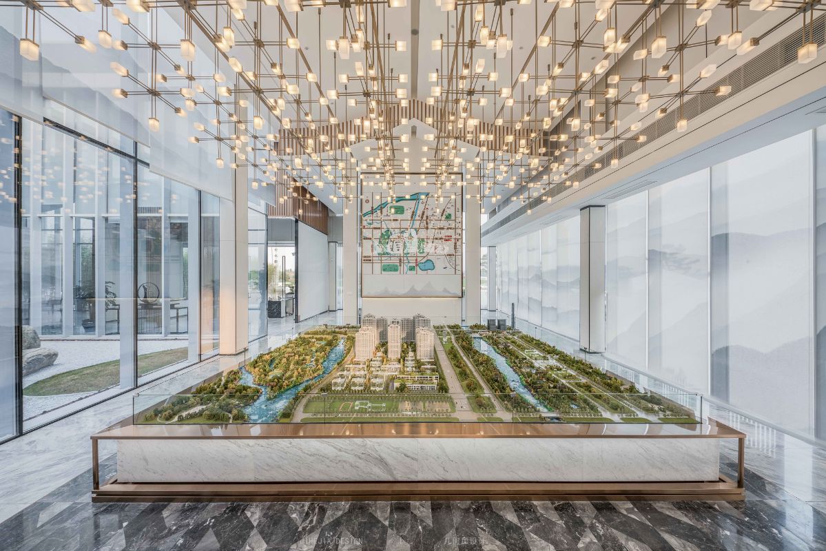
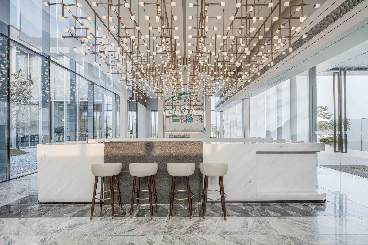
Suspension type condole top uses copper stainless steel to serve as a mouth, use without main illuminant design. The overall top space enhances the sense of hierarchy and ductility. The design that does not have advocate illuminant more the effect that USES lamplight integral part enlarged dimensional feeling to reach comfortable on the vision.
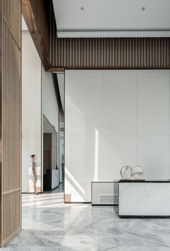
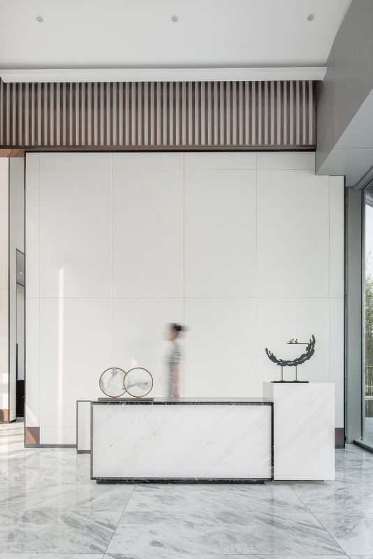
Metope part is the combination application that uses white hard package, black stainless steel to receive mouth, woodiness grille.
In integral area white hard package combines black to receive a mouth to reflect atmospher. Although two material are qualitative lubricious department is different, the distinction on simple sense, differentiate metope nature gives visual key.
Talking about the use of woodiness grille, it go up in white main body metope accomplish the division that dot eyeball reachs administrative levels, vertical sex grille not only differentiate administrative levels, and its form has classic order to feel. Three echo will be the level of the hall and the sense of etiquette fully show, let the residents feel the face of the solemn.
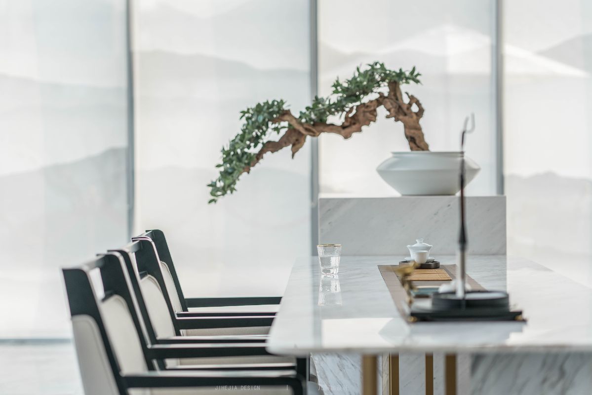
Front hall double set "four elegant area". Flower way, painting way, tea way, incense way. Embodies the space elegant temperament and the beginning of the space planning node.
A large area chandelier is used in the sand table to echo the inverted mountain shape and the mountain shape on the top, reflecting the reflection of mountains and waters.
Solid foundation makes architectural art sublimate, and pure craft makes architectural art pure. The uniqueness of xi’an lies in its past ancient and modern civilization from a broader perspective. The scenery is just a beginning, the humanity is the core of the city. The unique story is condensed into a small building, which falls quietly into the space, showing an artistic scene of coexistence and integration of landscape and humanity.
The charm and interest of the space need to match the local culture and temperament. This not only creates the artistic quality of space, but also conveys a more ideal philosophy of living.

Xi'an Ji He Plus Decoration Design Co., Ltd.
Xi'an Ji He Plus Decoration Design Co., Ltd. is a collision design company integrating indoor space design and soft decoration. The company was founded in 2008 by famous designer Xiao Yong, formerly known as Xi'an Yuanjing Space Design Agency. Geometry is added as "geometric space plus addition and subtraction". My life relies on the systematic floor design advantage of more than ten years. I am the creative director of the top interior design masters in Xi'an, with the core concept of human living body design coefficient as its core. The perspective of the design, the professional design level, the top-notch concepts, the advanced engineering project management system and the high-standard operation procedures have reached strategic cooperation with many well-known enterprises at home and abroad, and determined to become the respected leader in the high-end human settlements in China.


