INNOVATION Prize of Real Sate Sales
PROJECT
INFORMATIONS
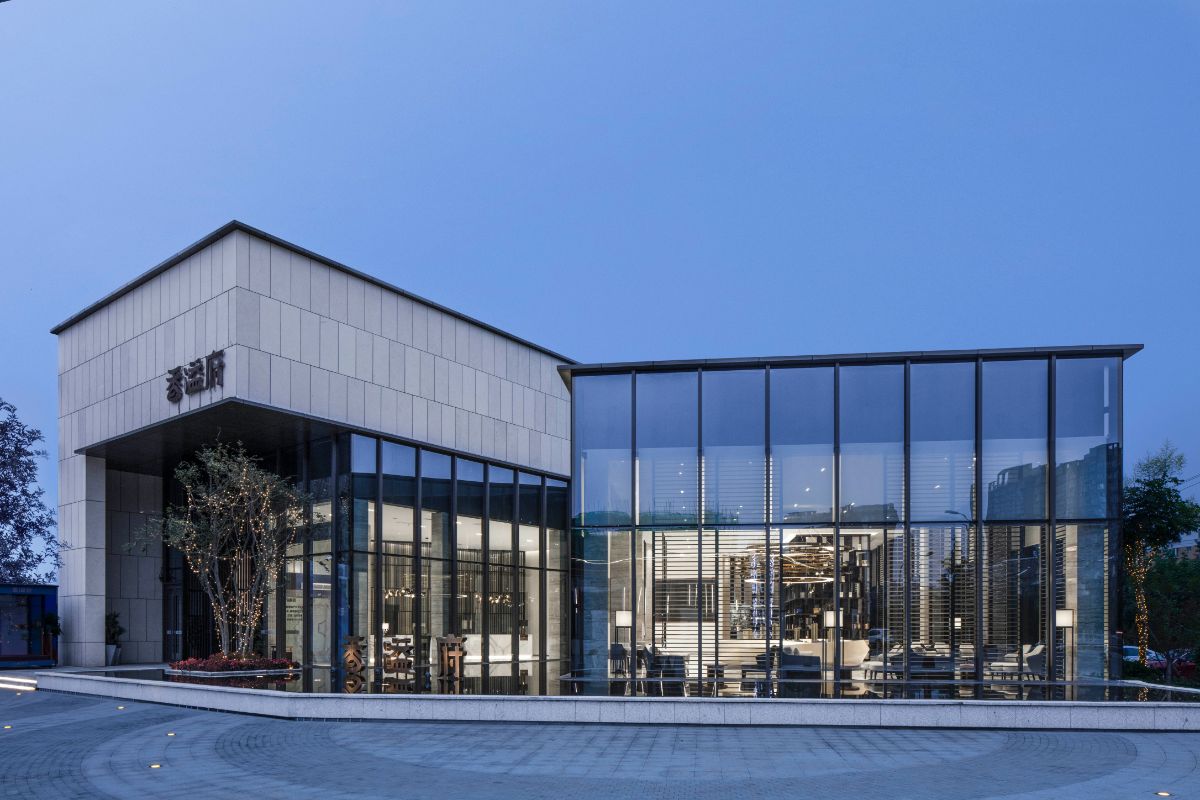
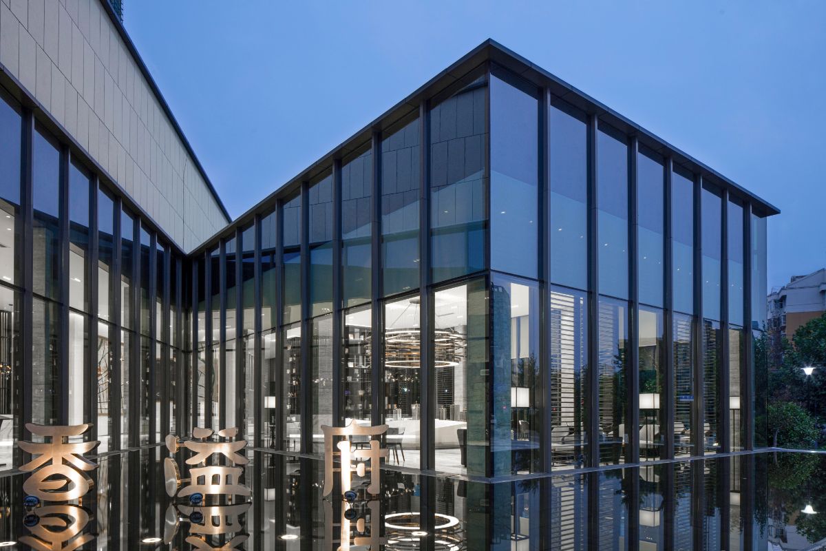
Picture 1: architecture should echo the current context of urban development. Xiangyifu sales office is adjacent to the confluence of two urban rivers in Lianyungang. The architectural design, landscape design and interior design of xiangyifu are designed to absorb the flexibility of water and create a quiet place floating on the water surface.
Photo 2: starting from "architecture is a solidified art", Zhao Fei finally presents the architectural outline of the project in the form of a moonlight treasure box through the inspiration of "journey to the west". In the evening, when the lights are on, the interior lighting blooms from the "V" shaped opening of the building, which is like the supreme treasure of the supreme saint of Qi Tian. It opens the moonlight treasure box of solidification time, and the rhythm of the whole building and the surrounding traffic is just like clouds and mud. Let people in the architectural space feel the "stillness" of time, and make Xiangyi mansion a "Moonlight treasure box" for people to escape from the bustle of the moment.
Picture 3: try to interpret the current urban lifestyle with architectural brushwork, looking for the relationship among nature, architecture and human settlements. Here, light and shadow become the main theme of the design, the ultimate modern design language and restrained oriental aesthetics will also be integrated into the space in a unique way.
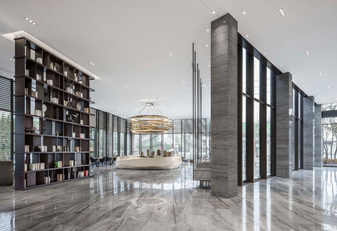
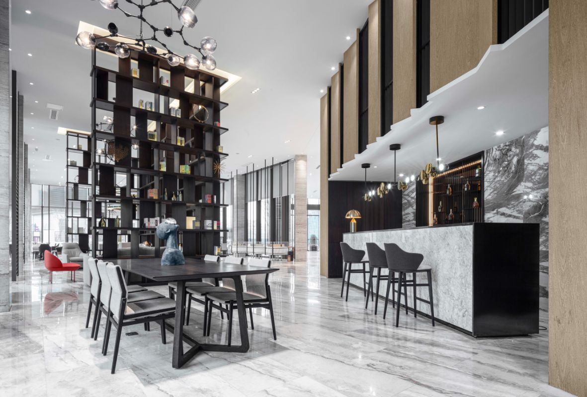
Picture 4: the contrast of large area marble and chicken wing wood forms people's first impression of Chinese style, which is introverted and implicit, steady but not publicized. The building emphasizes the beauty of natural texture of the material itself, reducing too much decoration, but releasing the interior space, bringing a transparent and open comfortable experience.
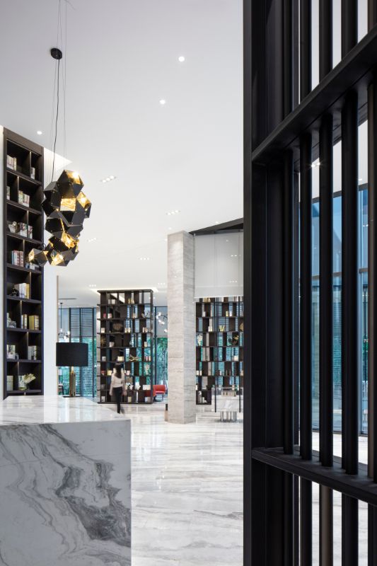
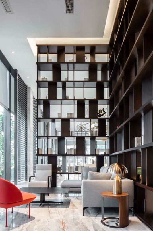
Picture 5: the bookshelf on the wall can solve the problem of single white wall and relieve the stiffness of space transition.
Picture 6: simple decoration, more harmonious space.
Photo 7: the bookshelf is isolated from the noise of the outside world, making the interior space quiet and reassuring. And in the modern design context, the Chinese style design elements that show the spirit of space are added to burst out a wonderful charm.
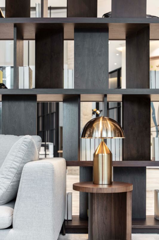
Photo 8: the stacks of nearly 100 panes on the bookshelf balance the dullness of color, and make the smooth breathing feel spontaneously.
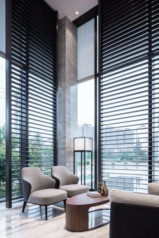
Photo 9: the window sashes of Jiangnan Water Village above the water bar are gently pushed open, simplified into lines and with a sense of minimalist aesthetics. The molecular lamp, which is full of modern sense, can also be seen as a twisted pine branch. The appearance of style is weakened, and the expression of art integrates modern and traditional, connecting China and the West.
Photo 10: the design creates a special feeling. The emotional perception brought by the sense of permeability can eliminate the boundary of the space and let the interior space merge.
Photo 11: the poetic detachment reduces the space to texture, composition, hue and color, leaving emotion full of life and energy.
Photo 12: double silver Low-E glass curtain wall with 8 + 12a + 8mm is adopted to bring heat to the room by using sunlight as much as possible. In addition, the shuttle type aluminum shutter screen is adopted to shield the extra sunlight and prevent the glare and glare of indoor people while not affecting the sight of indoor outdoor landscape.
Photo 13: the scale of the design is to unfold the art of narration. The balance, repetition, contrast and rhythm of materials and lines eventually form the formal beauty of architecture.
Photo 14: the brilliance of the design lies in its unobtrusive expression, specious and light. The sand table of the house type is presented in the form of hanging support, which is light and elegant, just like a swing in childhood.
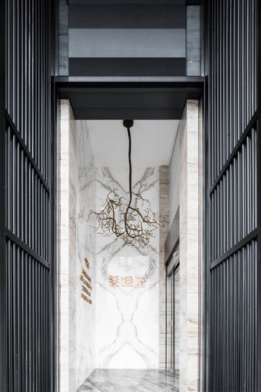
Photo 15: through the foyer, the metal and iron gate row upon row of vertical lines reappear. In the posture of two giant screens, they stand obliquely behind the reception desk. They are arranged in parallel, and the interior space is cleverly divided. The designer also transformed the space design into a landscape painting with splashing ink, so that the marble pattern of the reception desk "flew straight down" and integrated with the ground. To enter the "Moonlight box" customers, to create a smoke like dream of Chinese style mood.
Photo 16: the concept of time travel has also been applied by designers to the creation of artistic conception of interior space. The sand table area of the project uses the geometric characteristics of Mobius circle to metaphorize the interleaving of time and space. "Universe" is space, "universe" is time, "world" is space, "time" is time. The eternal and parallel space-time symbolized by Mobius ring echoes with the function of moonlight treasure box.
Photo 17: "space is the most important. When the space is created, the other decoration is the skin." Without excessive decoration, art endows space with soul, and the most concise and straightforward expression can often go directly to the heart.
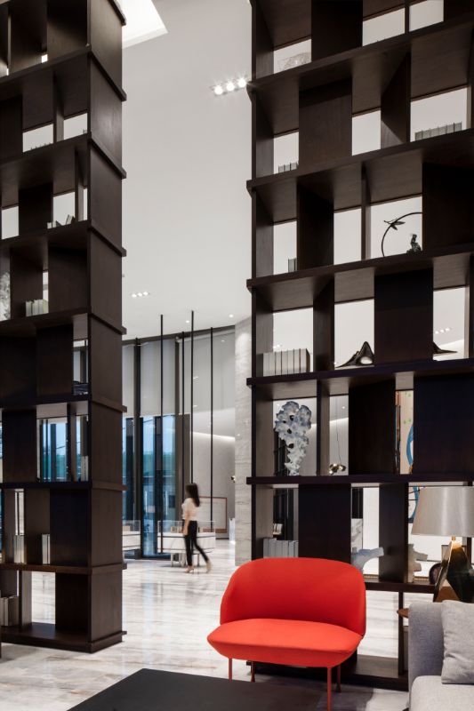
Photo 18: through the bookshelves, the layout of the negotiation area is also cleverly divided to create a semi transparent private space. It forms two functional areas: internal "static" and external "dynamic". In order to meet the different needs of intended customers and mobile customers.


