INNOVATION Prize of Commercial Space
PROJECT
INFORMATIONS
Design background: the case is located in Shenyang, Liaoning Province, China. The owner has been committed to the advanced beauty industry for many years, and the idea is to create a unique image store of his own brand.
Project location and old situation: the case is located in the newly emerging street of Shenyang City, with modern overall style and network red element, belonging to the old house renovation category, with a single door and single courtyard.
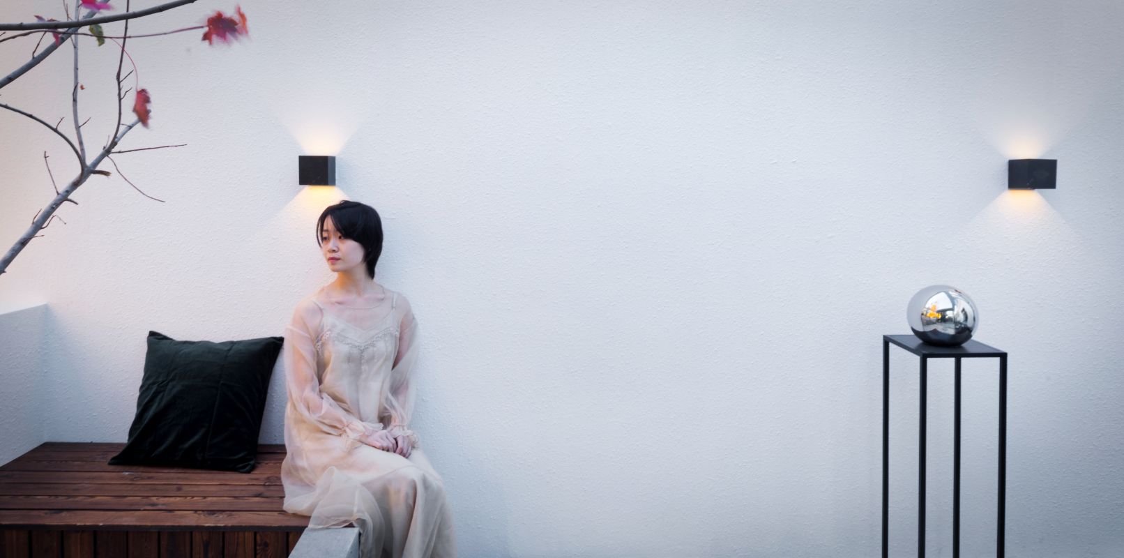
Design Description: single door and single courtyard are characteristics and problems. In order to make better use of space and advantages, we have expanded the indoor area, transformed part of the courtyard into indoor space, and added many functional areas on the original basis, so that customers have entered the beauty salon from the first step into the courtyard.
PROJECT
DESCRIPTION
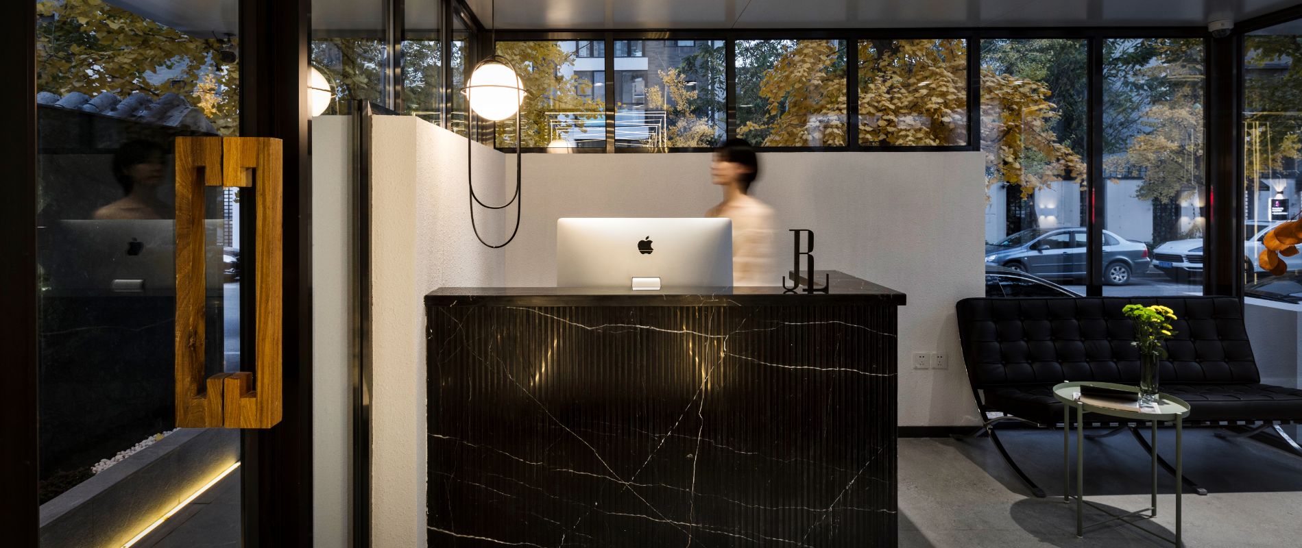
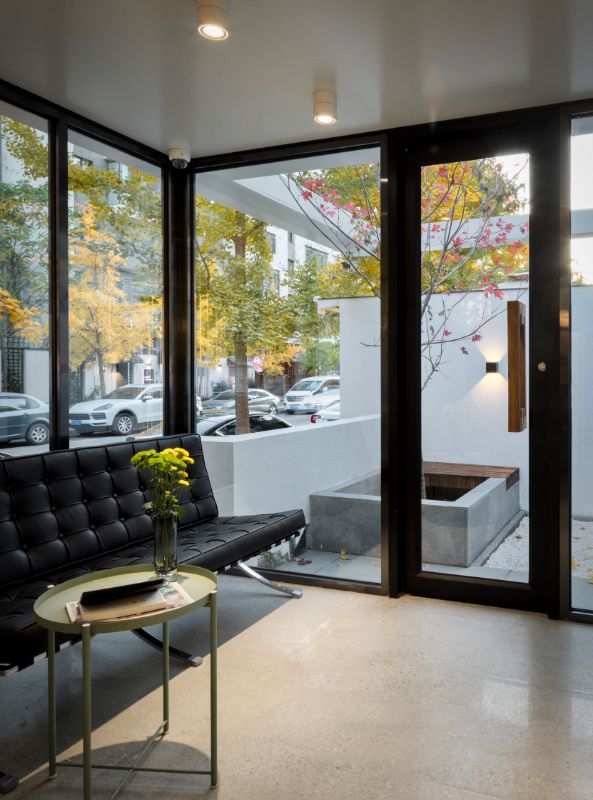
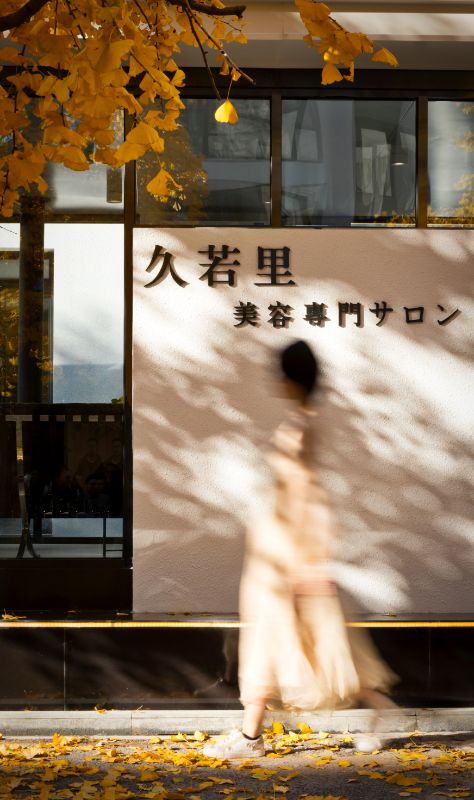
There is only one wall between the front desk and the street. The staff can pay more attention to the crowd's movements, and the transparent glass can better show the image of the store.
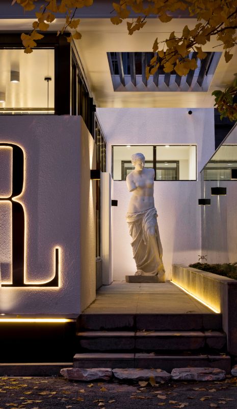
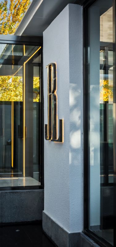
The exterior of the building adopts steel structure frame, large area of glass and aluminum plate. The entrance is on the right side. There is a flower bed at the entrance. It is a diagonal line on the body. It can better guide customers to enter the store, and there are corresponding guidance hints on the light.
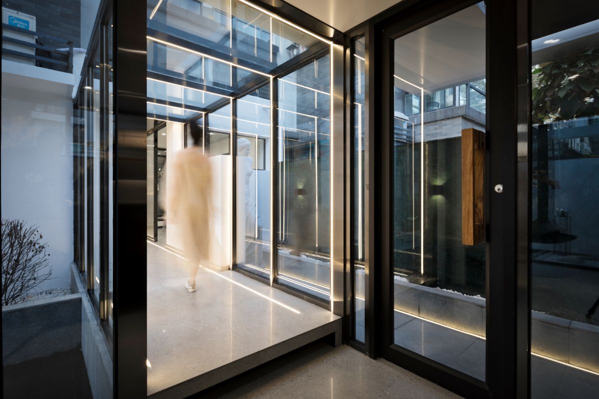
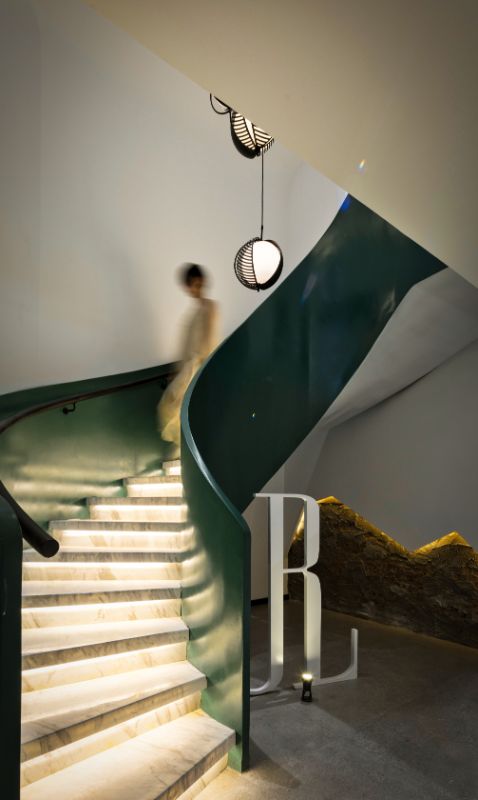
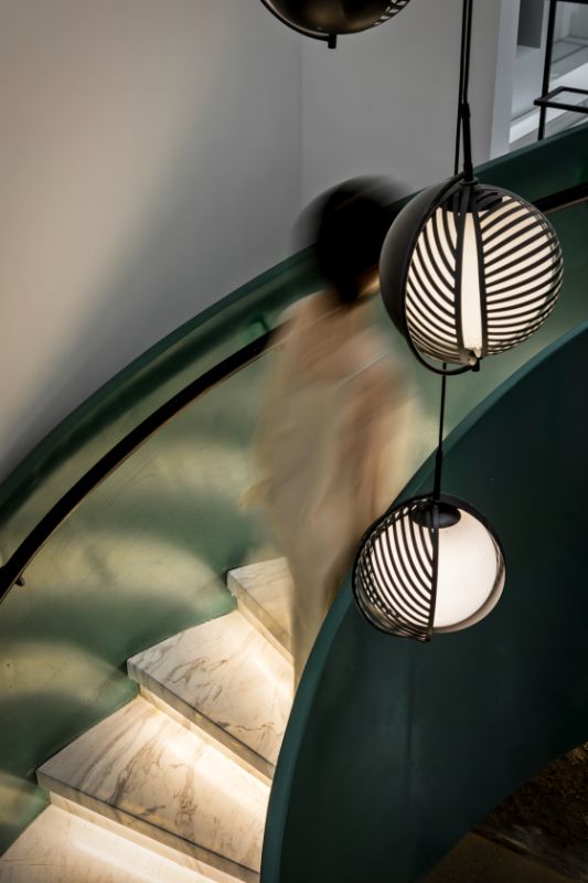
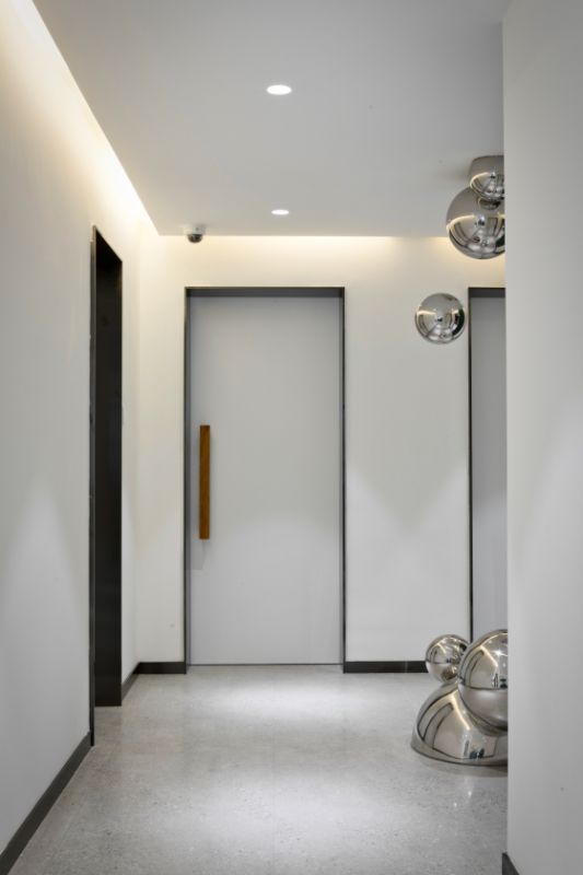
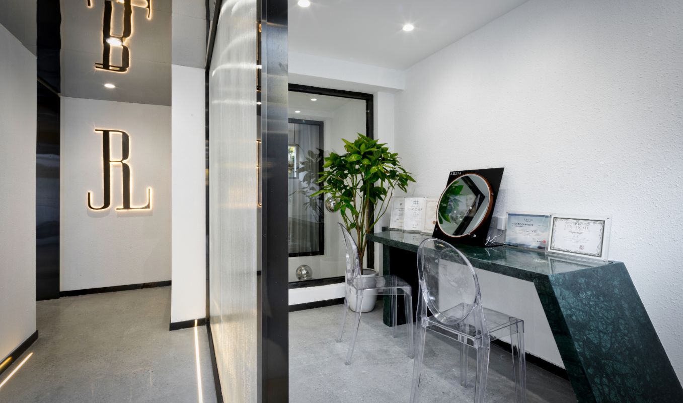
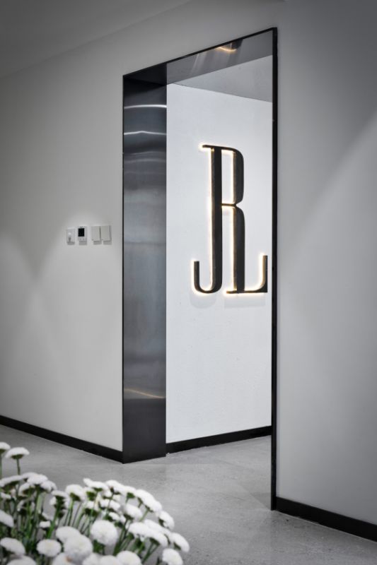
In terms of space distribution: the first floor is the front desk from the entrance. There will be two indoor and outdoor channels to enter the room. The main channel needs to enter through the glass corridor. The first is the detection room After the test, professional beauticians will take customers to the rest area to wait, and then enter each beauty room After going downstairs through the revolving stairs, there are two beauty salons on the lower floor Each floor has a cosmetologist's lounge The shape of the toilet breaks the inherent form. The logo of the project is placed above the sink to deepen the impression of customers on the brand.
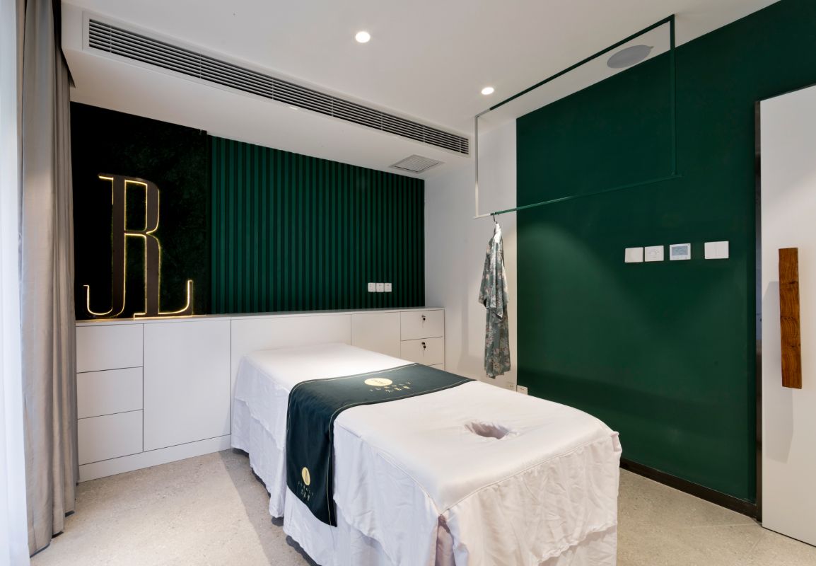
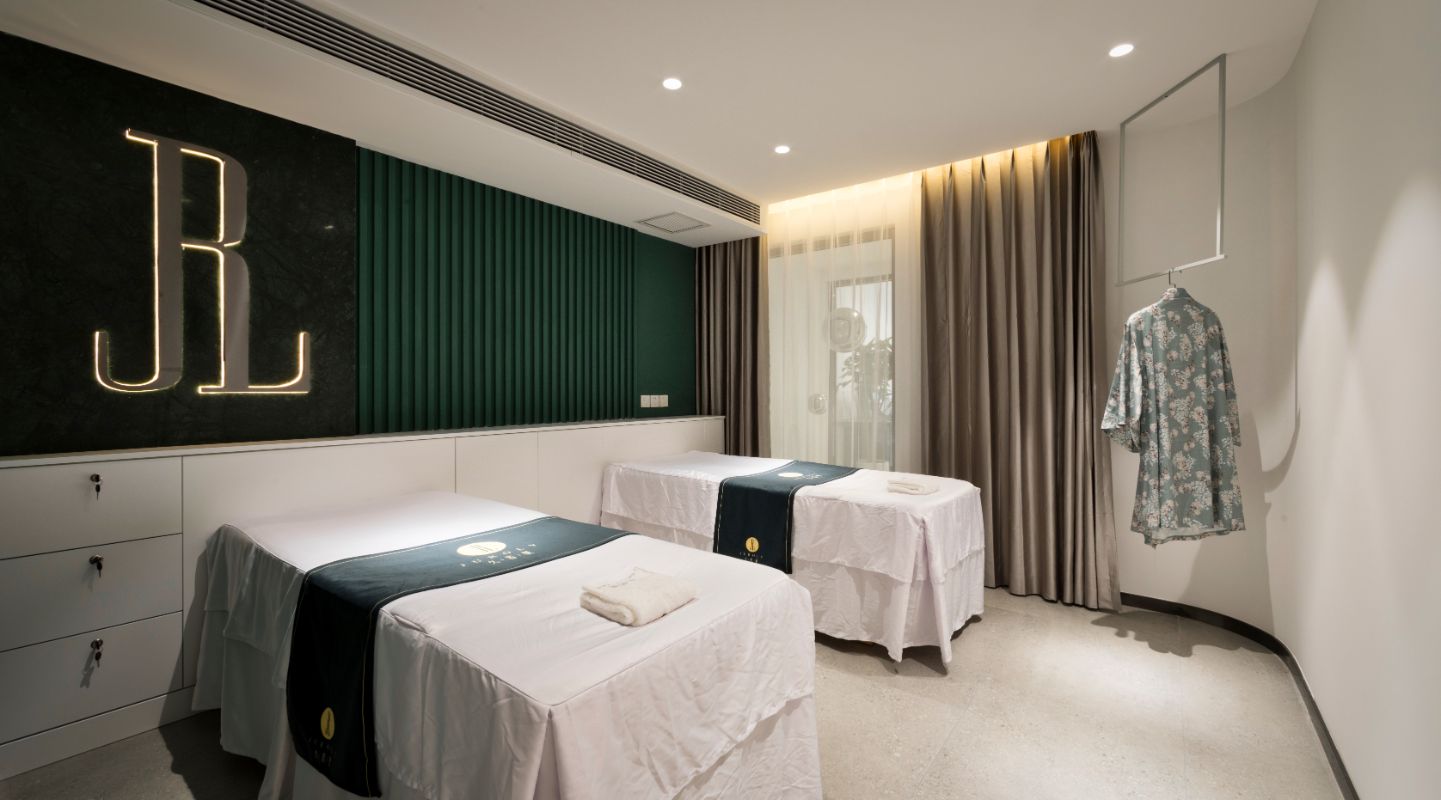
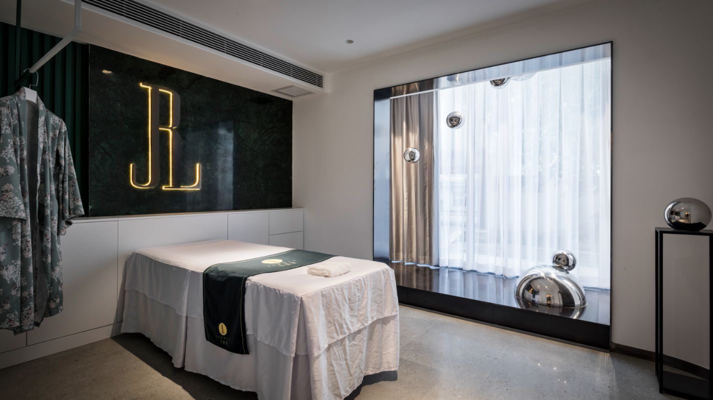
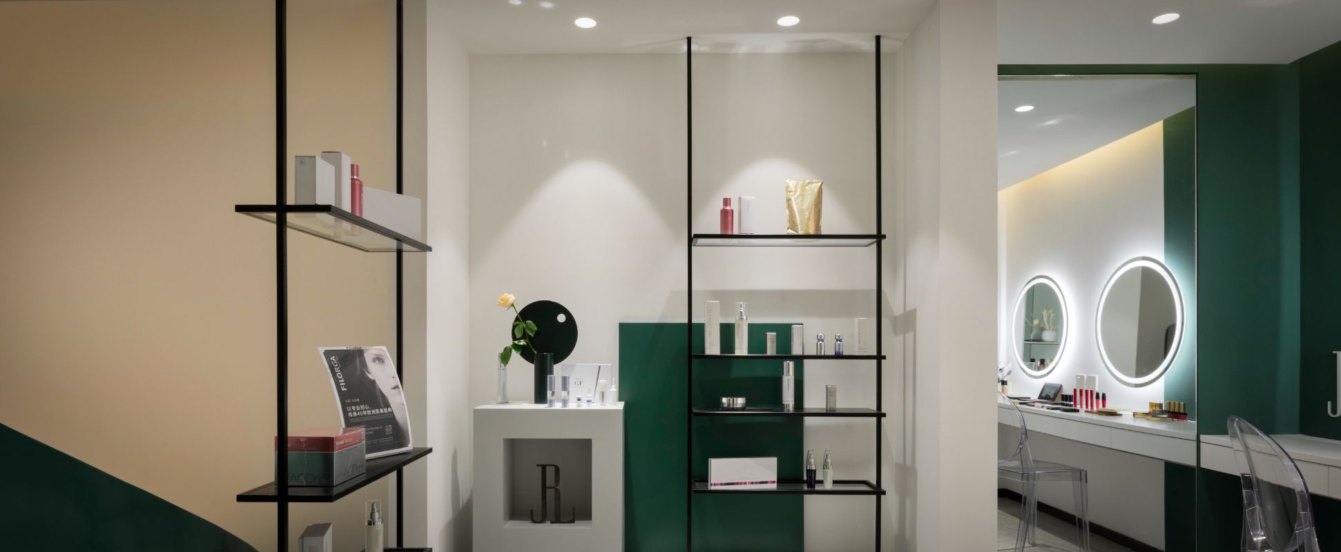
The beauty salon is divided into one layer and the negative one. The first layer uses a large area of green as the main color. Green latex paint and green stone are used for comparison. In terms of modeling, orderly arranged molding strips are designed to increase the rhythm of the wall. The negative layer uses exposed red brick and smooth white marble to make a strong contrast, giving people a wild feeling. In the rough and delicate contrast, it also expresses the results of beauty.
Color: the classic black and white gray tricolor is widely used in the case, and green is added as the soul element of the space. Black and white gray has a better sense of modernity and is not easy to go out of fashion. The appearance of green makes the space active.
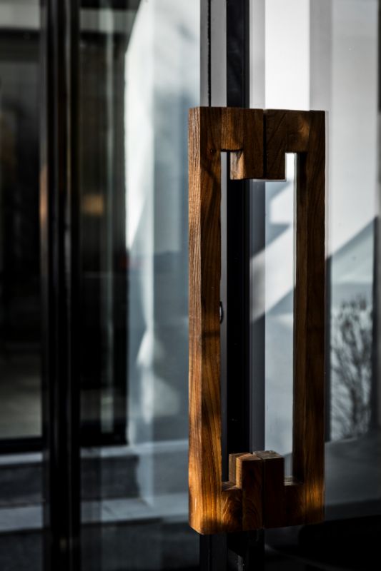
Material: because there are only black and white gray green, four colors, in the same color, different materials are used, so that each color has a different texture. For example, white, there are textured paint, white emulsion paint, jazz white natural marble and white artificial stone.
Conclusion: no matter in shape or color, indoor or outdoor, we strive to keep the overall coordination and unity, and use simple shape and color to create not simple space.


