PROJECT INSTRUCTION
INFORMATIONS
Daxijia | DAXI STUDIO, a trend brand collection store, this SHURUI design was invited to design an offline fashion collection store. We incorporate the concept of tolerance and growth in the “home” that Ms. Coco talks about.
002
As a fashion experience space, do not stick to the rules. DAXI STUDIO is based on the unique and keen sense of fashion, each side is an independent landscape, I hope that guests can find the fashion and comfort of the consumer scene.
003a 003b
PROJECT
DESCRIPTION
Low-key sense of luxury | a gas field that blends with fashion
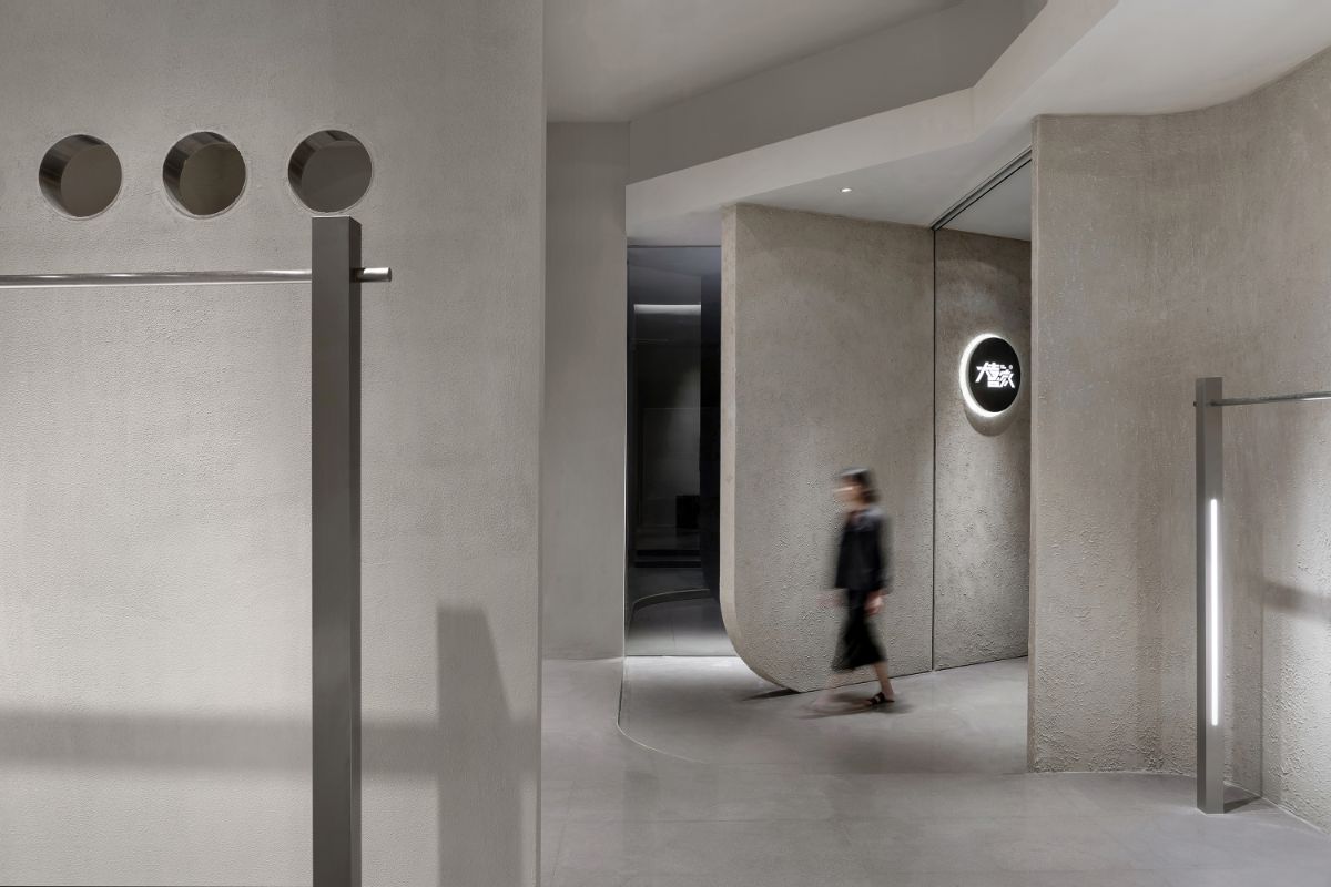
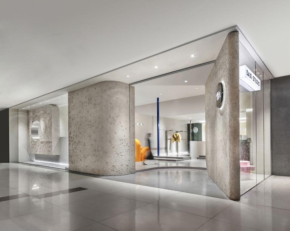
The entrance is placed in the right front according to the mall's flow line, and the inclined texture wall welcomes the guests to the store at an angle. The combination of clean, transparent glass and round cutouts creates an elegant, high-quality finish.
004 005
SHURUI design combines business and fashion. The whole space is based on calm and plain color. It incorporates the texture of art paint and marble luster as an extension of the material, presenting a space of simplicity and detail without losing detail.
006
The combination of minimalist shop furnishings, lighting design and large-scale three-dimensional modeling blends into the elements of contemporary architecture to better create a diverse space for a unique experience.
007a 007b
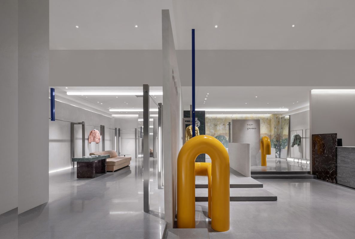
The longitudinally extending wall divides the space into two, with the outside being more open and the inside being relatively more intimate. The top structure runs through the sides, weakening its separation and reshaping the structural beauty of the space.
008 009
Taking advantage of the layered height of the original building, the entire space retains the architectural form, and the top surface is interspersed with the structure, echoing the roof of the “home” concept.
010a 010b
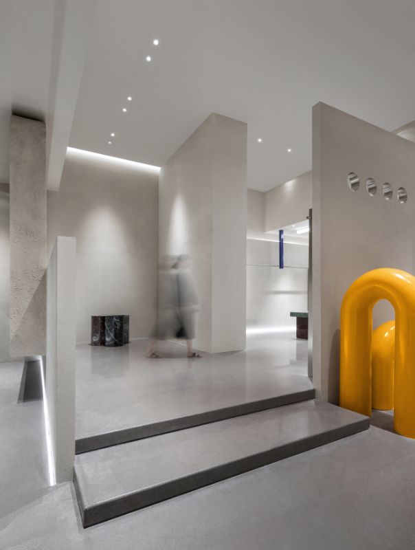
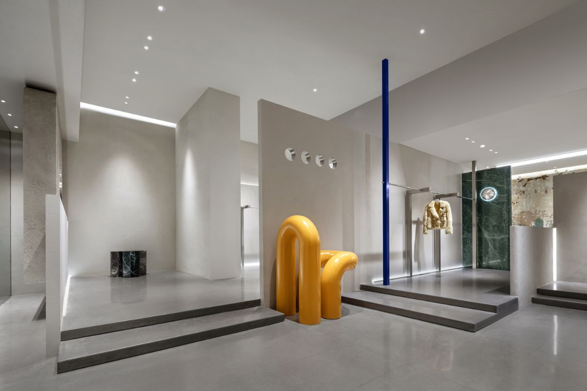
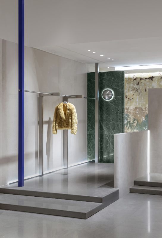
The progressive steps guide the flow of people to pick up the stairs, and explore the inner structure and the contemporary structure to make the display more layered.
011
Home Concept | Brand Diversity and Inclusiveness
The home is the easiest to give inner satisfaction, carrying the diverse personality of independent members, involving all aspects, integrating the recognition of photography, art, architecture, painting and other beauty.
012
Taking into account privacy and not completely closed, while using geometric lines, the space is divided into different areas to increase the association.
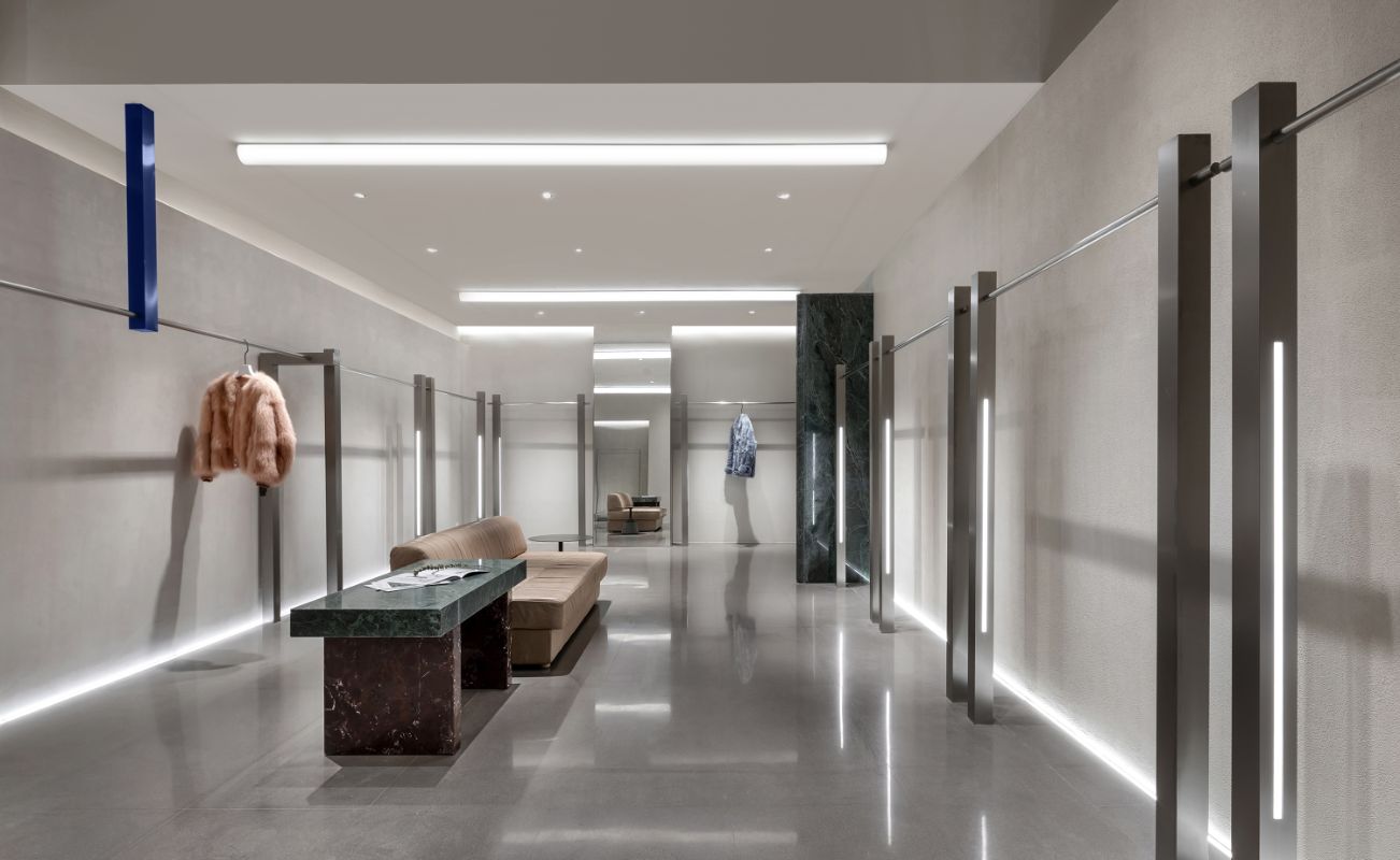
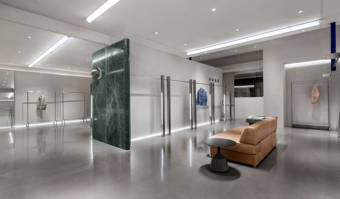
The array of shelves creates a staggered and rich sense of scene, breaking the slack of the inherent space and creating a dynamic vision.
The inner space is divided into separate seating areas, and the sofa and coffee table are as relaxing and pleasant as home.
013 014
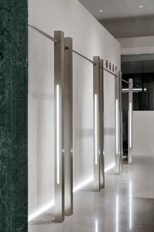
The minimalist top-floor connection shelf and the cylindrical acrylic strip light all reflect the rational arrangement of the dotted surface of the space.The light strips embedded in the side dilute the coldness of the stainless steel, and the ground glows with soft light, reflected on the wall, and the wall begins to float and float.
015 016a 016b
You can see that customers have dialogues, interactions, explorations, and exchanges with clothing. The atmosphere is actually created by the customers themselves.
017a 017b
Material collision | space fun
The four small holes in the rhythm of the wall broke the lengthy dullness and the air was able to march.
018
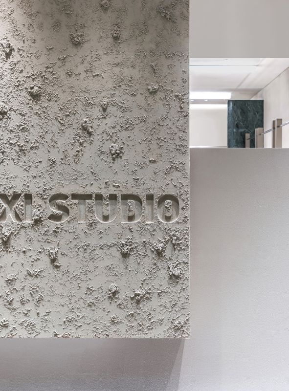
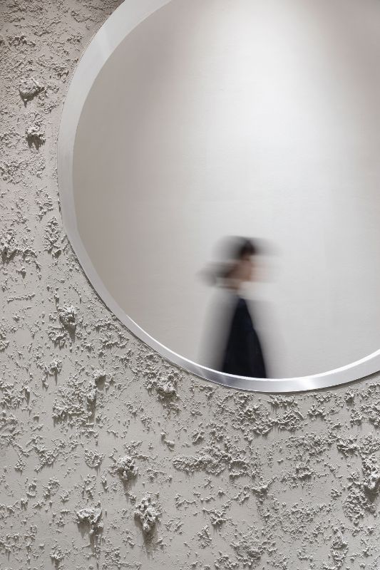
The artistic paint of the sense of texture pays homage to the wildness of nature and the perfect combination with minimalist aesthetics. The seemingly unfinished rough surface contrasts the purity of space.
019
The vitality of marble, metal and wood makes the space more diverse and inclusive.
020
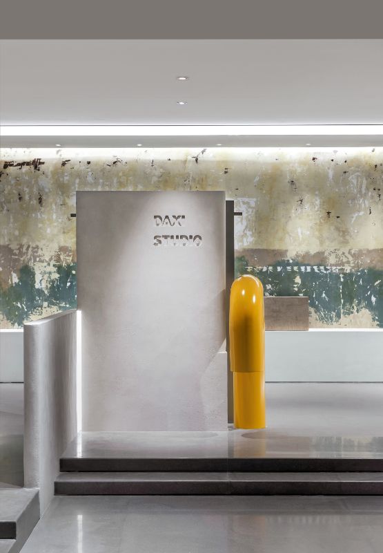
The encirclement of the low walls, the standing of the high walls, the mottled art paint wall with historical traces, outlines the past memories, and forms a gap with the modern attributes of metal.
021 022
The fineness of the top and facade art paints collides with the ground gray terrazzo
023
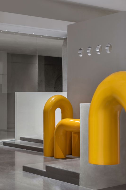
Highly saturated bright yellow curved tubes and navy blue props constitute a fun art installation, about fashion, they collide here and produce chemical reactions.
024 025
SHURUI design starts with a unique positioning of space, and it is compatible with the brand to interpret their attitude towards life. It is effortless in fashion here.

Zheng Jie
SHURUI Design
“Design is a kind of communication”. Every time the design is a dialogue between “people and people, people and space”, it is to integrate “infinite possibilities” into space. Commercial space design I don't think it is a model design execution, architectural, visual, fashion, art, product, lighting design language of different dimensions, used to interpret the cross-border combination of people and space and aesthetics.
PROFILE
receive honor:
The 9th International Space Design Awards in 2018 - Aite Award
2018 China Interior Design - Jintang Award
Asia Pacific Space Design Awards in 2018 - Top Ten Outstanding Young Designers
2018 Golden Bund Award - Best Commercial Space Award
2016 Zhejiang Xinrui Creative Designer
2015 outstanding creative designer in Zhejiang Province
2014 Zhejiang Excellent Decoration Design Award
Design representative works:
"DAXI STUDIO Collection Store", "YIXIE Disorder/Fusion", "GIFANTY", "SBOLRTE Stack", "COCO LIMITED Office Space", "Italian WZG Fashion", "SOGGIOMO Restaurant", "Milan TOP CARNE Western Restaurant", "Mexico 168 Restaurant", "Milan Courtyard Restaurant", "DESIGN+ Design Restaurant", "VDS Showroom International Designer Brand Collection Store", "UV-GO International Luxury Jewelry Experience Pavilion", "China Textile CBD"--International Fashion Exhibition Center "", Alibaba Taobao City - Zheli Orange Long Club", "Yi Shang Town SHIJIE Designer Brand" and so on.
A space or an idea always tells his audience through design, and a good design is not just about transmitting information, but more dragging us into a conversation.

