PROJECT INSTRUCTION
INFORMATIONS
Design description of Wuhan Tiandi life hall:
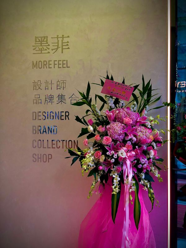
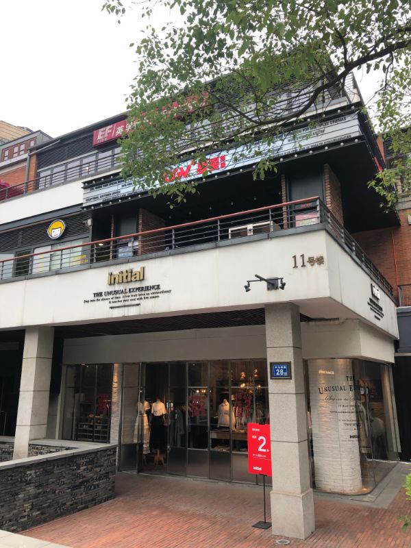
Murphy designer brand collection store has a history of more than ten years. It is also the first buyer type women's clothing store in China to introduce many European designers and many minority designer brands from all over the world. The manager attaches great importance to this design, which is also a comprehensive upgrade from VI to interior decoration vision.
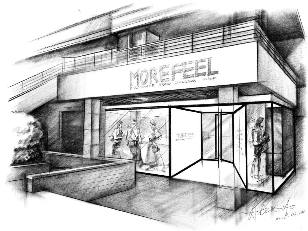
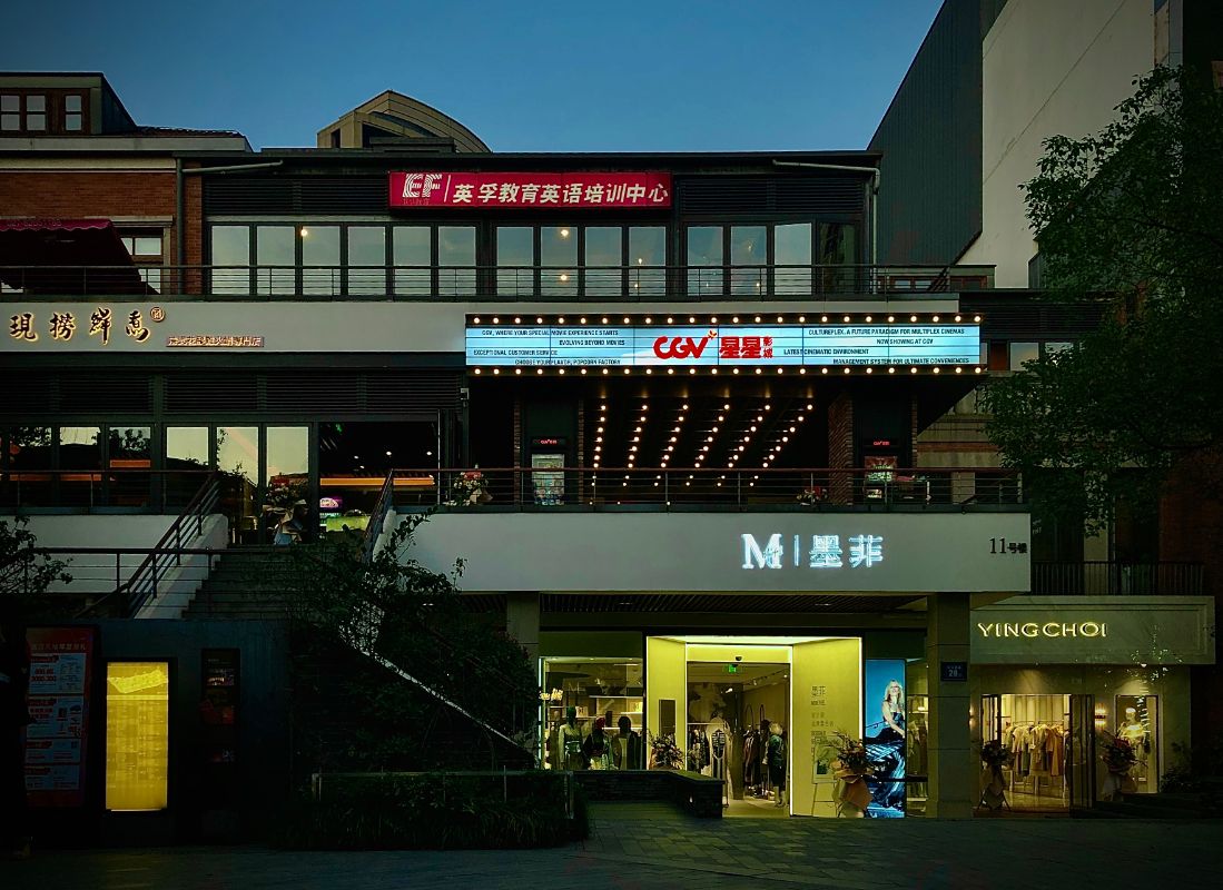
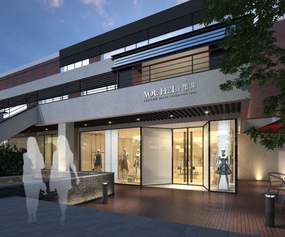
After full communication and discussion, the designer gave up the current popular fresh net red style, adopted the more famous international lines and ideas, created the appearance and public area with minimalist and modern fashion sense. The black and white color and the large area of super white laminated glass constructed the texture appearance like glass box, and the large-scale white brick board formed elegant and rhythmic cooperation.
PROJECT INTRODUCTION
INTRODUCTION
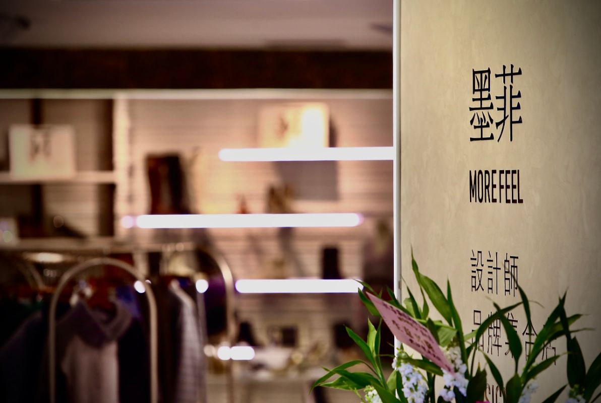
In order to create a special entrance, the designer outlines a sunken hall in front of the opposite floor glass door, and creates a bright and attractive entrance area with diffuse reflective light film. The ground is self leveling with nano cement and embedded with the company's English handwritten logo carved by laser on brass plate. The ground is polished and integrated with the ground, which once again attracts the attention of consumers.
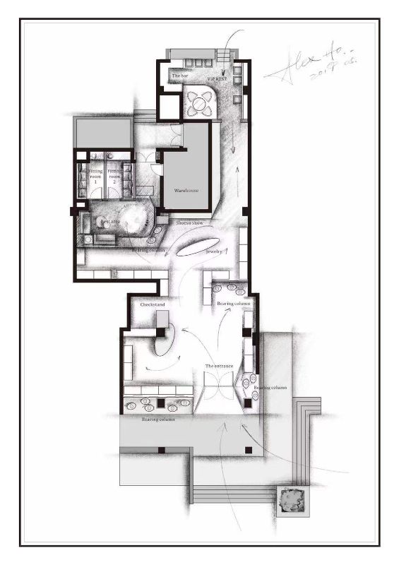
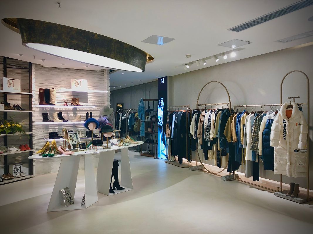
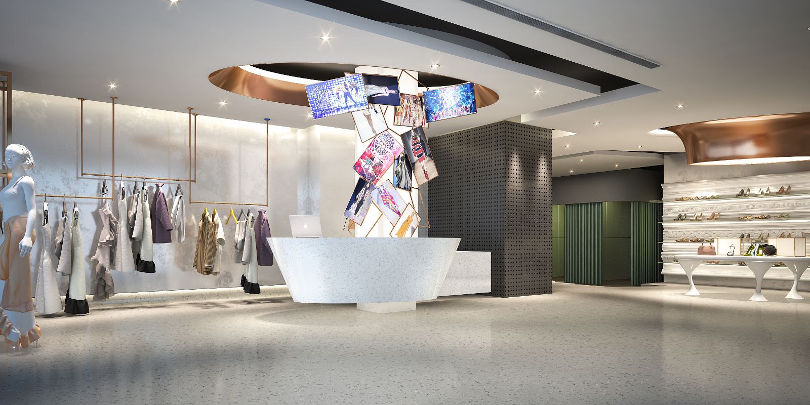
The whole interior space highlights the extreme collision between modern minimalism and elegant retro style. The first half of the interior is painted with luxurious Italian valpoint art paint white pearlescent, supplemented by unique hand work, highlighting the details in the minimalist geometric surface. The soft and elegant pearlescent perfectly matches and sets off the clothing. The overall polished white marble cash register shows a strong sense of block. From small to large, the retro photo frame rotates and rises, and the large LED screen inside transmits the trend information all the time.
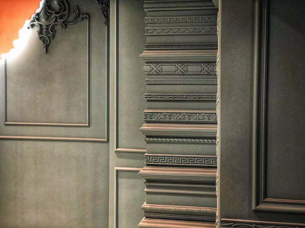
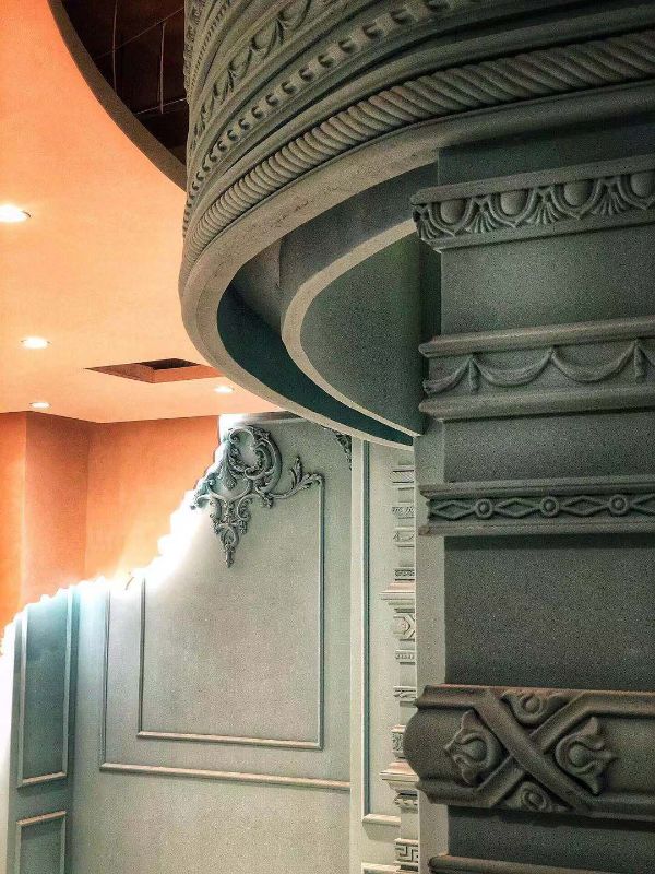
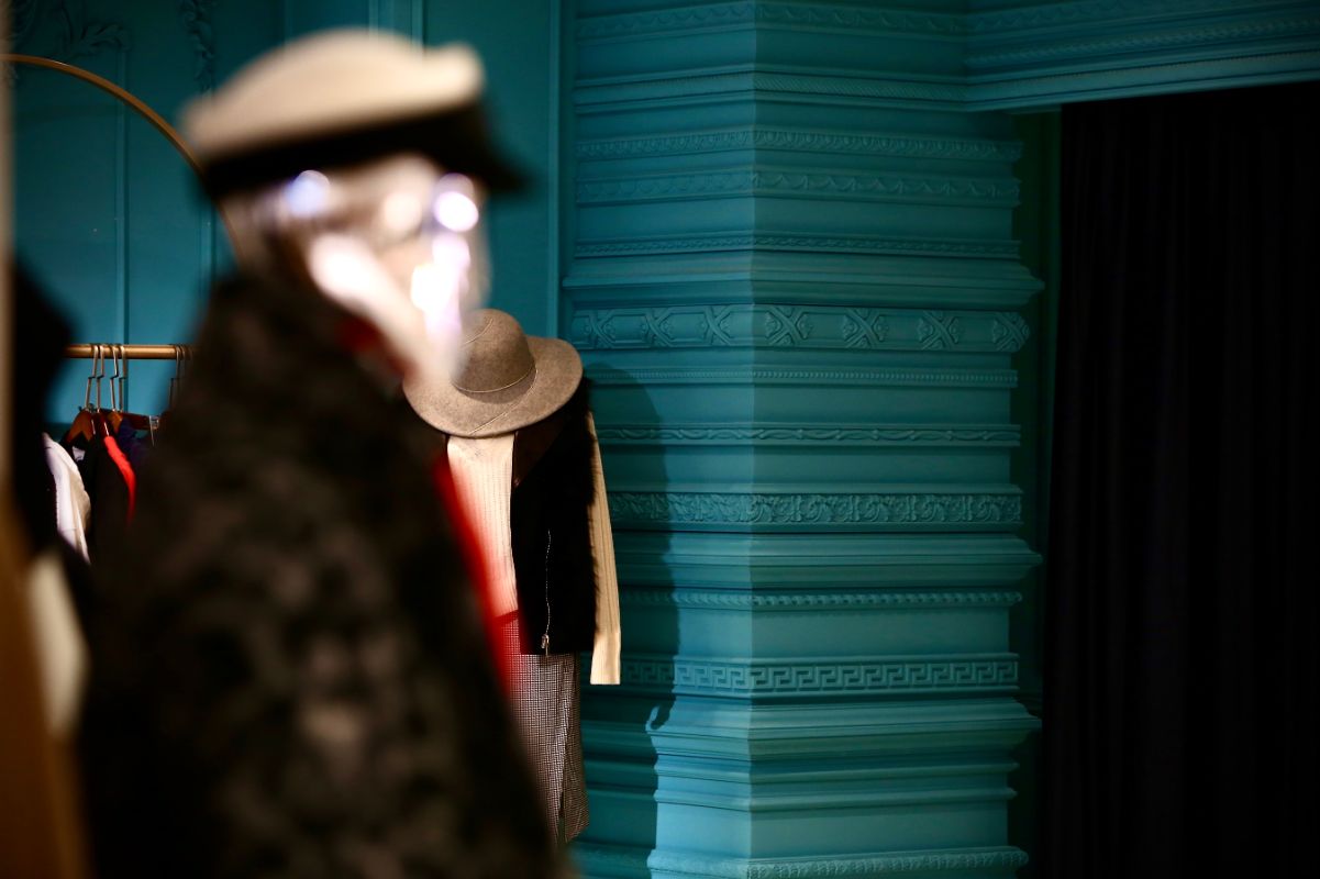
In the latter half of the space, the designer draws the curve like a cracked wall by hand, and enters the classical pattern space in the turning point. The layered European lines and decals focus on the interpretation of foreign culture. The combination of Morandi and Tiffany color makes the visual comfort and artistic elegance. The minimalist bar rest bed in the first layer of oil wax leather provides excellent rest experience for waiting guests. The shuttle shaped stone plate jewelry island and the line shoe cabinet display area of the luminous laminate set off each other, echoing the shuttle shaped lamp film lighting of the same size of the ceiling. The hand-made imitation copper appearance is a bright device.
The designer also vacated a VIP afternoon tea area in the special-shaped space to create a church like symmetrical European architectural space with the art paint with plain cement pores. The atmosphere was set off by the retro pattern of the Holy Grail, the old oak long table and the sink cabinet, which made the consumers feel strange.
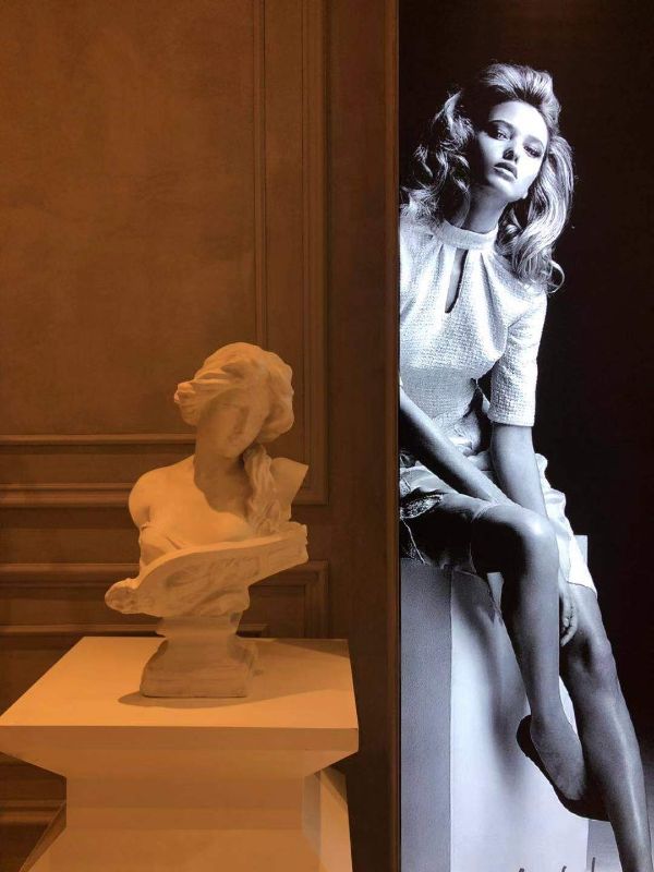
All the designs and ideas are based on the superposition of originality and artistic style, the introduction of soft decoration and Renaissance statues, which makes shopping not only a simple consumption behavior, but also the leading of aesthetic lifestyle, and also a new design style attempt of designer brand collection store.
