PROJECT
DESCRIPTION
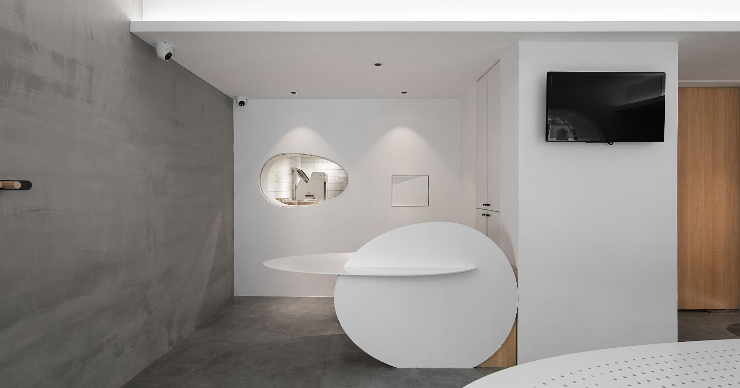
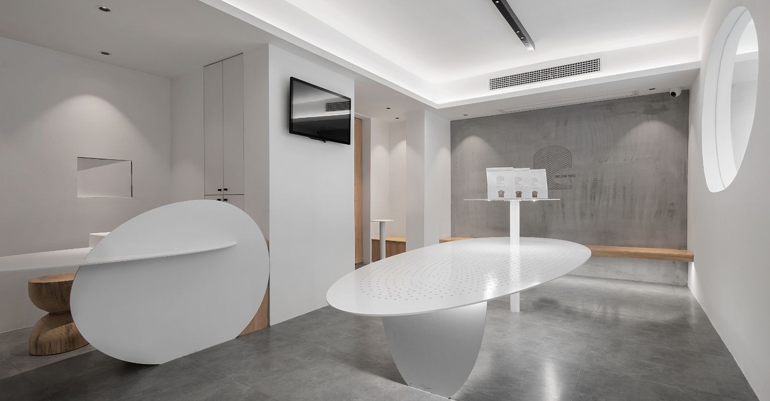
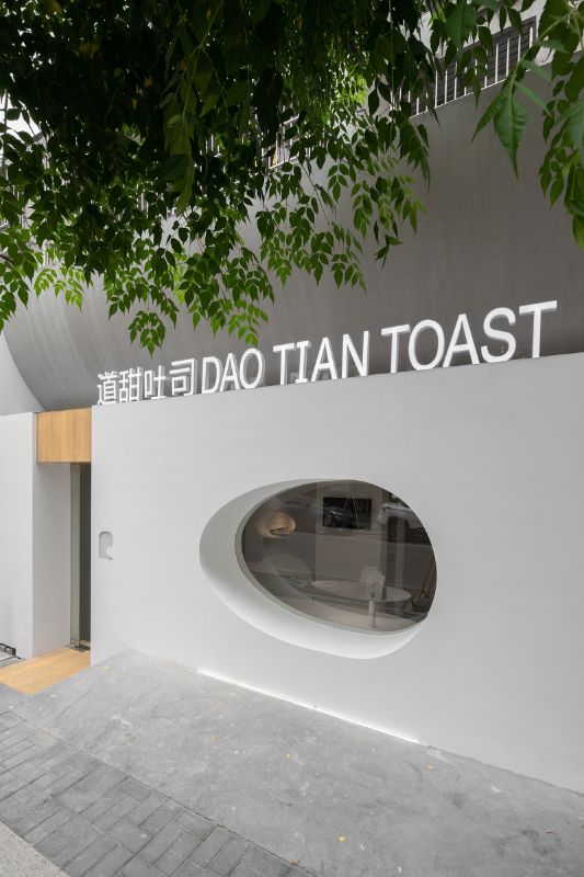
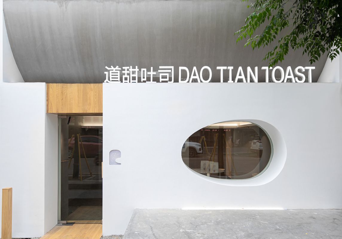
The shop was set down after the epidemic, and the owner is my friend, a young man who is very dedicated to his work. What he asked me was low cost and strong design sense. There was an operation room that could be seen from the exhibition area, and all the others were arranged by me. When I first arrived at the scene, my heart was still cold. The streets around me were a bit dilapidated. It's the sunken entrance that makes me feel interesting. As it is a post built room, its roof is flat, and there is a section of space behind it. Originally, the air conditioner was put behind the door head. In order to make the facade have a three-dimensional sense, I designed the door head as a reverse sloping roof, making its bottom arc backward, staggered with the front edge of the door for a certain distance, and the upper opening is still flush with the outside. Wrapping the original uneven door surface is equivalent to thickening the external wall, and the original thickness is only kept at the same width as the door at the entrance. When I was looking at the shop with my friend, he said that the window was pretty good and big, so I should keep it. I objected to it face to face. I said that no matter from the inside or from the outside, people only want to see what they want to see, so the window is meaningless. Moreover, the size of the window is not commensurate with the size of your current door. Instead, we need a more refined small window. I think many bread and toast are related to eggs, so I made the window into an egg shape, which is in contrast to the entrance on the west side. Due to the thickening of the wall, the "egg" has a deep depth, with a good sense of three-dimensional. The width of the entrance and the door retain the original thickness of the wall. The upper part of the door is decorated with wood. The platform entering the store below is also decorated with wood. The original two downward steps have been finished. A wooden column has been placed on the left side of the door, and an egg shaped stone has been placed on it. Here, the method of "boundary" in Japanese courtyard has been used, which means that you have entered the store area since then. On the right side of the door is a logo, which sinks into the wall and glows at night. The logo is also designed by me. It looks like a piece of toast with a big bite and a head with a big mouth. The arc of the mouth is exactly half of the egg shape.

Designer: Qitong Fan
One of the founders of MUJI construction, design director.
Top 100 of Jiangsu Province in 2019
China new real estate design conference outstanding residential apartment designer in 2019


